A Change in the Mood MusicThere's a first time for everything. My generation arrived in the workforce just as inflation was ceasing to be a serious problem (at least in much of the West). Since the early 1990s, consumer price inflation has stayed firmly under control. There have been undulations and oscillations, and times when the risk of inflation needs to be taken into account. But there's never been a time when my generation of 50-somethings had to deal with inflation as something that's real and matters. For people younger than me, the notion becomes ever more abstract and hypothetical. Anyone who knows any basic economics understands the concept, but it has ceased to be a driving force in politics or the economy. There have been plenty of other ills, but not rising consumer prices. That's over. Whichever way you look at it, official U.S. data suggest inflation is the highest in 30 years, and rising. It's plenty possible, indeed likely, that this will prove a transitory phenomenon. But for now it's real and undeniable, and we have to deal with it. Thus, a wave of people under 60 have discovered the delights of digging through the entrails of official inflation data. It's made for a fascinating but confusing day. I have an ongoing attempt to keep track of all of this. The latest update of the Authers Indicators inflation heat map is here. We've updated it in light of the new data. Now to venture into the thickets of the latest debate. Brace yourself for charts. First, and most importantly. Inflation is up, a lot. This is true whether you take the "headline" number (the best attempt of the Bureau of Labor Statistics to gauge the overall increase in average living costs), or the "core" number which excludes food and energy — not because they aren't important, but because they are driven by factors largely beyond the control of monetary policy. Headline inflation was momentarily higher when oil nearly hit $150 per barrel in summer 2008. Other than that, both measures show inflation at its highest in almost 30 years, but not clearly yet entering a new range: 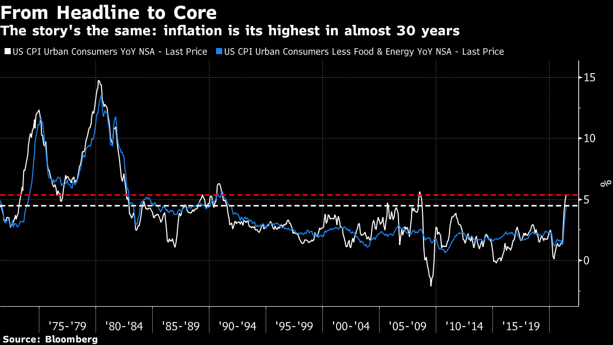 As is widely known, there has been a massive increase in the price of used cars, for reasons related to pandemic shortages. So the bureau handily publishes an index that excludes this, and also shelter (the single biggest component). After excluding everything that might make inflation look OK, you get this: 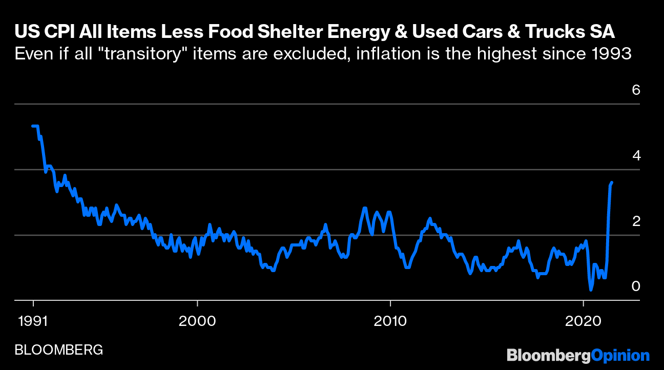 It reduces the number, but still shows the worst spike in almost 30 years. There are other ways of looking at the "core." The index has many components. Some will rise only once every two or three years, creating big bumps. So, you can measure the core by excluding the biggest outliers in either direction, whatever they are, and taking the average of the rest. This "trimmed mean" still renders inflation of almost 3%, as high as it's been in three decades barring the 2008 oil spike: 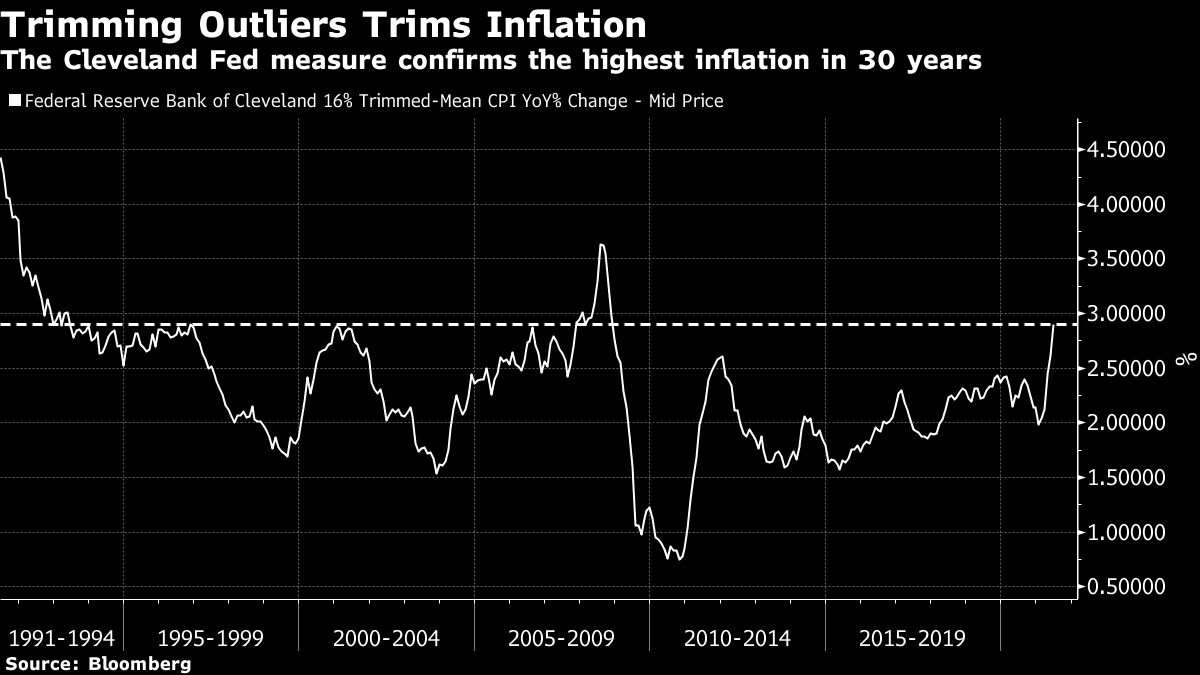 Another alternative is the New York Fed's measure of "underlying inflation," which is fiendishly complicated but involves disaggregating the bureau's data, looking at plenty of other measures, and seeking out the underlying trend. The latest number for June hasn't been published yet; as of May this measure showed a sharp rise to 3%, and it's a fair bet that it will now be right at the top of its range. But it's interesting that this measure, first of all, provides a smoother pattern (without a spike in 2008), that it shows inflationary pressure rising a bit ahead of the pandemic, and that it is influential over monetary policy. A significant rise in underlying inflation, so measured, has tended in the past to lead the Fed to tighten. Doubtless many in the markets expect the same again: 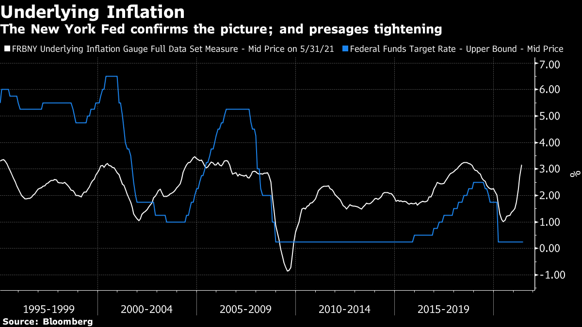 Now we can go further. Steven Englander, foreign exchange strategist at Standard Chartered Plc, tried calculating the core while removing the "reopening" sectors that showed the greatest impact from the recession — new and used cars and trucks, car and truck rentals, other lodging away from home including hotels and airline fares. These factors account for 12% of core inflation, but were responsible for almost two-thirds of June's increase. This is the outcome, expressed in month-over-month rather than year-over-year terms: 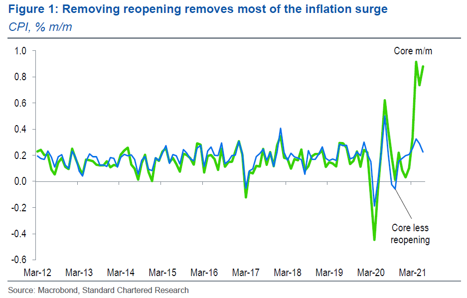 It startled me that this number was so different from the trimmed mean. Englander's own suggestion is that price increases have "fatter tails" than decreases — in other words there are examples of components suffering 100% inflation over a year, but precious few examples of 100% deflation (unfortunately for us consumers). If we go with the straight median level of inflation, from all the categories pursued by the BLS, we get an outcome much lower than the trimmed mean: 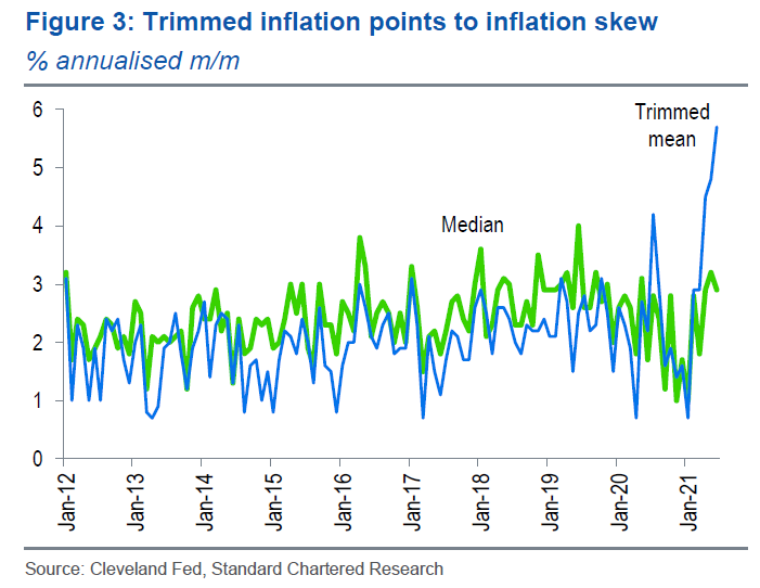 I'm still a tad concerned that we may be overstating the impact of the pandemic, because there are still some sectors where it is having an obvious and probably temporary deflationary effect. For example, medical equipment and supplies is -6.3%, probably due to a post-pandemic glut, admission to sports events is -7.2%, and college tuition is "only" +0.4%. This is its second lowest reading since the series started. Englander acknowledged the point but noted correctly that these sectors are very small. He conceded "there is danger in being too clever in slicing up CPI." After all, the Fed did in the 1970s spend much time trying to show that there was no inflation. With this caution in mind, let's continue. We all know that there were significant "base effects" from the pandemic — prices fell early last year, so an increase back to normal now will look like serious inflation. The index hit bottom in May last year, so base effects will now start to drop out of the equation, but there are ways to deal with them while we wait. The Council of Economic Advisers (in the White House, who evidently have an interest in making inflation not look too bad), offered this version, which annualized inflation since February last year, the last pre-pandemic month. Doing this leads to significant reductions in core inflation, but still leaves it above 3% now: 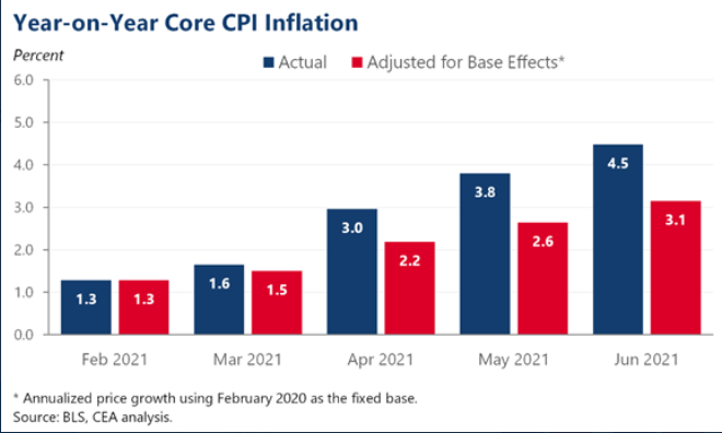 Another way of dealing with base effects is to look at annualized price changes over the last six months. That gives a more accurate idea of the current trajectory. On this basis, core inflation is now at 6.2%, and the headline rate is at 7.2%, according to Mickey Levy of Berenberg Capital Markets: 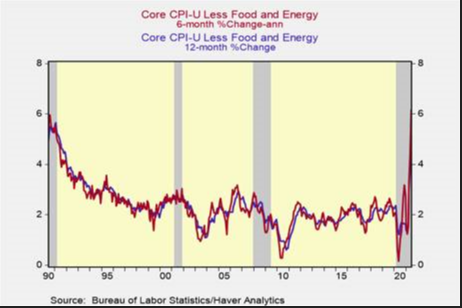 The White House put together its own bespoke index of pandemic-affected services, listed in the chart below. The index is still 2% below its pre-pandemic level, but it has increased 16% since bottoming in February this year. So it will take well into next year for these effects to wash through: 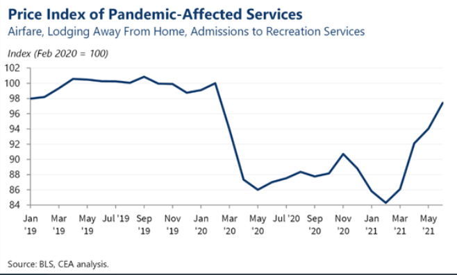 The White House also produced this handy chart that shows once pandemic-affected services and vehicle-related components are excluded, month-on-month core inflation actually fell this month and last. So that's all right then: 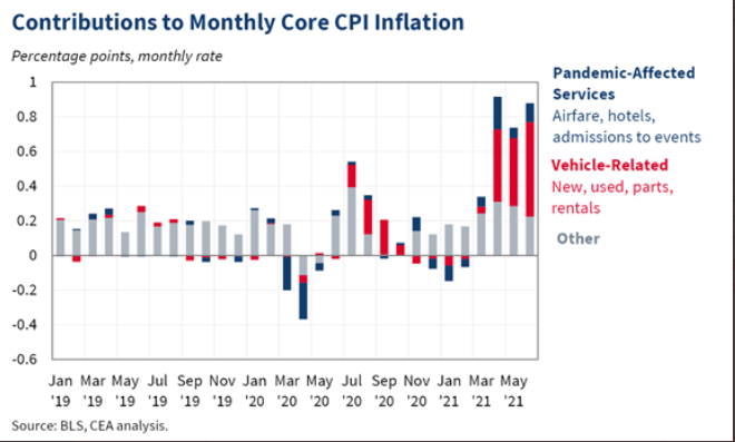 Away from the most specific pandemic effects, the greatest concern is over shelter, which accounts for roughly a third of the index. Shelter inflation rose to 2.6% this month, and it has climbed at an annualized 3.5% over the last six months. House prices are increasing, which means that shelter inflation (based on actual and imputed rents, which I'm not going to get into here) is likely to rise in due course. Shelter is now center stage of the inflation debate; if it takes off, it will have effects. On that note, this chart put together by RealPage is concerning. As homes are vacated and new leases signed, it shows rents rising by 14.6%: 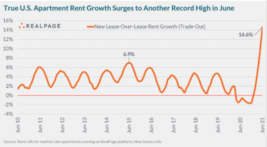 Meanwhile, occupancy is unusually high. Landlords like to have some accommodation in reserve, and deter tenants by raising prices. At present, tenants are taking the high rents offered in a way not seen since the turn of the century: 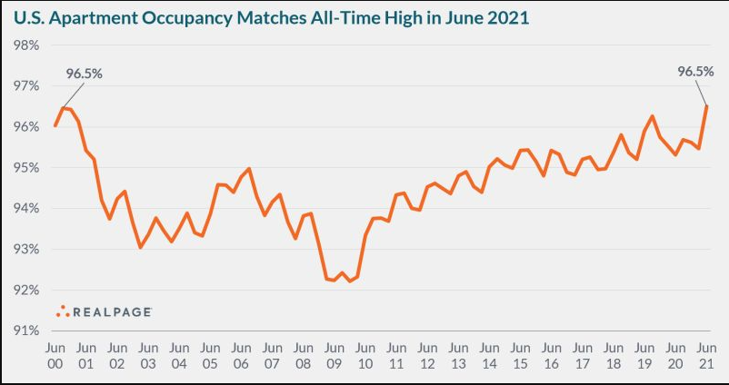 Where does all this leave us? There is no decisive evidence yet in either direction. It seems dangerous to dismiss this as transient inflation at this point. It's also way too soon to be sure that this will lead to a secular increase in inflation. Beyond these imponderables, there are two crucial unanswered questions. First, we need to know whether people actually spend the money in their bank accounts after the pandemic. Will aggregate demand take off as many hope, but people who dislike inflation now fear? This is Levy's take: The widespread nature of the price increases across many categories of consumer goods and services is consistent with anecdotal evidence of accelerating production costs and businesses raising prices of consumer products—and consumers' willingness to pay the higher prices. As we have emphasized, some of the price spikes are temporary in nature, but underlying pressures are mounting. The debate about temporary vs. persistent inflation will be resolved by future growth in aggregate demand. If, as we and the Fed project, strong nominal spending growth persists after the current spurt as the economy reopens, then inflation pressure will also persist, reflecting higher production costs and business flexibility to raise consumer product prices. Fueled by tons of pent-up demand and consumer purchasing power, it is starting to look more and more like a stylized cyclical inflation driven by excessive monetary and fiscal ease.
The second crucial question is whether workers really will try to use their clout to raise wages, and if so whether they will be successful. Higher real wages would be a boon for society — but could also drive inflationary psychology. This is the comment of TS Lombard's Steve Blitz: The critical issue for inflation trend is not inflation expectations but wage expectations. Until people expect higher wages going forward, they will see high prices in their forecast, but not engage in borrowing to buy in advance – the backbone of any inflationary process.
We had new survey evidence on this from the National Federation of Independent Business, whose monthly report on small businesses is widely respected as a leading indicator. This found the highest proportion of small businesses raising prices since 1981: 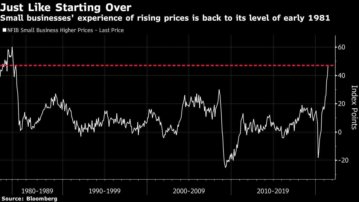 It also found that the proportion saying they were finding vacancies hard to fill remained at an all-time high. That augurs well for anyone hoping for a higher-paying new job: 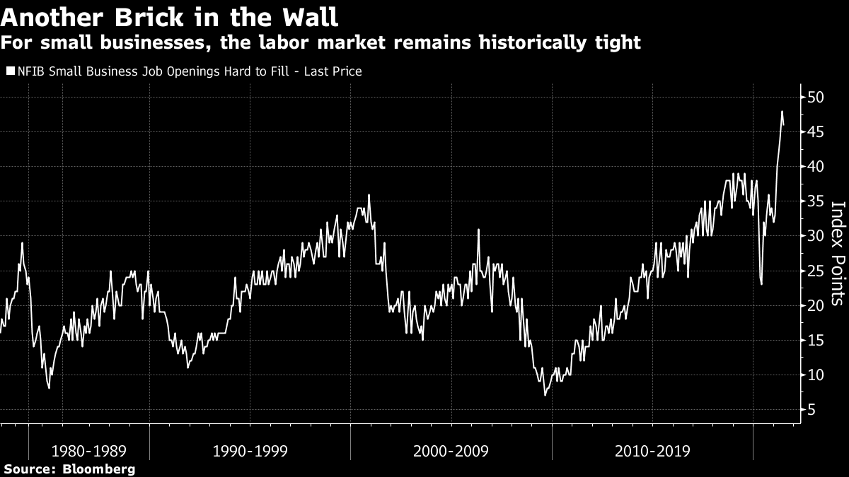 But Blitz counsels caution. Looking at the guts of the report, the proportion planning to raise prices is far higher than that planning to raise wages. This would obviously be good for profits, but arguably not as damaging for inflation in the long run. And yes, it won't exactly be great for workers: 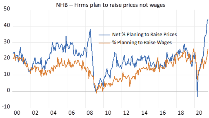 Looking at another survey, from the Conference Board, Blitz shows that the proportion of workers expecting a raise in the next six months is rising, but still isn't as high as it has often been over the last decade. It's perfectly possible that workers will grow more bullish and push harder, but that hasn't happened yet: 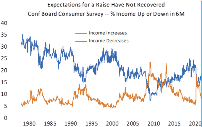 Englander of Standard Chartered drew up a measure of inflation covering "deep services" that are particularly labor-intensive — personal, education and communications, recreation and medical care services. These make up 13% of the basket, and as the chart shows their inflation is very low. If the most important driver of underlying inflation comes from wage demands, he hypothesizes that it would show up here. And, at least to date, it hasn't: 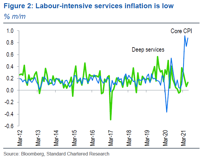 But there's always an argument against. Capital Economics points to the rate of voluntary job-quitting, which is a great leading indicator of wage pressure. The quit rate dropped a little in the last month, but it is still consistent with a sharp increase in wage pressure: 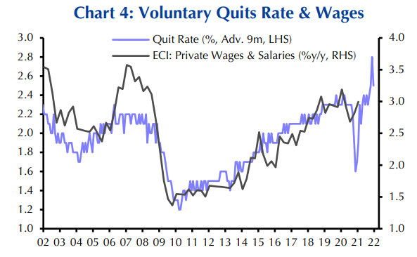 In summary, we have high inflation, and while much of it should be transitory, it could be dangerously habit-forming. For the next few months, attention will focus on the housing market, on indicators of consumer demand, and on the tight and strangely behaving labor market. And, of course, on the Fed. It would require a lot of courage for a central bank to do nothing in the face of the worst inflation in three decades. As for markets, prices are driven by more than inflation. But on the face of it, current prices imply far higher confidence that inflation will soon be over than is warranted by a dispassionate look at the facts. As I said at the outset, we are out of practice at this, but the last time core inflation was this high, the Fed funds rate was 4.75%, and the 10-year Treasury was yielding more than 7%. We aren't going back to those levels anytime soon — but maybe a little more evasive action on inflation would be a good idea, while we all learn how to deal with it? 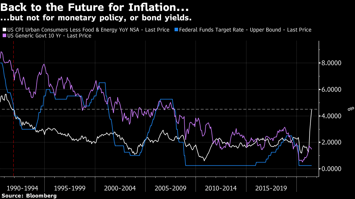 Survival TipsWhile writing a blog post on the most alarming NFIB prices report since March 1981, I thought I'd dramatize it by mentioning what was number one at the time. Unfortunately, it turns out that in the U.S., it was REO Speedwagon's Keep On Loving You. The video is if anything even more toe-curlingly awful than the song. The year's biggest pop song was Bette Davis Eyes by Kim Carnes, a darn good song, but there were also number ones by Air Supply, Hall and Oates, Rick Springfield and Eddie Rabbitt. Ugh.
Back home in England, 1981 was the year of classics like the Specials' Ghost Town, and Tainted Love by Soft Cell. But unfortunately number one at the end of March was This Ole House by Shakin' Stevens, which only sounds good if you've just sat through some REO Speedwagon. Not long after, Making Your Mind Up by Bucks Fizz, that year's Eurovision winner, started a long stay at the top of the charts. And Ultravox's great nouveau romantic anthem Vienna was famously thwarted from reaching number one by Joe Dolce's Shaddap You Face. People actually went into record shops and spent money to buy a vinyl disc with this song on it. Why? When we look back on the past, particularly our youth, we remember the best that was around, and filter out the dross, which is just as well. Maybe things these days aren't as bad they seem. Like Bloomberg's Points of Return? Subscribe for unlimited access to trusted, data-based journalism in 120 countries around the world and gain expert analysis from exclusive daily newsletters, The Bloomberg Open and The Bloomberg Close. | 

Post a Comment