| We've just published the latest update of the inflation indicators. In a nutshell, they show a steady but not overwhelming broadening in price pressures, with bond markets still more or less unconcerned, while economic experts polled by Bloomberg remain more anxious about the prospect of deflation. A rise in wage inflation and continuing pain from producer price increases, which might be exacerbated by fresh Covid-related bottlenecks, are causing the greatest immediate concern. People who argue that this inflation is transient and those who think it's a secular trend both still have plenty of evidence. The debate remains open. For now, I'd like to highlight one quirk of our methodology. The point of the exercise was to stick with my original selections after I'd picked the main 35 indicators. They were judgment calls, made after talking to people and giving the matter some thought, rather than quantitative decisions. That enabled us to resist temptations to "cherry-pick" to back one argument or another. There are at least two cases where if I had made a different — and reasonable — call, we would have had a different inflation picture. Thankfully, they cancel each other out. First, when selecting five components of the CPI inflation basket, I wanted to include a sector that might be expected to suffer inflation as the economy reopened. I chose recreation services, in blue. Recreation services inflation has picked up in the latest reading, but remains below 2% and well below its average for much of the last decade. Had I chosen recreation, rather than recreation services, the reading would have been less benign. Inflation for the sector is only slightly higher than for recreation services — but it is running at its highest in a decade. As the heat map is driven by how each component compares with its average for the last decade, that decision made the difference between an indicator flashing a warning, and one suggesting nothing to worry about: 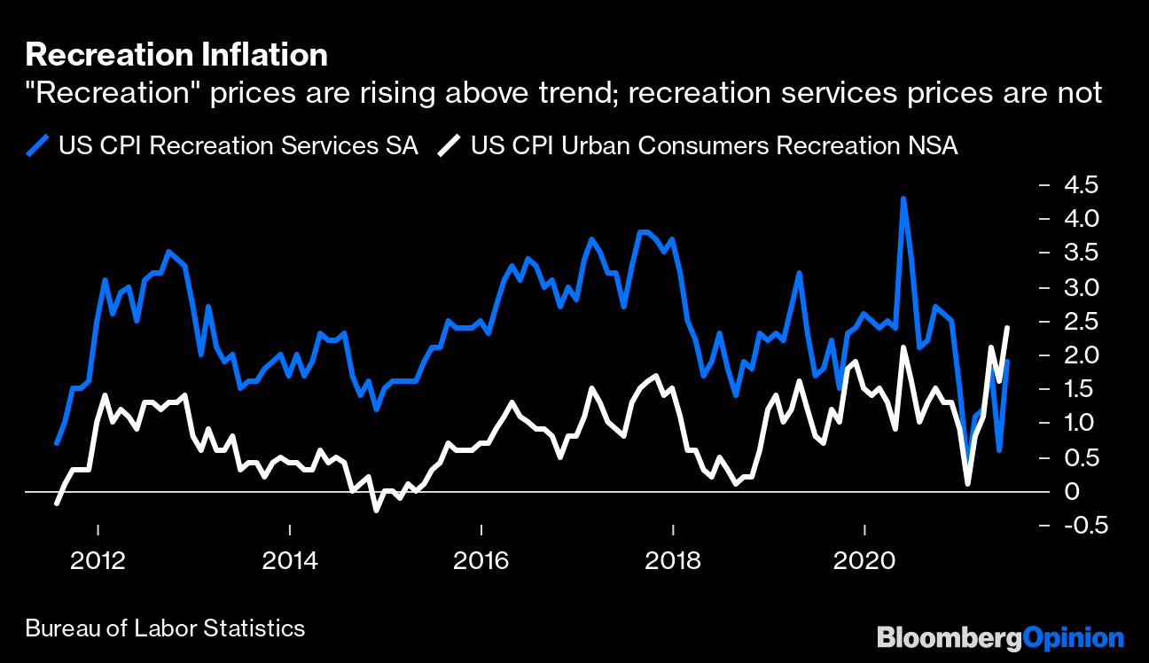 When it came to overall measures, I talked to a number of people about sensible gauges of core inflation. The most frequently mentioned by far was the Cleveland Fed's "trimmed mean" which excludes the biggest outliers in either direction and takes the average of the rest. In the last couple of months, plenty of analysts have trumpeted the praises of the median (the component that sits in the middle of the distribution). I don't recall anyone suggesting the median when I was drawing up our indicators. There's a reason a lot of people want to use the median now; it suggests there's little cause for worry. The trimmed mean, on the other hand, has just risen very sharply. Here is how they've both moved over the last two decades, in a chart I published last week: 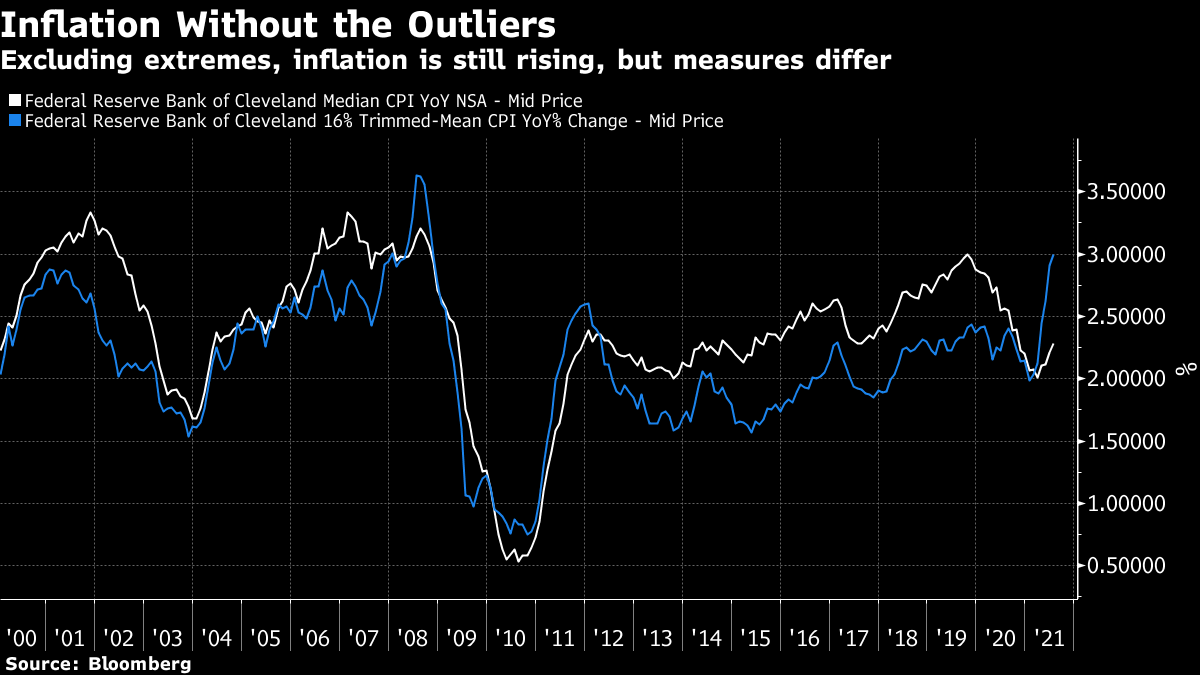 At the point I decided to include the trimmed mean, it suggested less of an inflationary problem than the median. Now that's reversed. Where does that leave us? On balance, it suggests that the anti-cherry-picking idea is working. I made my choices a few months ago. They've roughly evened out. So at this stage, I'm inclined to try using this method more in future. Decide what your criteria are at the outset, and do so carefully. Then stick with those criteria to help drown out the noise as time goes by. So far, I think it's working. One common reaction to last week's awful consumer confidence figures was to blame the delta variant. America is beginning to return to the miserable pandemic disciplines we all grew to know and loathe last year. It makes sense. For one statistic that suggests that delta is having an effect, look at the number of travelers passing through U.S. airports. Having recovered to approach pre-pandemic norms, the number has rolled over in the last two weeks. It stands more than 20% below its level of two years ago, so it does indeed look as though the virus is having an impact on economic activity again: 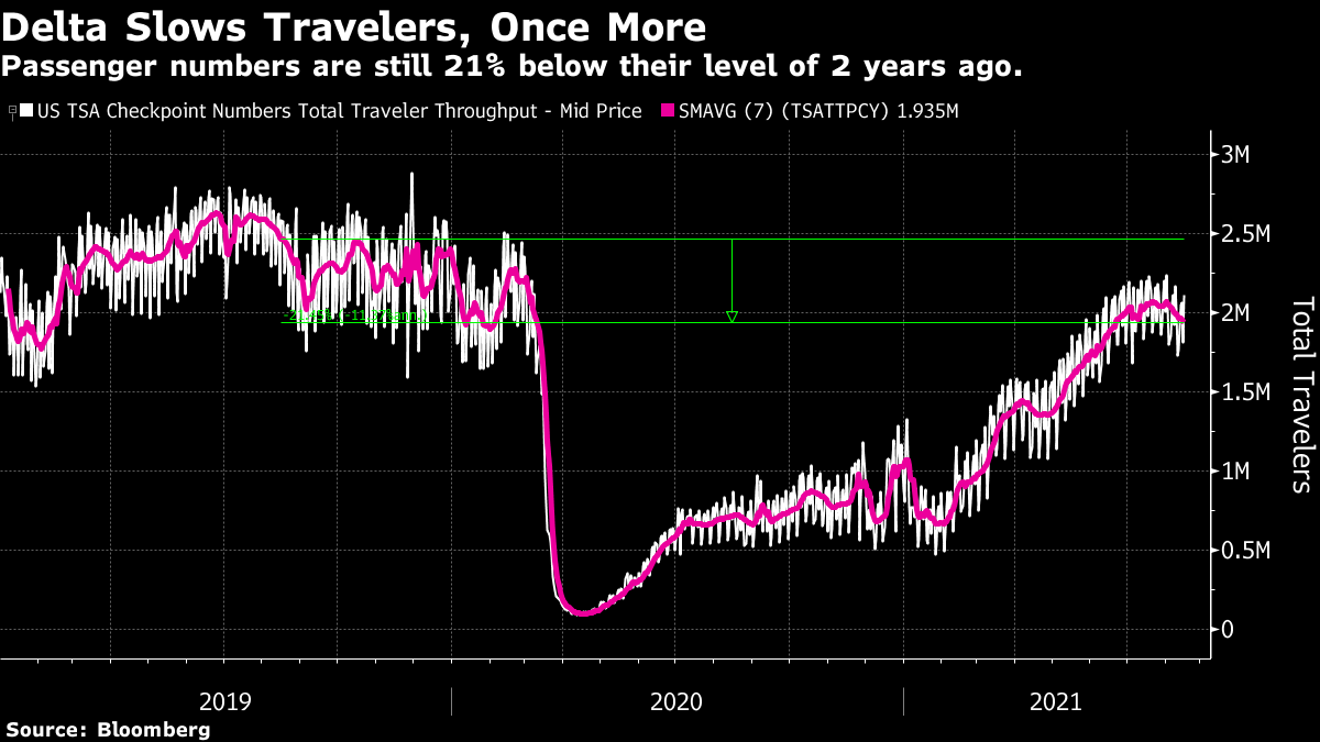 To avoid feeling too doom-struck, also look how doctors and medical staffs are doing. Once people get sick, the American medical system is doing a much better job of keeping them alive. The rate at which Americans are needing to go to hospital is alarmingly high, and has narrowly exceeded its peak from the third wave of mid-winter. That is a crushing failure for the efforts of public health authorities to stop the spread of the disease. But the number that need to go into intensive care is running below the peak. That's a victory for hospital staffs (and good news for those of us who might be worried about catching Covid): 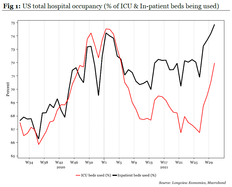 This shows up even more clearly if we look at the mortality rate. Over the last 18 months, the medical profession has learned much about how to stop people dying from Covid: 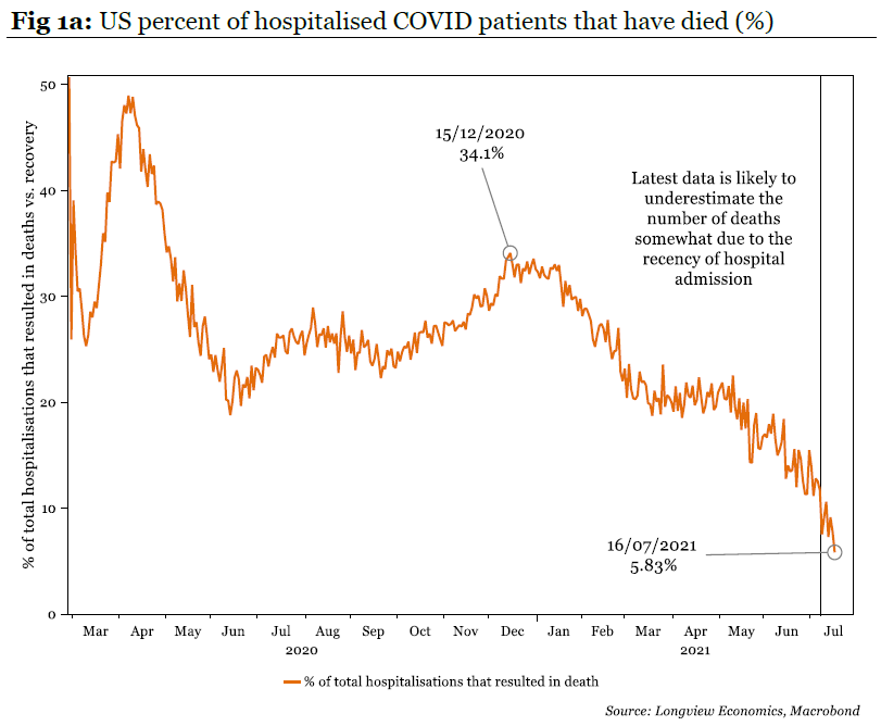 The chart, from Longview Economics Ltd. of London, brooks no argument. Medical science is catching up with the virus. If that is a victory for the U.S., the high rate of hospitalization reveals a profound defeat. This grows clear when looking at the differing experience of the U.K., which fell victim to both the alpha and delta variants before the U.S. The charts are from Credit Suisse Group AG. 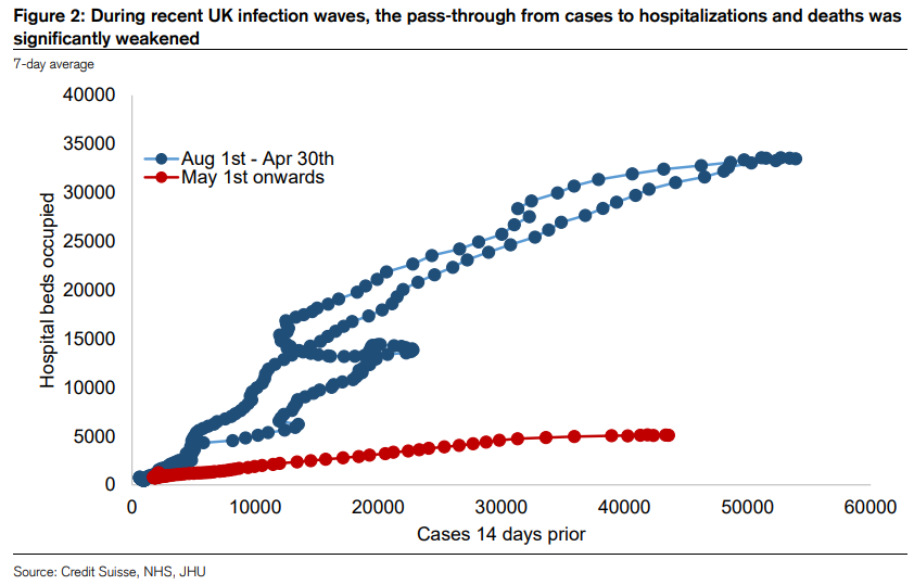 The last big wave, in blue, started a few months before the vaccination program began, and reached its worst with the arrival of the alpha variant. The current delta wave, in red, started when the first phase of Britain's vaccine rollout had already happened. The rate at which the delta variant succeeds in sending the people it infects to the hospital is dramatically lower than the rate for the alpha variant. Now, here are the same numbers for the U.S., this time divided into the states with the lowest rates of vaccination (mostly Republican-voting in the south), and the highest (mostly Democratic strongholds in the northeast). 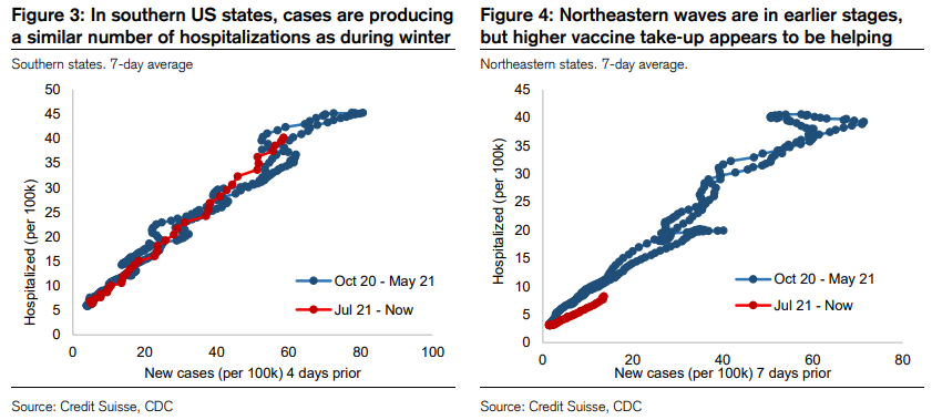 In less-vaccinated states, the delta wave seems just as likely to hospitalize those it infects as its predecessor. In the northeast, the wave started more recently. So far, it looks as though the higher vaccination rate may have helped compared to the southern states. But also, at this early stage, it doesn't appear to have had such a dramatic effect as the vaccination program in the U.K. This looks like powerful testimony for the positive impact of vaccination. But it also might suggest that the U.K. got something else right in its vaccination approach. To some extent, this resolves a moral and scientific puzzle that I wrote about at the end of last year, here. In deciding how to roll out a vaccine, there are two broad choices. One is to give it to those most in danger; the other is to prioritize those who might be most likely to spread the virus, using the vaccine to try to thwart the spread. The first implies starting with the very elderly and those with conditions that put them at risk should they catch Covid. This is what the U.K. did. The second implies starting with medical and emergency workers, which is what the U.S. did. The moral question pitted Kantians (who believe that we should treat others as we would want to treated ourselves), against utilitarians who want to maximize the greatest good for the greatest number. There was also a scientific question; the vaccine plainly did a good job of stopping people from getting sick, but did it stop them from spreading the disease? If the vaccinated might still be infectious, there is little point in vaccinating medical and emergency workers first. It's better to save the most lives possible by starting with the most vulnerable. We are now learning that vaccinated people can spread the disease. That — along with the hesitancy that means large pockets of elderly people have remained unvaccinated — helps explain why the U.S. has had less success in keeping people out of hospital than the U.K., even though the two countries now have broadly comparable vaccination rates. This might be a reason for continued cautious optimism about the U.K.'s thoroughly out-of-favor economy, and the assets connected to it. It also helps to explain why U.S. economic activity is worse affected than the European economy. More importantly, it gives a clear steer as to how vaccines should be rolled out and administered in future. Let's return to the Nixon Shock, the moment 50 years ago on Sunday when Richard Nixon unpegged the dollar from the last version of the gold standard. One interesting point to emerge from research for my essay on this over the weekend is that none of the men behind the decision thought that flexible exchange rates would result. Most assumed it would lead to a renegotiated set of fixed rates. Central bankers, including Paul Volcker himself, thought flexible rates would make life intolerably difficult for them. Central banks have never managed to shake off their fear of floating. That definitely includes the Fed. Robin Brooks, chief economist of the Institute of International Finance, offers the following chart. The blue bars count the number of mentions of the dollar in speeches by Fed policymakers. The black line shows the exchange rate of the dollar against the currencies of the rest of the Group of 10 economies. As we can see, the dollar's sharp increase that accompanied the collapse in the oil price in late 2014 was accompanied by a sudden attack of mentionitis: 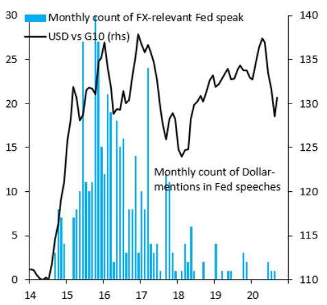 Most of that cast of characters are still around, so for dedicated Fed-watchers, here is a color-coded chart of exactly who talked about the dollar the most. Janet Yellen, now the treasury secretary, seems to have felt the need. So did Lael Brainard, who might find herself the next chairwoman of the Fed. Jerome Powell, the current chairman, seemed less bothered: 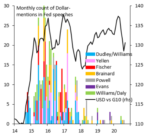 A stronger currency tends to mean less inflation. In the last few years, with central bankers worried about deflation and unemployment, that's prompted bankers to try to fight such a thing. They still suffer a fear of floating. Brooks argues that this is particularly misplaced at present. With inflation evidently a growing threat in the U.S., but not elsewhere, a stronger dollar would be in everyone's interests. As he puts it: "The dollar has essentially gone into a holding pattern versus Euro and Yen, even as both Japan and the Eurozone struggle with deflation. Since the U.S. is cyclically outperforming other countries on most measures on COVID-19 economic recovery, it would seem the world needs a much stronger dollar."
He has a point. In the post-gold world, it behooves central bankers to conquer their fear of floating. Several kind people have written with advice on air travel in time of Covid. You all know who you are: Thank you.
First, and unsurprisingly, brace to be at the airport at least an hour earlier than usual. Also, press "print" enough times to ensure you have hard copies of everything you will need to show (particularly if traveling with children). Second, check that your airline allows you to wear an N95, and also that the mask you bought really is an N95. Quite a number of airlines don't allow you to wear a mask with a valve, as this could allow any germs in your breath to escape into the air around you. Such masks are often marketed as N95s. Third, if you're going to wear an N95, I'm warned that by the end of a trans-Atlantic flight it feels like wrapping your face with chicken wire. Passengers who invest in gel ear protectors, which you can put behind your ears to save them from the mask digging in all night, and relieve the pressure on your face a little, emerge at Heathrow looking less frazzled, I'm told. Finally, be warned that the food options aren't great. As the requirement is that you should return the mask in front of your nose and mouth between chews and sips, that's not surprising. So I'll aim to eat something at the airport. Thanks to all. If anyone has any further tips, please let me know. Like Bloomberg's Points of Return? Subscribe for unlimited access to trusted, data-based journalism in 120 countries around the world and gain expert analysis from exclusive daily newsletters, The Bloomberg Open and The Bloomberg Close. | 


Post a Comment