Putting Up With the Powell Put The Federal Reserve and the stock market often appear to be moving together. Just who is moving who? Some new research suggests an answer. First, let's define the issue. Between the summer of 1998 and the end of 2008 — spanning the period from the Russian debt default and collapse of hedge fund Long-Term Capital Management to the global financial crisis — the Fed's behavior was widely described with the words "Greenspan Put." The notion among traders was that the U.S. central bank's interest rate moves were driven by the stock market. If the S&P 500 was falling, it would feel the need to cut. If the market rose, the Fed would after a suitable interval start raising rates. Whether there was really a "Greenspan Put" in the minds of the Fed, which subsequently turned into a "Bernanke Put," is unknowable. What is undeniable is that it looked like it. This chart compares the S&P with the fed funds target rate's upper limit from over that decade: 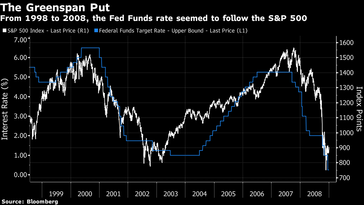 It's a crude chart, but effective. Since the GFC, things have been different. With the fed funds effectively at zero for most of the post-crisis decade, the Fed's balance sheet, and successive doses of quantitative easing, or QE, asset purchases, have taken over as the chief monetary policy tool. That has led to another crude and effective chart, which maps the S&P against the size of the Fed's balance sheet since the beginning of 2009. The Fed made a heroic attempt to reduce its assets for a few years, but with the second crisis the apparent relationship is restored. The S&P rises and falls in line with the balance sheet. If the market declines, the Fed responds with a big increase. Under new ownership, the Bernanke/Yellen/Powell Put lives on: 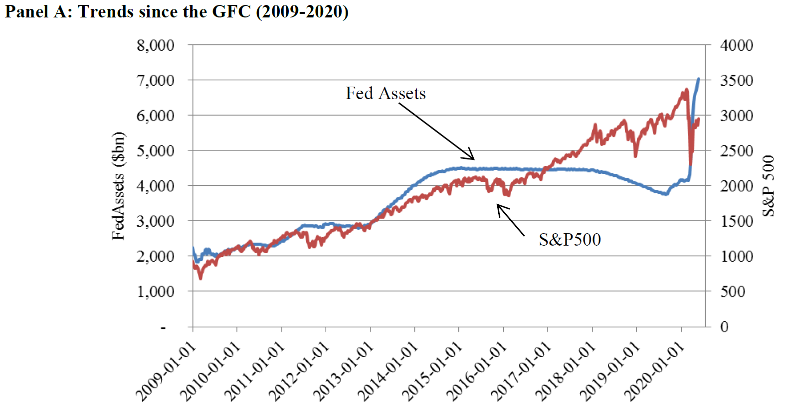 To look at the most recent events in microcosm, here is the same chart for the last year, including a few weeks in March when the bond market broke down and a financial crisis to match that of 2008 was in prospect: 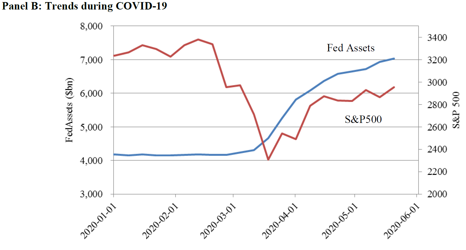 The general correlation is obvious. Most everyone who knows anything about markets knows that the Fed's actions have a huge impact, and that for the last 20 years they appear to have been more influenced by the stock market than before. But correlation doesn't imply causation. What can we say about exactly how much stocks affect the Fed, and how much the Fed affects stocks? Talis J. Putnins of Sydney's University of Technology has attempted to quantify it in a new paper, provocatively entitled From Free Markets to Fed Markets. It can be downloaded here. He looked at the strength of the correlation between changes in the Fed balance sheet and changes in the the S&P's level for each week from two months before to two months after the change in the balance sheet. That yielded this chart: 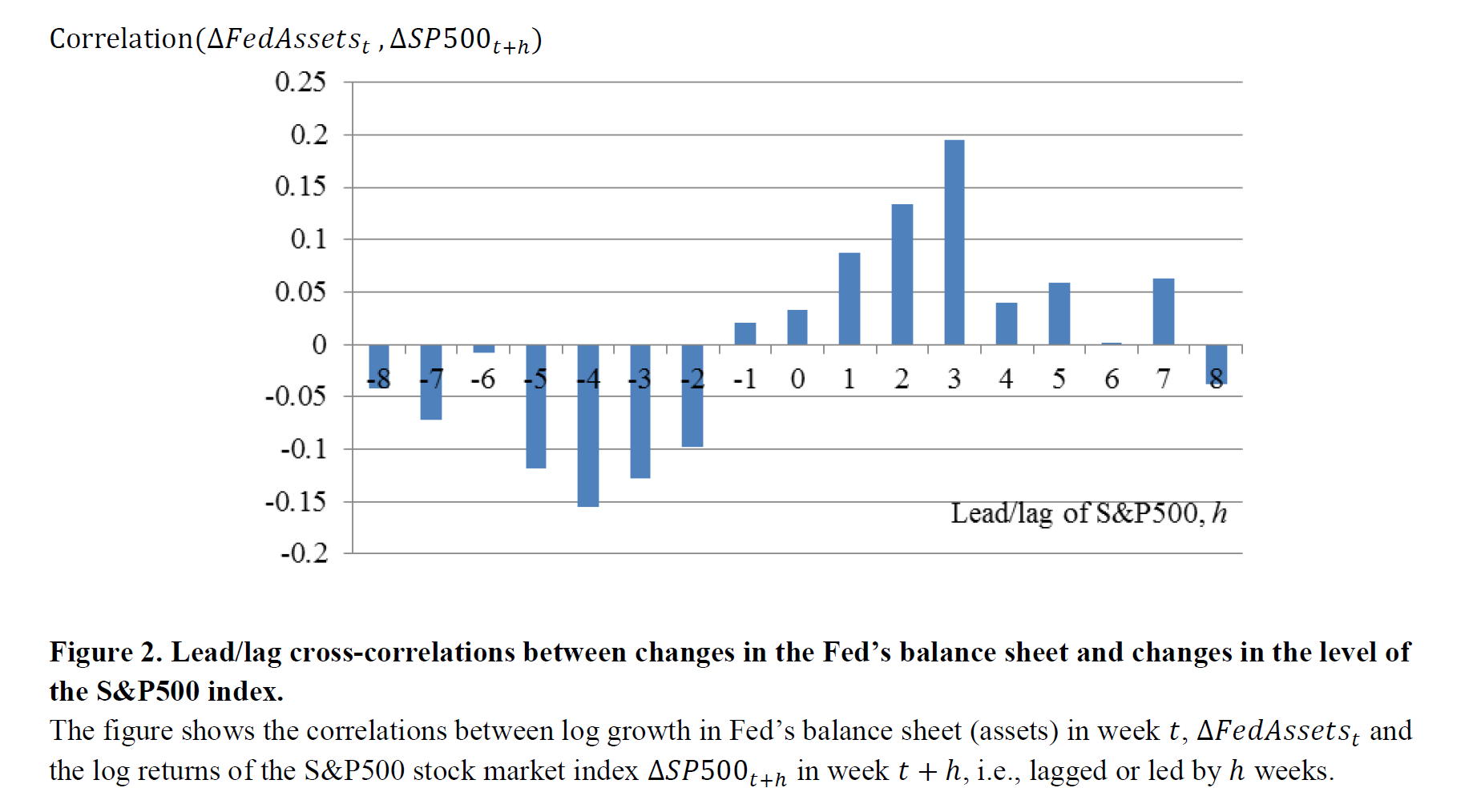 There is a negative correlation between what the S&P did a month ago and moves in the Fed's balance sheet. In other words, if the S&P falls we should expect the balance sheet to be increased about a month later. Once the Fed has made its change, we should expect the two to move in the same direction for the next month — a rising balance sheet raises the S&P, a shrinking balance sheet brings it down. The lag is clear; it takes about a month for a weak stock market to prod the Fed into a response, and once that response has been made the effect is felt in full a month later. So the two are indeed related but with a lag. How strong is the link? The top chart shows us what we should expect the Fed to do in response to a 10% correction, while the lower chart shows the S&P 500's response to a 10% shift in the balance sheet: 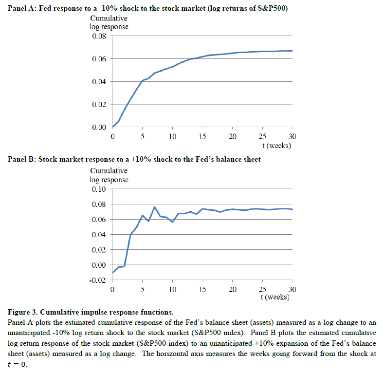 There was also — and this should surprise nobody — a marked asymmetry to the Fed's actions. It responds to falls in the market with alacrity. It doesn't seem to feel any great macro-prudential need to prick bubbles by comparison, and so the tendency to respond to a rise in stocks with a shrinking of the balance sheet, as seen at the end of Janet Yellen's tenure and the beginning of Jerome Powell's, was much weaker. In late 1996, less than two years before the "Put" era began with LTCM, Alan Greenspan was plainly worried about the possibility of asset bubbles, and uttered his famous warning of "irrational exuberance" (following through with a rise in rates that induced a minor stock market correction). Now, the idea of raising rates to curb share prices appears so outlandish to Powell that he said in June "we would never do this." When Putnins tried to quantify the "put" relationship between increases in the balance sheet intended to bail out the market and their impact on stocks, he yielded the following: A 10% fall in stock markets is estimated to result in a cumulative balance sheet expansion of around 6.7%, while a 10% expansion of the Fed's balance sheet is estimated to result in a positive 7.4% impact on cumulative stock market returns over the following five to eight weeks. When it comes to explaining the amazing stocks rally, which continues as the world is ravaged by a miserable economy and a pandemic that refuses to be extinguished, Putnins was able to confirm that the Fed has had a lot to do with it (although not everything). On his assumptions, between 10 and 13 percentage points of the S&P's gain since the Fed intervened in March can be explained by that Fed intervention. There is room to explore how this happens — whether it is just an effect on confidence, or whether the fall in bond yields prompts investors into buying stocks, for example — but the common sense result is confirmed. The Fed didn't used to behave this way, but it does now, and the result is that stock prices, which tend to rise over time anyway, have an asymmetrical pressure on them to go up, rather than down. Black Swans and Fat Tails Investors often complain about "black swans" — the extremely unlikely and very damaging events that were so named by Nassim Nicolas Taleb a decade ago. A lot of supposed black swans are nothing of the sort. They are merely events that investors had wrongly failed to anticipate. What happened to the world economy in the second quarter, however, is different. Long experience would have suggested it was frankly impossible. Many of the problems from the 2008 crisis stemmed from models assuming that outcomes would follow a classic "normal" or bell-curve distribution with only very few outliers; 95% would be within two standard deviations of the norm, and 99% would be within three. The problem arose when bell curves stopped looking like bells and became asymmetrical, or developed "fat tails" with a big number of outcomes that fell more than three standard deviations from the norm. Now, let's look at a bell curve for quarterly GDP growth in the U.S. and the euro zone since 1995, as assembled by the team at S&P Global: 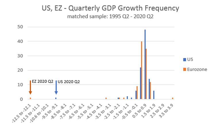 Until this quarter, this graph does indeed look like a normal bell with a touch of kurtosis — meaning it has a peak that is a little high and tails that are a little too long. It was also slightly asymmetric, with the EU in particular far more likely to deviate on the negative side than the positive. Then came the Covid-19 shutdown. Paul Gruenwald, S&P Global Ratings' global chief economist, estimates that the U.S. and euro-zone second-quarter growth numbers were 11 and 17 standard deviations away from their respective means. This compares with 3 and 4.5 standard deviations, respectively, for the worst of the GFC. This reminds me of a darkly comic incident in the summer of 2007, as the forces that would create the crisis were beginning to make themselves felt. A group of quantitative funds had all simultaneously suffered a series of losses that the models had suggested were impossible. Goldman Sachs Group Inc. was obliged to spend money to bail out its funds that had run into trouble. Asked to explain what had gone wrong, the CFO of the time, David Viniar, said the models were buffeted by "25 standard deviation events" several days in a row. This provoked a great postbag from statistics professors. One suggested that consecutive 25-standard deviation events might never happen even in the full history of an unimaginably large number of universes. Another said that what Viniar was saying, using statistical jargon, was that what had just happened had not in fact happened. What he really meant was that Goldman's models had totally failed to predict how likely such an event was. This piece from 2008 is a masterpiece of the genre: - a 5-sigma event corresponds to an expected occurrence of less than just one day in the entire period since the end of the last Ice Age;
- a 6-sigma event corresponds to an expected occurrence of less than one day in the entire period since our species, Homo Sapiens, evolved from earlier primates;
- and a 7-sigma event corresponds to an expected occurrence of just once in a period approximately five times the length of time that has elapsed since multicellular life first evolved on this planet.
A 25-sigma event confronted them with problems as Excel didn't have enough numbers to cover it. They gave up and suggested it was the same probability as one person winning the U.K.'s National Lottery 22 times in a row. What has just happened, then, was really, really unlikely. And thanks to base effects, S&P Global Ratings is bracing for a 5.5-standard-deviation event in the current quarter as the economy grows again. In Europe, it could be even more extreme. We get similar results using purchasing managers' indexes. Here are the U.S. and Chinese manufacturing PMIs over the last 15 years. in both cases, a number above 50 shows expansion, and below it shows recession: 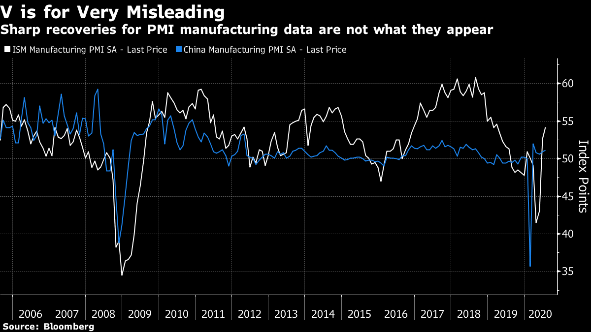 On the face of it, PMI tells us that both countries had the shortest, sharpest recessions on record, and are now back to normal — the U.S. is as strong as it has been since early last year. They don't show this. The surveys are based on rates of change, rather than levels, and these have been scrambled by the sudden stop early this year. The fact that slightly more than 50% of manufacturers think that things are better this month than last month isn't anything to celebrate. In such circumstances, Gruenwald of S&P suggests we jettison rate of change statistics, and look instead at levels. When the economy gets back to pre-Covid levels, that will mean something, and it isn't going to happen this year. This is his final, excellent suggestion: The first, straightforward, level benchmark should be end-2019 GDP: where we were before the COVID-19 crisis started. The second, trickier level benchmark is our post-COVID economic path. This will prevail after the COVID-19 shocks have worked through the system. Once we are on that path, we can once again worry about and report rates of growth for our main macro variables. Until then, let us give growth rates a rest. If we look for levels, the black swan that arrived earlier this year need not obscure vision. Survival Tips If you're in the northeastern U.S., close your windows if you haven't already done so. The first preliminary gusts of Tropical Storm Isaias have arrived in New York as I write. It never rains but it pours, as they say…. Like Bloomberg's Points of Return? Subscribe for unlimited access to trusted, data-based journalism in 120 countries around the world and gain expert analysis from exclusive daily newsletters, The Bloomberg Open and The Bloomberg Close. | 

Post a Comment