| You never really learn how something works until it goes wrong. This is true of many electronic devices, in my experience, and we are all now learning that it's also true of inflation. Price rises have been under control in the Western world for decades. Now, we have a problem. If the numbers are to be trusted, inflation has taken off in a way that hasn't been seen in a generation. But we also know that Covid-19 administered an economic shock of a kind that nobody had seen before, and it was natural that it would have an effect on prices. The forces that pushed down prices are still with us, and many have a vested interest in their continuing to do so. And so, we are all learning to explore and sometimes manipulate inflation statistics in a way we haven't previously done. There is one key question underlying all the effort. Is this inflation transitory, or is it built to last? I'm not going to answer that question here, mainly because I don't think it's yet possible to give a definitive one. But I do want to explore the latest inflation stats for August, all of which can be excavated from a Bloomberg terminal, to get us closer. Here we go: Why Does It Matter If Inflation Is Transitory? It's not just because the Fed uses the word. The key point is that the bond market itself is devoted to the proposition that this inflation is a blip caused by the pandemic that will be over in a matter of months. This is how the core (excluding food and energy) annual change in the consumer price index has compared with the 10-year Treasury yield since 1980, a period that goes back to an era where the Fed under Paul Volcker was fighting serious inflation: 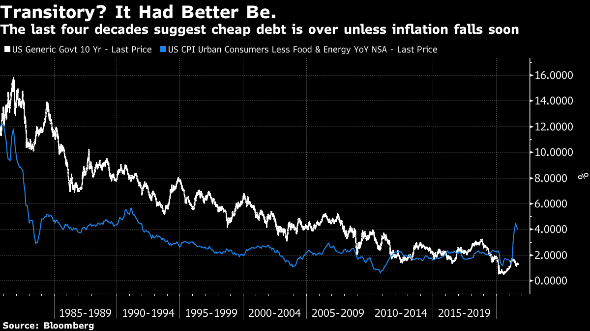 Generally, low bond yields aren't compatible with high inflation, and the natural state of affairs is for the 10-year yield to exceed core CPI. Supine inflation has allowed a steady decline in bond yields over the last 40 years, which in turn has enabled all kinds of exciting financial innovations, and these days it helps to prop up stock markets. On this chart, the last few months stick out like a sore thumb. It's very unusual for core CPI to be so far above the 10-year yield. How unusual? In the last 60 years, something like this has only happened twice before, during the oil spikes of 1975 and 1980. In both cases, it didn't last long. This is the spread of the 10-year yield over core CPI, going back to the start of Bloomberg's data set in 1962: 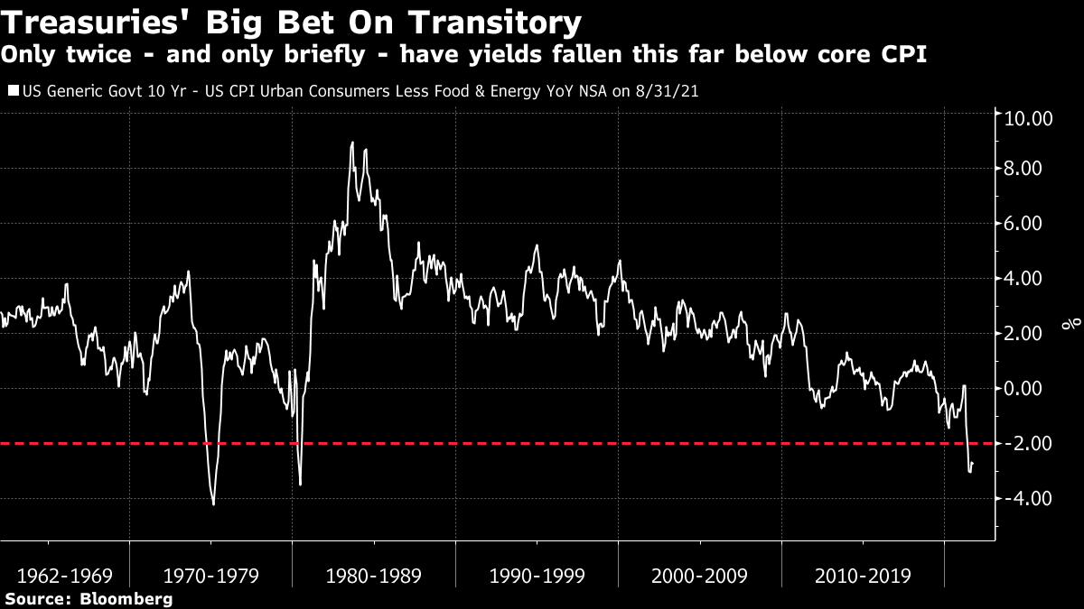 One way or another, this cannot last much longer. So, either inflation really is transitory and swiftly reduces to bring the spread back within 2 percentage points, as is the current assumption; or bond yields will have to rise by an unconscionable amount. Add a percentage point or two to bond yields at their current levels and the assumptions underpinning contemporary markets crumble. I am not predicting this, merely trying to show that the bond market has made a huge bet on transitoriness, and that much rests on bond investors winning their bet. What Does Transitory Mean Anyway? Transitory is one of those handy central banking words that give some guidance to markets, but whose definition is wishy-washy enough to allow some leeway. Ten years isn't transitory, but inflation can last for more than one month without being labeled a secular trend. So what does it really mean? A few months ago, the idea was that it concerned base effects. The immediate impact of the pandemic shutdown was to cut off demand, and many prices tanked. That created an unnaturally low base, more or less ensuring high year-on-year inflation 12 months later. Beyond the pandemic, there was also a dramatic fall in the oil price early last year. West Texas Intermediate even went negative for a few hectic trading hours one afternoon. Of course inflation will look bad 12 months after that, and of course that is a transitory effect that needn't bother us too much. There's a simple fix. We can look at 24-month rather than 12-month inflation rates. This chart shows two-year inflation going back 70 years. On this basis, the rate since August 2019 is nothing to write home about: 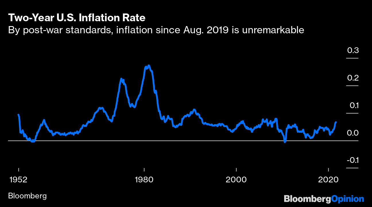 But there is a difference between arguing that this isn't a return to the serious inflation of the 1970s (it isn't), and arguing that it might be more than a flash in the pan. This is how two-year inflation has moved since 2000. The last 24 months, a period starting well before Covid-19 even had a name, have seen the highest inflation since the top of the crude spike in 2008. That inflationary episode ended amid the global financial crisis: 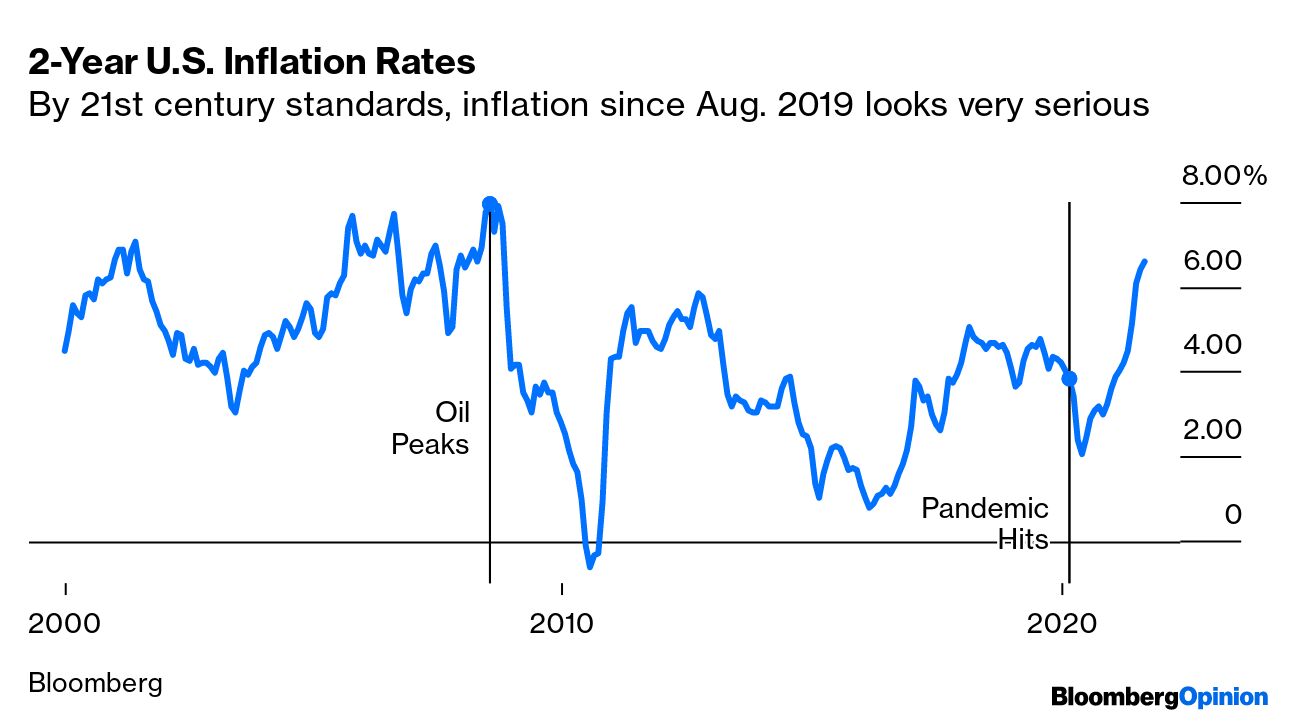 So, there is definitely more to this inflationary episode than a freakishly low base effect. At least in that sense, this isn't transitory. What Inflation Can We Ignore? Some aspects of inflation matter to us, but are beyond the control of monetary policy, so are excluded from the headline rate. When we talk about "core" inflation we usually mean excluding food and fuel. But the last months have brought many other measures to prominence. This matters because the most extreme inflation has been registered in a few specific sectors that had suffered specific pandemic effects, such as hotels, air fares, rental cars and used trucks. How do we best get a fair gauge of what is happening to the general level of prices? The Cleveland Fed keeps two measures: the "trimmed mean," which excludes the inflation components each month that have shown the most extreme moves in either direction; and the median, which simply traces the components whose price rises fall in the middle of the distribution. A few months ago, the trimmed mean had plenty of adherents. Then it began to rise while the median stayed under control, and there was more interest in the median. This is how those two measures have moved following the August data: 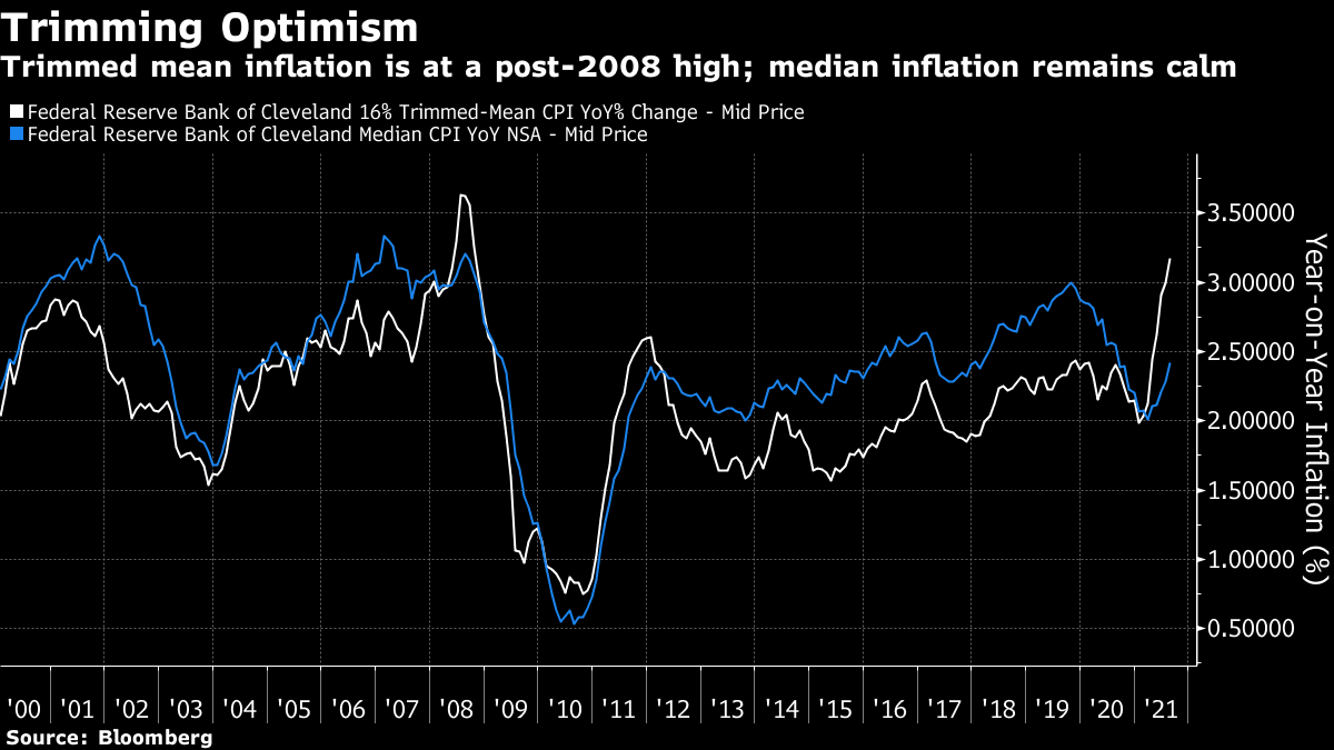 The trimmed mean is now above 3% (the upper limit of the Fed's target), and its highest since 2008. Unlike the headline numbers, it is still rising. This suggests that broader prices are shifting slowly upward, not at a spectacular rate but still one that looks significantly higher than we have seen in more than a decade. Meanwhile, the median is also rising, but still low compared to its recent history, which is reassuring. Unfortunately, however, this is looking at the median on a 12-monthly basis, which can be distorted by base effects. Here is how month-on-month median inflation has moved in the last 20 years. 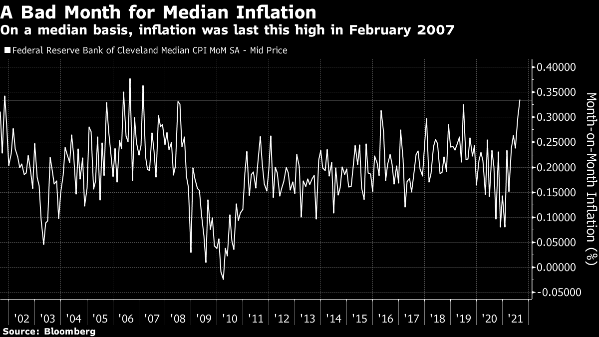 After oddly low numbers late last year, median inflation is now rising at its fastest rate since early 2007. This doesn't suggest any reason for terror. It does, however, suggest that the general price level is in the course of shifting to a noticeably higher level. One final measure of core inflation needs to be mentioned. Earlier this year, the Bureau of Labor Statistics started reporting "CPI All Items Less Food, Shelter, Energy & Used Cars & Trucks." I cannot conceive of why anybody would have been interested in this precise combination before the pandemic but it is now handily calculated for us. The good news is that once you exclude those things and resign to going without food, fuel, a roof over your head, and a used car or truck, you will find that prices are rising by less than the headline. The rate of inflation has even begun to go down. The bad news is that even this rather strange version of the inflationary core remains above 3%, and it didn't decrease in August: 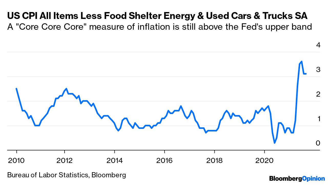 In conclusion, then, we can use a number of sensible statistical techniques to account for the extreme conditions following the pandemic shutdown. They all still leave a picture of core inflation that is increasing. And to be clear, as this is 2021 and almost all political and economic discourse is hyperbolic, no sensible person is saying that we're going back to the 1970s. This is what the median month-on-month chart looks like if we take it back 50 years: 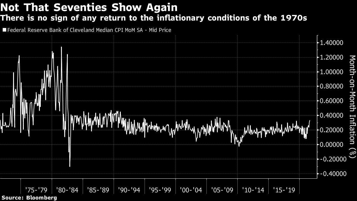 Unfortunately, as I said earlier, inflation doesn't need to return to the 1970s to upset the bond market. What Determines What Happens Next? This newsletter has gone into the intellectual arguments about inflationary pressure often enough. The key factors that determine whether a few months of elevated inflation become habit-forming include expectations, and wage demands. Within the consumer price index, by far the most important component is shelter, accounting for a third of the measure. Sharp rises in house prices, and the opportunity to renegotiate leases, could theoretically offer landlords the chance to jack up rents in the months ahead. For now, that is just a theory. As it stands, shelter inflation as officially measured remains below its average for the last decade. But it has begun to rise a little, and the next few months are crucial: 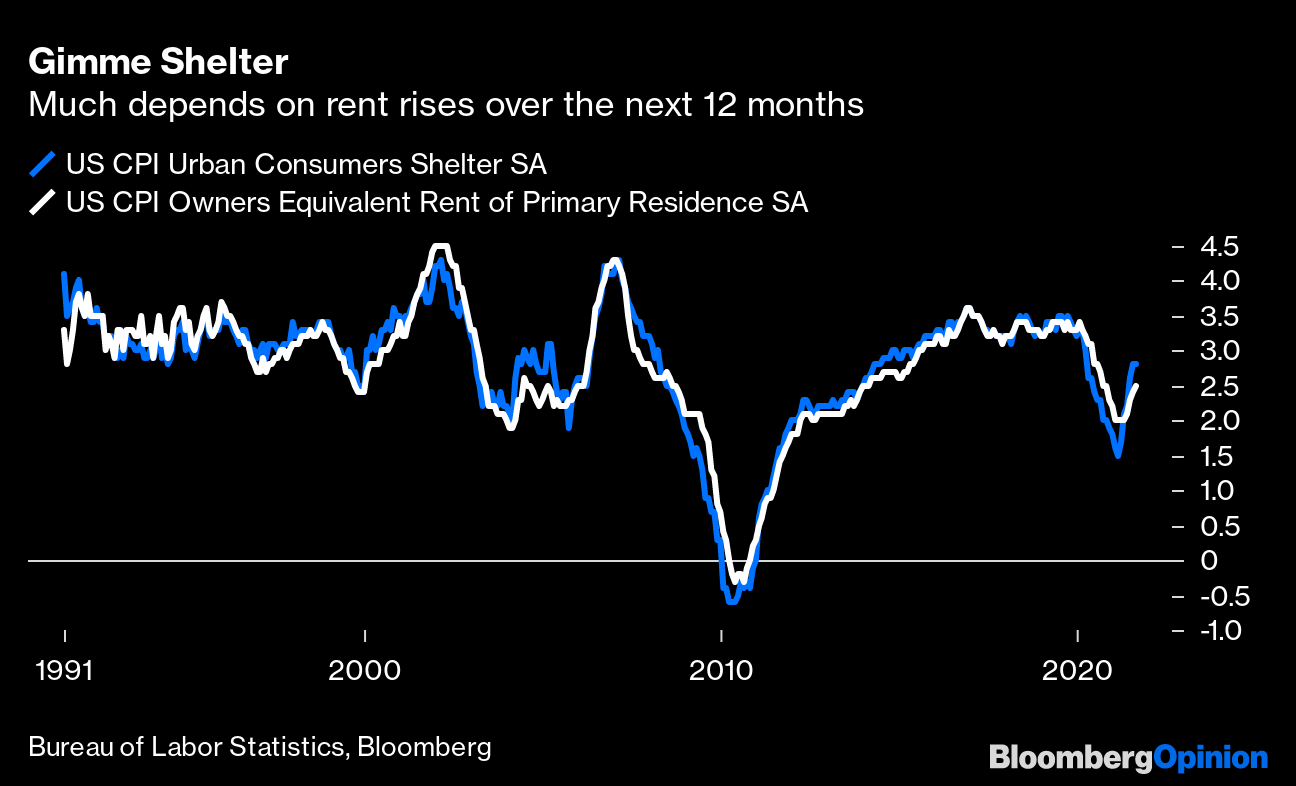 Another important point is that we can't put the pandemic wholly in the past tense. Used car inflation is far down from its peak, but air fares show the delta wave is having an effect. This chart shows the level of the airline fare index over time, rather than its rate of change, so that the bewildering base effects are clearer. Air fares had been declining steadily (with seasonal variations) for several years before the pandemic prompted a crash. As demand returned this year, 12-month inflation hit 25% in June, and subsided to 7% last month. The base effects are such that it could well go negative by the end of the year. If we ever have an "all-clear" from the pandemic, there is every risk that air fares will be inflating at 25% again before 2022 is over: 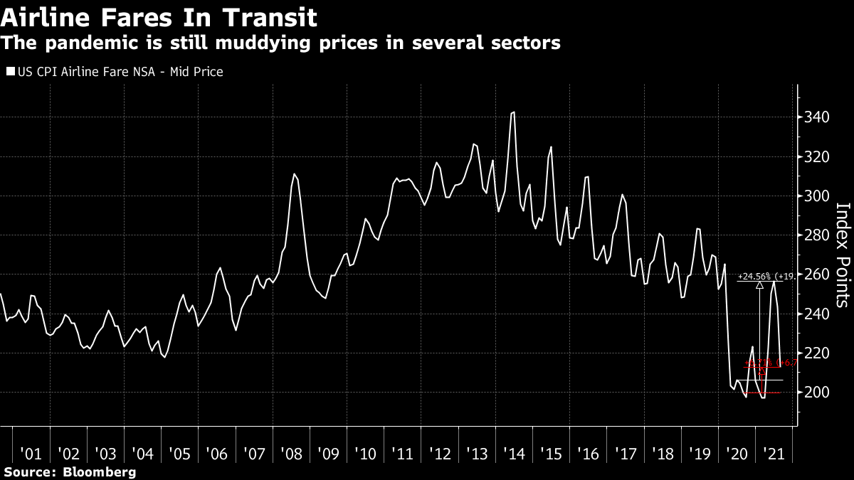 It would be good if some of the extreme transitory post-pandemic effects went away, yes. But Covid is still artificially suppressing prices in plenty of segments of the economy. This still cuts both ways. What About Those Inflation Indicators of Yours? We've updated the indicators again today here, along with a full explanation. They are based on a heat map comparing current levels to the last decade. Measures that look high show up in darker blue. Here is what the heat map looked like on June 14, after the May CPI numbers had administered a nasty shock: 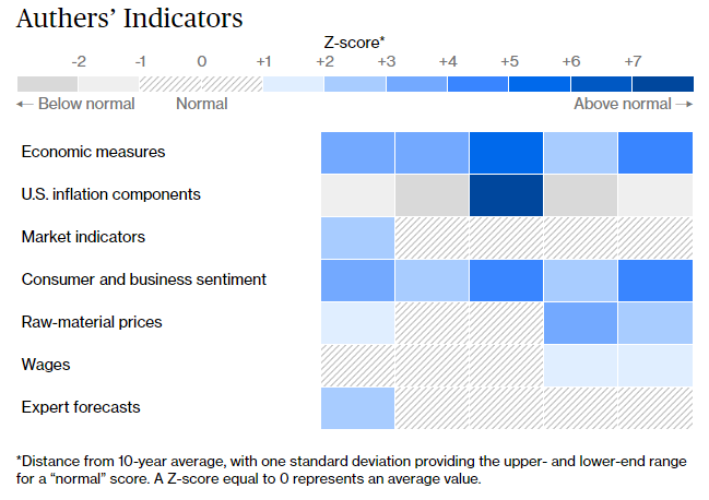 And here is what they look like now: 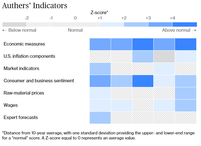 The key point is that it's difficult at first glance to see much difference. Look more closely, and you'll see wages have picked up a bit in the last three months, while raw materials prices have calmed down (thanks to the decline in lumber prices) and inflation components are now more in alignment with each other. Three months ago, rental cars stuck out like a sore thumb. Now they aren't so alarming, though some other prices are rising a bit. This heat map is still consistent with both the transitory and the non-transitory camps. Now to draw attention to two key points that are easily missed. First, here are the five economic measures we include:  The Z-score is how many standard deviations the readings are above their average for the last decade. Note that the trimmed mean now looks further out of line than the headline numbers for both consumer and producer price inflation. Subtly, within this data, we can plainly see a significant rise in the general price level. The rise in transitory sectors swamped this a few months ago; now the correction in some sectors makes it easier to miss the increase in the general level. A second point is under market indicators. The U.S. longer-term inflation breakevens and yield curve both suggest that we have no inflation to worry about. But the 10-year German inflation breakeven is now its highest in seven years: 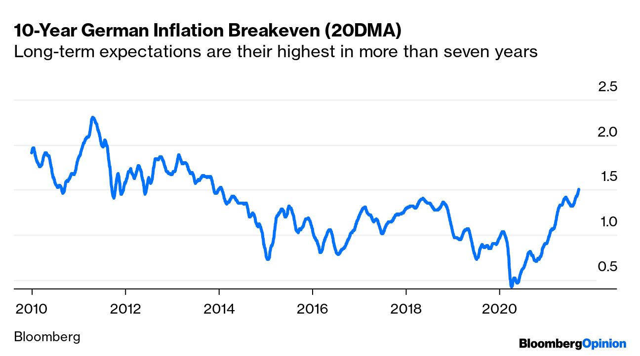 To be clear, investors still aren't expecting even as much as 2% inflation per year over the next decade in Germany. But compared to where the market has been, there does appear to be some returning belief that the European Union isn't after all destined for a Japanified deflationary morass. That's good news. But to the extent that it shows diminishing market confidence in deflationary forces, it should worry those betting that U.S. inflation will be transitory. There are still more questions than answers about inflation. But it's not at all clear that the latest numbers mean a victory for Team Transitory. Sorry. Good news. Live music is returning, and next month Harry Styles will be performing his much-delayed concerts at Madison Square Garden. My daughters will be in attendance, and I am happy not to be chaperoning them. However, I am delighted to see that Harry is taking some sensible precautions to ensure they won't be exposed to anyone with Covid in an enclosed and sweaty environment. Here's a flier my daughter just received by email:  Free vaccinations are available, and the kids will get a discount on merchandise if they show their vaccination card. What a great reward for good and responsible behavior. Further: 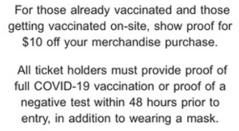 It's a wonderful sign of the times that young role models like Harry are prepared to treat people with kindness. Now, all the kids need to do is put on their masks and then they can have the time of their lives, with tens of thousands of other screaming teenage girls, and their harassed parents don't need to worry about their safety. Thank you, Harry. You're golden. Only angel really. And let's hope Covid cases keep falling. Like Bloomberg's Points of Return? Subscribe for unlimited access to trusted, data-based journalism in 120 countries around the world and gain expert analysis from exclusive daily newsletters, The Bloomberg Open and The Bloomberg Close. | 

Post a Comment