| I sat down to write another Points of Return on the great inflation debate. Then I swiftly decided I needed a break. If I feel that way, I imagine readers probably do, too. I'm grateful for the feedback I've received so far on this fascinating topic; in 20 years or so, the answer to the inflation riddle will seem obvious. We won't be able to fathom how we couldn't see it. But for now, there is still much to discuss, and will be for a while. For today, I will leave inflation as usually understood to one side and dive into asset price inflation instead. Are we being asked to pay for too much for financial assets? It is difficult going on impossible to put a value on a currency whose only virtue as an asset is its scarcity, guaranteed by the prohibitively expensive energy bills needed to mine it. Bitcoin has already confounded naysayers, such as me, by forming several bubbles. Once a bubble has burst, that is supposed to be it. But bitcoin has taken hits of 70% or more at least four times in its brief history, regrouped, and come back. The way it keeps rebounding, the way Wile E. Coyote springs back to life after being squashed by a boulder, is a wonder of our time. But there is also something remarkable about the pattern it follows when it crashes. At the time of writing, bitcoin is worth less than $30,000. A few short months ago it was worth more than $60,000. In the following chart, the bitcoin price is rebased to start at its peaks in December 2017, and in April this year. After Christmas 2017 it gave up more than 80% in 12 months. And as the chart shows, its descent from a recent peak has followed exactly the same path so far. It's always tempting to look for patterns where there are none. But bitcoin's history rhymes so strongly that it's hard to dismiss as coincidental. 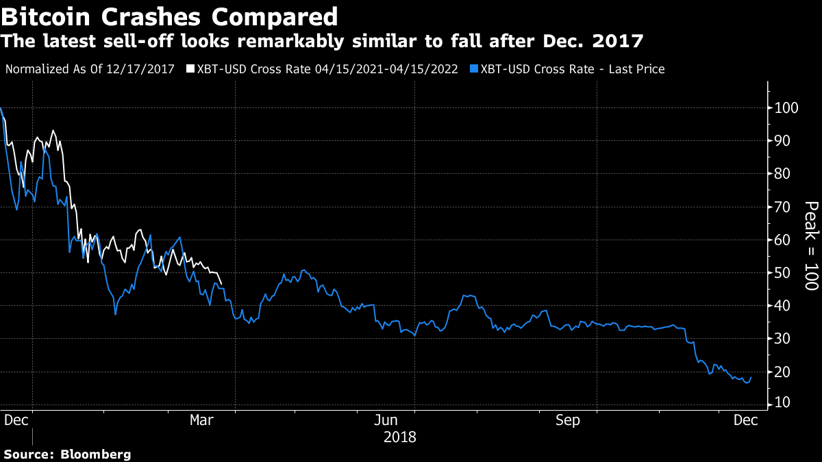 Meanwhile, the alarm about inflation has hidden yet another leg up for the U.S. stock market compared to the rest of the world. This chart shows the S&P 500 relative to the MSCI and FTSE versions of the All-World Excluding the U.S. index, for the century so far. There is little practical difference. It is rebased to the S&P's relative low in November 2007, as the world woke up to the horrors that the subprime mortgage mess was about to inflict on us all. In terms of share prices, almost of those horrors were suffered outside the U.S. Since that point, the U.S. stock market has outperformed the rest of the world by a staggering 200%: 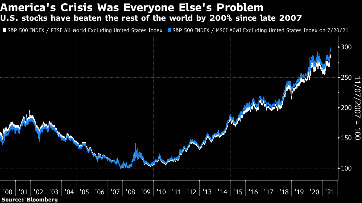 On the face of it, this is crazy. This is an interconnected world. The U.S. has grown faster than Japan and western Europe over the post-crisis decade, but also a lot slower than most of Asia. Even given the happy fact that the FANG internet platform companies are all based in the U.S., this is remarkable. If we take the simplest of all equity valuations, and compare prices to sales, the mystery deepens. The U.S. is usually more expensive than the rest of the world. But on this basis, it is more expensive than ever before (including 2000) and the valuation gap compared with the rest of the world is wider than it's ever been: 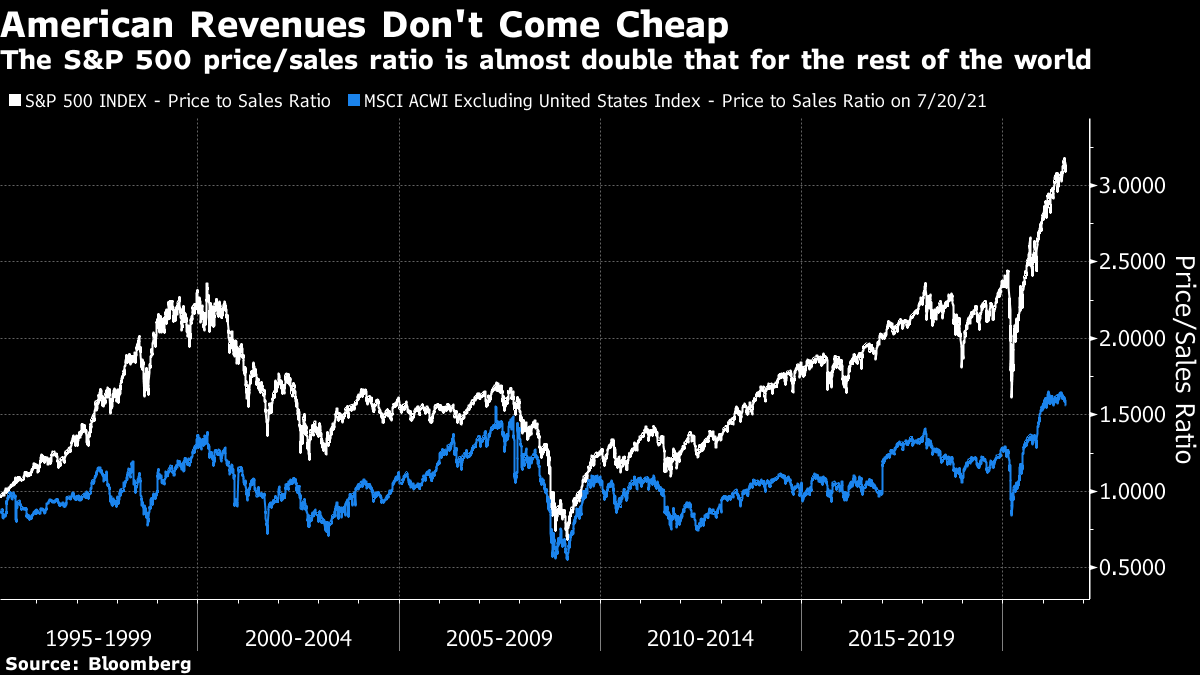 How to explain this? To answer, we need to delve into how to value equities. How much is it reasonable to pay for equities at present? Ultimately, when you buy a stock, you buy its future stream of earnings. The next year's earnings are conjectural, and the last year's earnings may be unrepresentative. So it makes most sense to gauge a company's earnings potential by looking at experience over a full profit cycle. This leads us to Robert Shiller's cyclically adjusted price-earnings multiple, or CAPE, which compares an index's price to average inflation-adjusted earnings over the previous decade. This famously allowed Shiller to point out the warning signs ahead of the crashes of 2000 and 2008, but it also sent a warning that stocks were overpriced for much of the great decade-long, post-crisis rally. That led to many attempts to ditch the measure, or revise it radically. Anyone wanting to encourage investment in stocks would certainly like to explain away the story the CAPE is telling at present. At 38, it is far higher than on the eve of the Great Crash, and approaching its all-time high ahead of the dot-com bust in 2000: 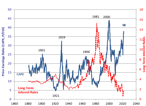 To be clear, this is primarily an American phenomenon. Rob Buckland, global equity strategist for Citigroup Inc., kindly sent me his latest round-up of CAPEs across the world. The presence of the FANGs, which are currently licenses to print money, mean that the U.S. will rightly trade at a higher multiple than most others. But with the exception of Greece, whose ratio is artificially high thanks to grievous losses that companies suffered during its debt crisis, the U.S. is far more expensive than anywhere else: 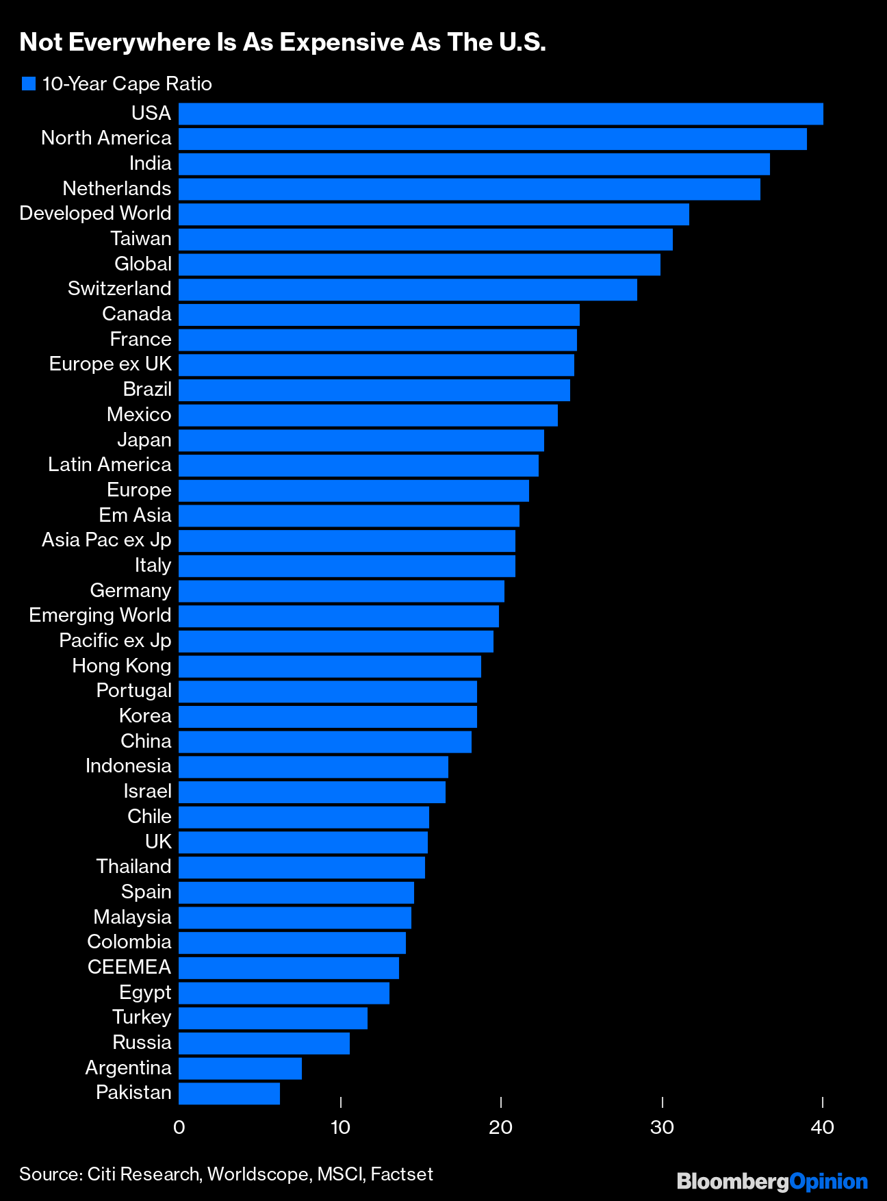 Countries with fewer tech companies, which command a higher multiple, will show up as cheaper. So you cannot use the CAPE to make direct comparisons. But this ranking does provide some interesting food for thought. The U.K. looks underpriced; the likes of Turkey and Russia are being charged a steep discount for their autocratic public sectors; Brazil and Mexico look expensive given the extent of their problems, and so on. All else equal, it is hard to explain why people are still piling into the U.S. when stocks are so much cheaper in so many other places. We all know one reason for all stocks to be expensive in absolute terms, compared to their own earnings and history, and that is the bond market. Investors have a choice. If they have money, they need to do something with it, and cash has never been as unappealing as it is at present. So much of equity valuation will depend on bonds. In the immediate wake of the Covid shutdown, equities were great value compared to bonds. A yearlong equity rally, during which bond yields have risen, changes that calculus somewhat. How to measure it? Shiller includes long-term interest rates on his charts, and also now offers the concept of the excess CAPE yield, or ECY, which is the gap between the CAPE earnings yield (the inverse of the ratio) and the 10-year bond yield. As he shows, this has been a good way to predict how stocks will perform compared to bonds over the ensuing decade. The higher the ECY, the better the future relative performance of stocks. And the picture at present is finely poised. At 3%, the ECY suggests that stocks will do better than bonds over the next decade. But then they usually do. And the outperformance won't be all that great. And it's perfectly possible that both will go down: 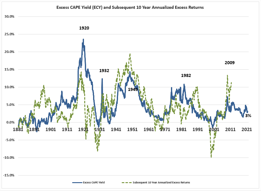 Another approach to working out a sustainable equity valuation has been championed by Crossborder Capital Ltd. of the U.K. The idea is to compare the total liquidity available in the system to total equity holdings. If there is money around (as there certainly is after last year's desperation measures), then there will be more that needs to find a home somewhere. The key is to look at the share of liquidity that is going to equities. Providing this isn't excessive, a valuation that looks far too expensive compared to fundamentals may nevertheless be sustainable. For the U.S., the exercise yields the following chart, which looks worryingly similar to the Shiller CAPE line. Stocks appeared an interesting buy a year ago. They now look very expensive, and almost as expensive as they were before the dot-com bust: 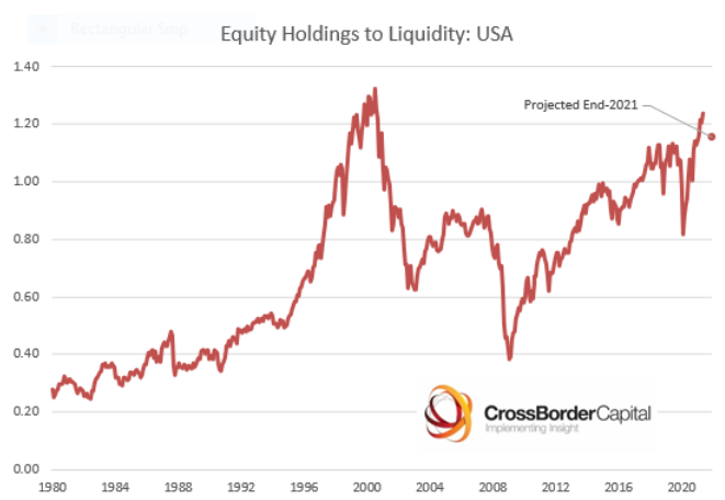 So while the phenomenal U.S. bond market can justify pricier stocks, there are limits, and those limits are fast being approached. On this measure, as with Shiller's CAPE, the American stock market appears to inhabit a different planet from the rest of the world. The same exercise for global equities finds the share of liquidity going to stocks is bang in line with the average for the last quarter century. Not compellingly cheap, but in no way a sign of imminent danger or a crash: 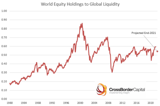 What other long-term measures are there? One that has been widely popularized, particularly by the London academic and investor Andrew Smithers, is known as Tobin's Q. It is named after the late economist James Tobin, a Nobel laureate, and shows the ratio of corporate market cap to corporate net worth as shown in the accounts used to calculate gross domestic product. As corporate net worth is habitually overstated in the accounts, the Q ratio tends to be a little less than one. Theoretically, it should tend to revert to one. But it doesn't. The following chart of Q comes from Advisor Perspectives Inc. and was calculated by Jill Mislinski with data as of the end of June. As you can see, it's terrifying: 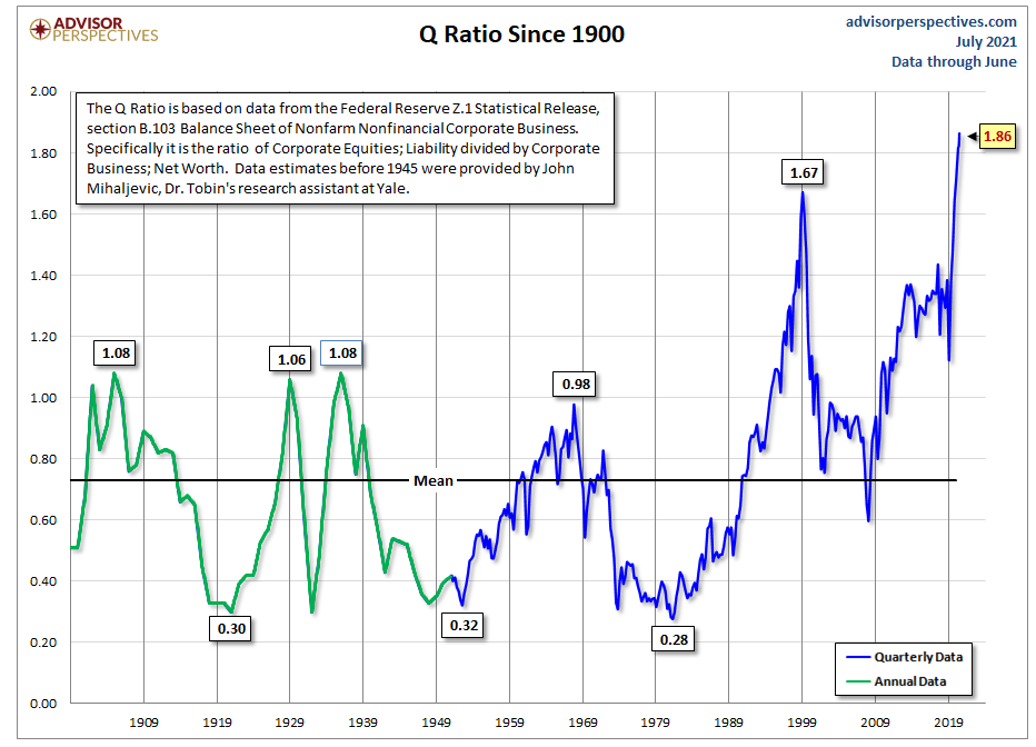 How seriously should we take this? That's where this gets more complicated. The whole concept of replacement value for businesses is harder to establish with the growth in importance of intangible assets. Alphabet Inc. and Apple Inc. are probably worth quite a lot more than any sensible measure of their physical assets. Their intangible assets are obviously very valuable, but impossible to pin down with imprecision. There is also an ad hominem reason to doubt the importance of Tobin's Q. Last month I chaired a panel on asset allocation for Johns Hopkins University's Carey Business School. Abby Joseph Cohen, the legendary equity strategist at Goldman Sachs Group Inc., was on the panel and told me that she had had once had the chance to ask Tobin about using his Q as a valuation tool. Apparently, the man himself dismissed the idea out of hand. The ratio has its uses but, according to its inventor at least, stock market valuation isn't one of them. OK, it isn't possible to get through a Points of Return without discussing inflation. Does the current high headline rate have any effect on the valuations we should put on stocks? Does future valuation depend on whether we are deflationist or inflationist? In days of yore, the rule of thumb was that P/E and inflation had an inverse relationship; higher inflation meant demanding a lower multiple on stocks. But when inflation has risen, it tends to have drawn stock prices with it. In conditions of inflation, companies can raise prices. Higher inflation is generally a symptom of economic growth, which is good for companies. And as Vincent Deluard of Stonex Group Inc. shows, using data from Shiller's website, there is a clearly perceptible relationship between trailing returns and inflation. The higher inflation is now (and it's high, in headline year-on-year terms), the higher the last year's return is likely to have been (and boy, has the last year been good for the stock market): 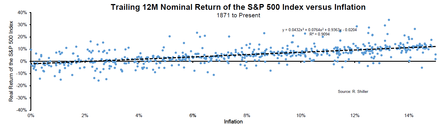 But inflation now has very different implications for future returns, in part because it leads to higher interest rates. Once inflation gets into the high single digits, subsequent real stock market returns tend to be negative: 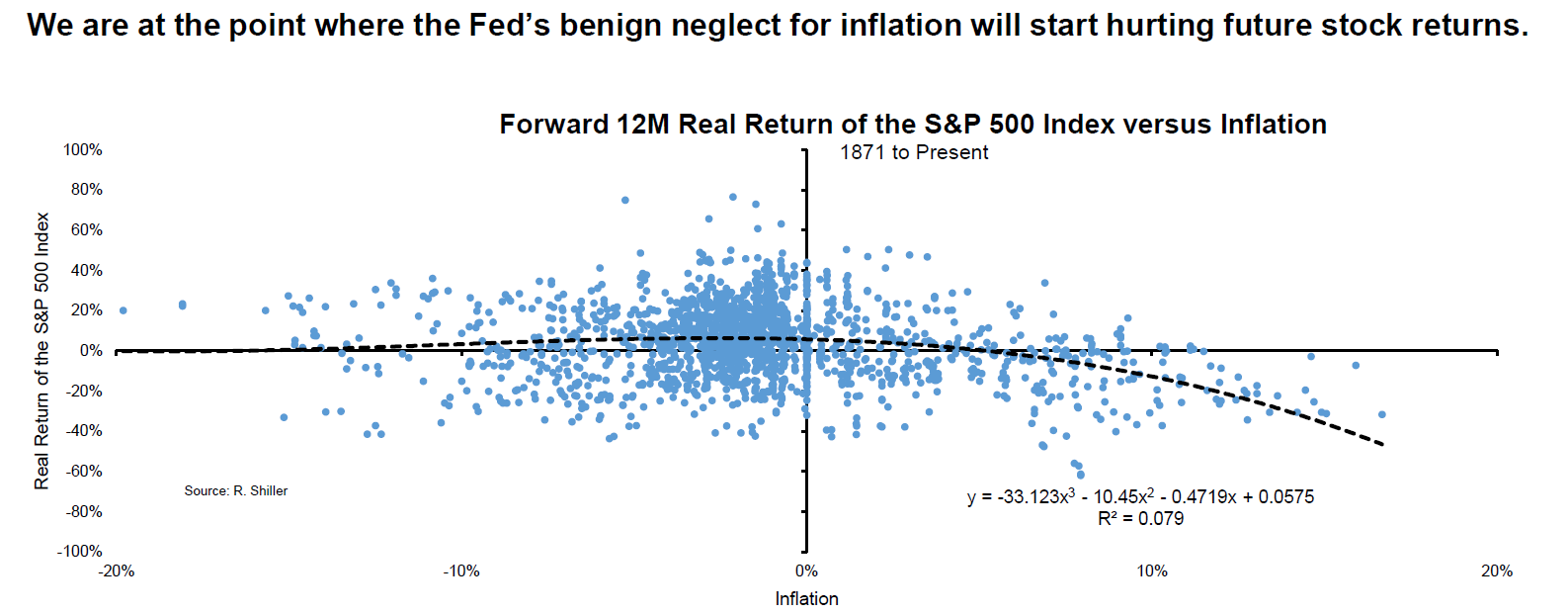 Some economists believe high single-digit inflation awaits us by the end of the year, although they are still in a minority. Strip out obviously transitory elements, and current price rises are still in the low single digits. But this exercise is a salutary one. Equities might do better than bonds in conditions of rising inflation; they're still unlikely to do well in absolute terms. Whatever your view on inflation, a shift away from the U.S., and away from the companies and sectors that have powered the U.S., seems to make eminent sense. Yesterday, we had a headline that read Fade to Grey without linking to the New Romantic classic by Visage (one of the songs I remember very fondly from the year 1981, when REO Speedwagon and Bucks Fizz were having bigger hits). The omission, for which I apologize, is now rectified. Meanwhile, St. James Infirmary yesterday raised the issue of another great standard, George Gershwin's It Ain't Necessarily So. Originally written for a tenor, it sounded great when Jimmy Somerville of Bronski Beat sung it in a high falsetto, and when Nicki Parrott, a soprano, sings it with Byron Stripling, yesterday's hero, on trumpet. But the greatest version ever, as far as I'm concerned, was sung in an incomparable basso profundo by Paul Robeson. It never fails to move me. Like Bloomberg's Points of Return? Subscribe for unlimited access to trusted, data-based journalism in 120 countries around the world and gain expert analysis from exclusive daily newsletters, The Bloomberg Open and The Bloomberg Close. | 


Post a Comment