The Plot Thickens…The question doesn't go away. Are stocks in a true bubble, which can only be corrected by bursting, or can their historically high valuations be justified by the historically low yields paid by bonds? And should the possibility of higher inflation, which all else equal would bring higher bond yields in its wake, be enough to deter investing in the stock market? Or should we be inured to the deflationary environment that has persisted for more than a decade? Sadly, there are no clear answers, but there are plenty of people discussing the topic, and arguing about it ever more vociferously. I will attempt now to offer the most intriguing new data points. What Lael Said NextThe single most important data point for the market is that a Federal Reserve governor has commented publicly on the sharp rise in bond yields. Moreover, it's Lael Brainard, who was widely canvassed as a potential treasury secretary and is also considered a potential next chairwoman of the Fed. She used language that closely echoed the words of Christine Lagarde, president of the European Central Bank, last week: I am paying close attention to market developments — some of those moves last week and the speed of those moves caught my eye. I would be concerned if I saw disorderly conditions or persistent tightening in financial conditions that could slow progress toward our goal.
Parsing this, we get the message that the Fed cares about what is happening in the bond market, and dislikes the speed with which yields tightened. But arguably the operative word is "if." She is saying that "disorderly" conditions and "persistent" tightening would be concerning if they happened. So this doesn't portend immediate action, though it does suggest that the Fed will act in the event of another leg upward. At the margin, this would embolden those who believe that some version of yield curve control or financial repression is inevitable, and that bond yields will stay unnaturally low for a while. This would strengthen the case for stocks, despite their valuations. What it would do to the economy in the longer term is a profoundly different and much more difficult discussion. Shiller and StocksFor more than two decades, the cyclically adjusted price-earnings, or CAPE, multiple promulgated by Yale University's Robert Shiller has been widely accepted as the single best gauge of whether the stock market is in a bubble. He used the CAPE to predict the dot-com crash in 2000, and it subsequently provided a useful warning that the market remained over-extended heading into the global financial crisis. The measure compares share prices to average inflation-adjusted earnings over the previous decade, and corrects for the tendency of P/E multiples to reflect the point in the business cycle. We now need to take into account two important points. First, Shiller always publishes the CAPE, which goes back to 1880, on a chart that also includes 10-year interest rates. Plainly, the level of bond yields will have an effect on the multiple that stocks can justify — the question is how much. Second, CAPE has sent generally unhelpful "sell" signals during much of the U.S. stock market's post-crisis rally, prompting many different academic attempts to find ways to adjust it. How to deal with the current situation, of extreme high CAPEs and extreme low yields? Shiller published an article late last year, heavily covered on Points of Return, arguing for a new measure called the "Excess CAPE Yield," in which the 10-year bond yield is subtracted from the CAPE earnings yield (the inverse of the CAPE). The higher this is, the better we can expect stocks to do relative to bonds, and vice versa. Shiller showed that the ECY did a good job of predicting the subsequent 10-year gap in returns between stocks and bonds, and that as of late last year it predicted that equities would outperform. That has now been translated, in some corners of my Twitter feed, into an argument that now is a time to fill your boots with stocks. I don't think that's what Shiller meant, and the moves of the last month have in any case shifted the calculus. Shiller hasn't updated his spreadsheet for the end of the month yet, so I plugged in the latest numbers for the S&P and the 10-year Treasury yield. The actual figures will be slightly different but not by much. Here are the results for the flagship comparison of CAPE with bond yields: 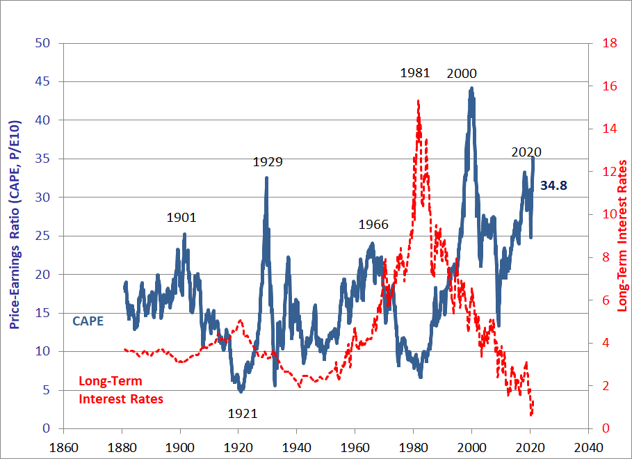 By my back-of-the-envelope calculation, the CAPE is back above 35 for only the second time in history, a figure that is hard to ignore. But bond yields, while they have rebounded, remain significantly lower than they had ever been before last year. That yields an ECY of 3.1%, down from a peak of 4.88% at the worst of the Covid shock: 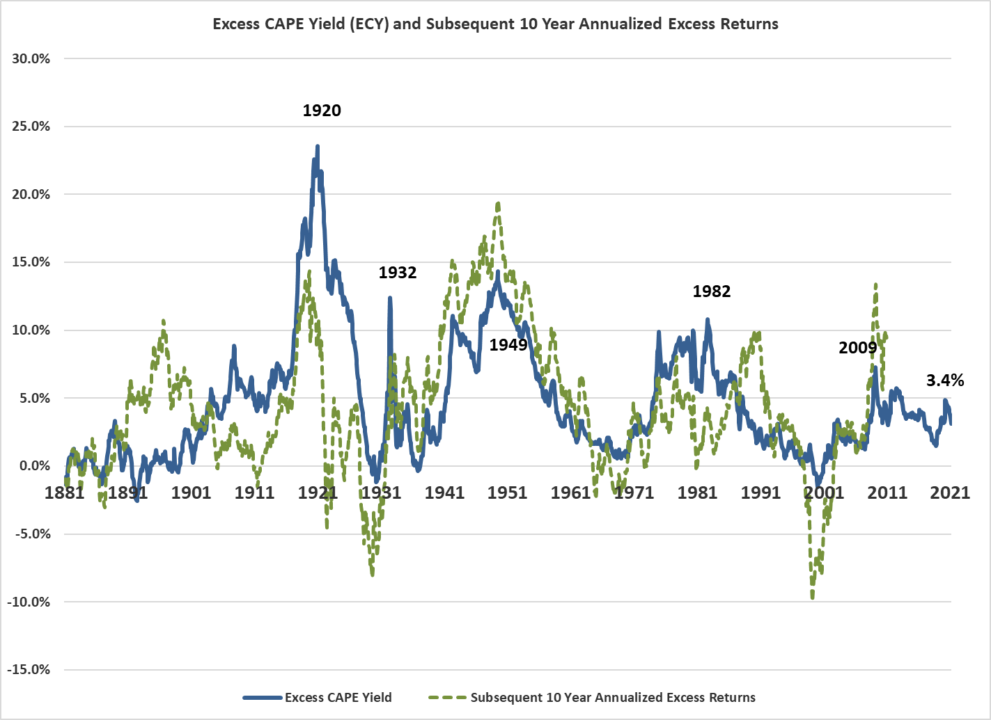 As the S&P 500 has outperformed long bonds by some 100% since last March, the signal the ECY sent then to buy stocks not bonds was obviously a good one. But the ECY isn't suggesting this is a compelling time to fill your boots with stocks. The average ECY over the entire 140 years of Shiller's data set is 4.69%, which is also the average for the last 50 years. The ECY went negative in the last extreme bubble, of 2000, so the current situation is significantly different. But last year has brought us to a position where even on this measure, this is a somewhat unappealing time to buy stocks. True, there's no bubble, and they should beat bonds over the next decade — but then you'd expect them to do that most of the time. A Bubble in BubblesNow let's take a move into counterintuitive logic. Google Trends searches allow for a clear measure of anxiety about stock market bubbles. Unfortunately Google was in its infancy in 2000 — it was yet to overtake AltaVista as the most popular search engine when that bubble burst. But we have data going back to 2004. And the following chart, produced by Clocktower Group of California, shows that concern about stock bubbles has just spiked higher: 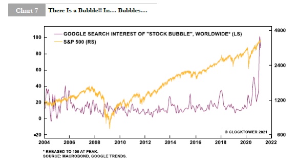 Counter-intuition enters when we remember that widespread concern about a bubble is a good sign. It means that there is still plenty of anxiety about — and hence we aren't in a bubble. It's the risks we don't perceive that are dangerous, not the ones for which we are on the alert. Back in 2008, housing and subprime finance were in a bubble for the ages, as were commodities and emerging market stocks. George Soros called it the "super-bubble." Others referred to the "bubble in everything." There was almost no concern at the time. If there had been, they might not have inflated so far. The Value of Math and the Math of Value Vaccine Monday, the day last November when Pfizer Inc. announced the initial test results of the Pfizer/BioNTech Covid-19 vaccine and confirmed that it was realistic to bring the pandemic under control within months, looked like a market turning point at the time. Value stocks, after a historically brutal run for most of the year, have enjoyed a rotation in their favor since then. This chart, also from Clocktower, shows the violence of the move in favor of value in February: 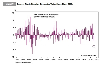 The following decomposition of returns by Jonathan Golub, U.S. equity strategist at Credit Suisse Group AG, shows what has happened beautifully. He splits the last 12 months into two, with the turning point coming on Vaccine Monday, about two-thirds of the way through. Breaking down the returns of growth and value into their components of earnings, price-earnings multiple and dividends gives us the following result: 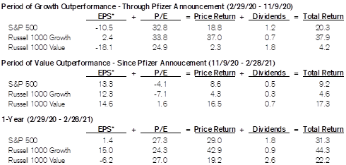 Amid all the confusion and excitement, the market has produced a remarkably sensible outcome. Over the full year, multiples on both growth and value stocks have increased to roughly the same extent, and now almost all the gap between them over the last 12 months can be explained by earnings. As might be expected, growth stocks did deliver earnings, while value stocks tended to be in the sectors worst affected by the pandemic, and didn't. So at this point the market seems adequately to have discounted the events of the last year, and for the future it is earnings — and not multiples — that will drive further differences in return. If you believe in further recovery, that should mean that value logs more outperformance as its earnings have plenty of room to grow. The Phillips SquiggleFinally, the following chart was shared with me by David Kotok of Cumberland Advisors Inc., and created by Thomas Synnott III. It charts the "Phillips Curve," which measures the trade-off between inflation (on the vertical scale) and unemployment (on the horizontal). Simplifying massively, a popular idea of the Keynesian heyday was that this would produce a diagonal curve from top left to bottom right — policymakers could trade more unemployment for less inflation, and vice versa. This chart shows the level of inflation and unemployment at the end of each year for the last 50 years: 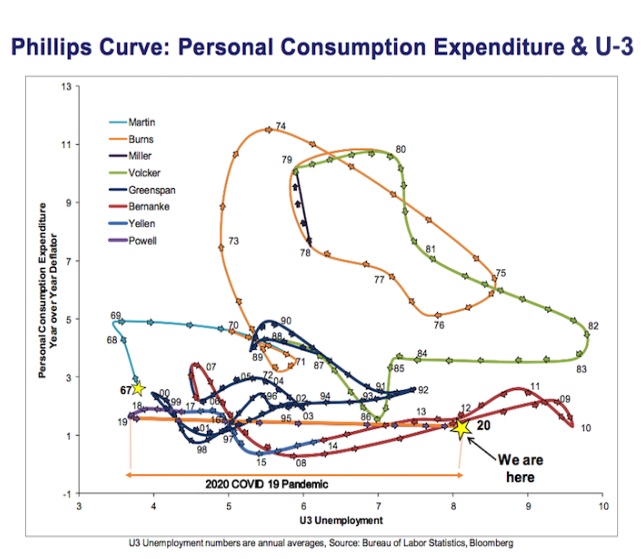 There is a dimly recognizable trade-off in the late 1970s, when lower unemployment was bought at the expense of higher inflation, and then more dramatically in the early 1980s when Paul Volcker won much lower inflation by allowing unemployment to rise. Prior to 2020, the most dramatic year on record was 1984, when unemployment shot down while inflation stayed steady. Not coincidentally, that was the year when President Ronald Reagan won re-election. But 2020 was the sharpest move on record — a horizontal move straight to the right, as unemployment more than doubled while inflation barely moved. You could argue that the chart as a whole, which is a thing of beauty, demonstrates that the relationship is so tenuous that it shouldn't be at the center of fiscal and monetary policy. But it is also an argument, Kotok thinks, for the Fed to push forward with an exceptional policy, focused on reducing unemployment, in response to an exceptional event. That therefore becomes an argument for assuming that yields stay low, and governments go all in to try to stimulate growth. On Kotok's argument, deflation is by far the greatest risk, so we should brace for the Fed to keep yields low, and take positions in healthcare stocks, and more or less anything that will benefit from governmental attempts to spark growth. He makes a great deflationist case: is an immediate inflation spike on the horizon? We don't think so. A temporary rebound is not an inflation shock that triggers a permanent trajectory shift in the price level. So for now, we view this economic recovery as coming from a "hundred-year-flood" type of shock.
Note that the shock you see depicted does not include the imminent substantial demographic shift of nearly a million dead Americans in excess of "normal" numbers. Nor does it show the global shock from "excess" deaths in nearly every other country. It also does not show the results of a growth-penalizing Trump administration policy that limited US population growth by restricting immigration. All that will unfold in 2021 and beyond.
Nor does the chart show the now-developing healthcare shock as long haul COVID illness threatens a growing cohort of people. In America the estimate of long haul COVID cases hovers around 10 million; it may take years for us to really know how large this cohort is.
Survival TipsAre there any rock and roll movies funnier than This Is Spinal Tap or The Blues Brothers, I asked yesterday? Only one candidate has emerged — the brilliant The Rutles, a spoof of Beatles documentaries fronted by Eric Idle of Monty Python fame, and Neil Innes. It is very, very good, but not quite up there with Spinal Tap. For more of the late Neil Innes, here is his Protest Song, performed on the BBC's Old Grey Whistle Test; or you could also try another Protest Song by the great Hugh Laurie, these days best known as Dr. House, performed in an American accent on the BBC, and in a British accent for Saturday Night Live. I have a lot of sympathy for his chorus — it's always easy to find problems, but much harder to say what we need to do about them. Like Bloomberg's Points of Return? Subscribe for unlimited access to trusted, data-based journalism in 120 countries around the world and gain expert analysis from exclusive daily newsletters, The Bloomberg Open and The Bloomberg Close. | 

Post a Comment