Sea Fever Off the CapeWe need to journey back to the Cape. I don't mean Cape Horn or the Cape of Good Hope, or even Cape Cod, but merely the treacherous quantitative waters of the cyclically adjusted price-earnings multiple. For those who didn't read last Thursday's Points of Return, it might be best to go there quickly now, as it sparked an impassioned response. CAPE has dominated the debate over stock market valuations for at least a decade. Very briefly, a CAPE is like a normal P/E, except that it compares prices with the inflation-adjusted average of earnings over the previous 10 years. This corrects for the tendency of P/Es to be higher when profits are cyclically depressed, and lower when they are at a top. The CAPE became famous after Robert Shiller of Yale University put it at the center of an argument in 1999 that U.S. equities had formed a bubble that was about to burst. The CAPE also helped spot the risk of a big equity sell-off ahead of the global financial crisis. Since then, the CAPE has returned to extremes, and currently is higher even than it was on the eve of the Great Crash of 1929. Does this mean another bubble is about to pop? Shiller has always published his CAPE numbers in combination with a historical series of long-term interest rates. Bond yields are presently at historic lows. To what extent can they explain or justify extreme high equity valuations? Last week Shiller published an article introducing the "Excess CAPE Yield," which is the inverse of the CAPE (earnings over price) minus the 10-year bond yield. This number is very high at present, and as this chart shows, that implies equities are a great bet to beat bonds in the years ahead, even though they are so expensive in absolute terms: 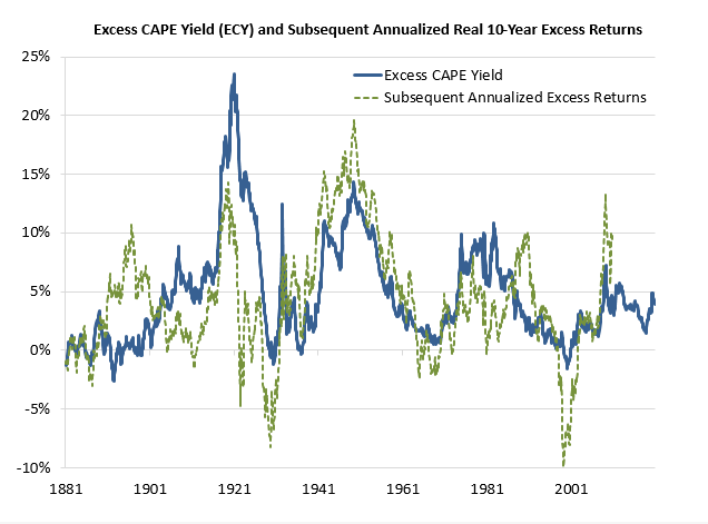 To be clear, as this caused confusion in last week's newsletter, the annualized excess return here is the return compared to bonds. As bonds are unbelievably expensive, this isn't perhaps as radical a departure as it at first appears. Logically, equities can still outperform if both bonds and stocks go down. The prediction still provoked quite a reaction. One Points of Return subscriber brought my attention to this fascinating article by Michael Finke, published by Advisor Perspectives in July, which shows that CAPE has been a stunningly accurate predictor of future returns without taking bond yields into account. This is how CAPE has fared in predicting 10-year returns on the S&P 500 since 1995: 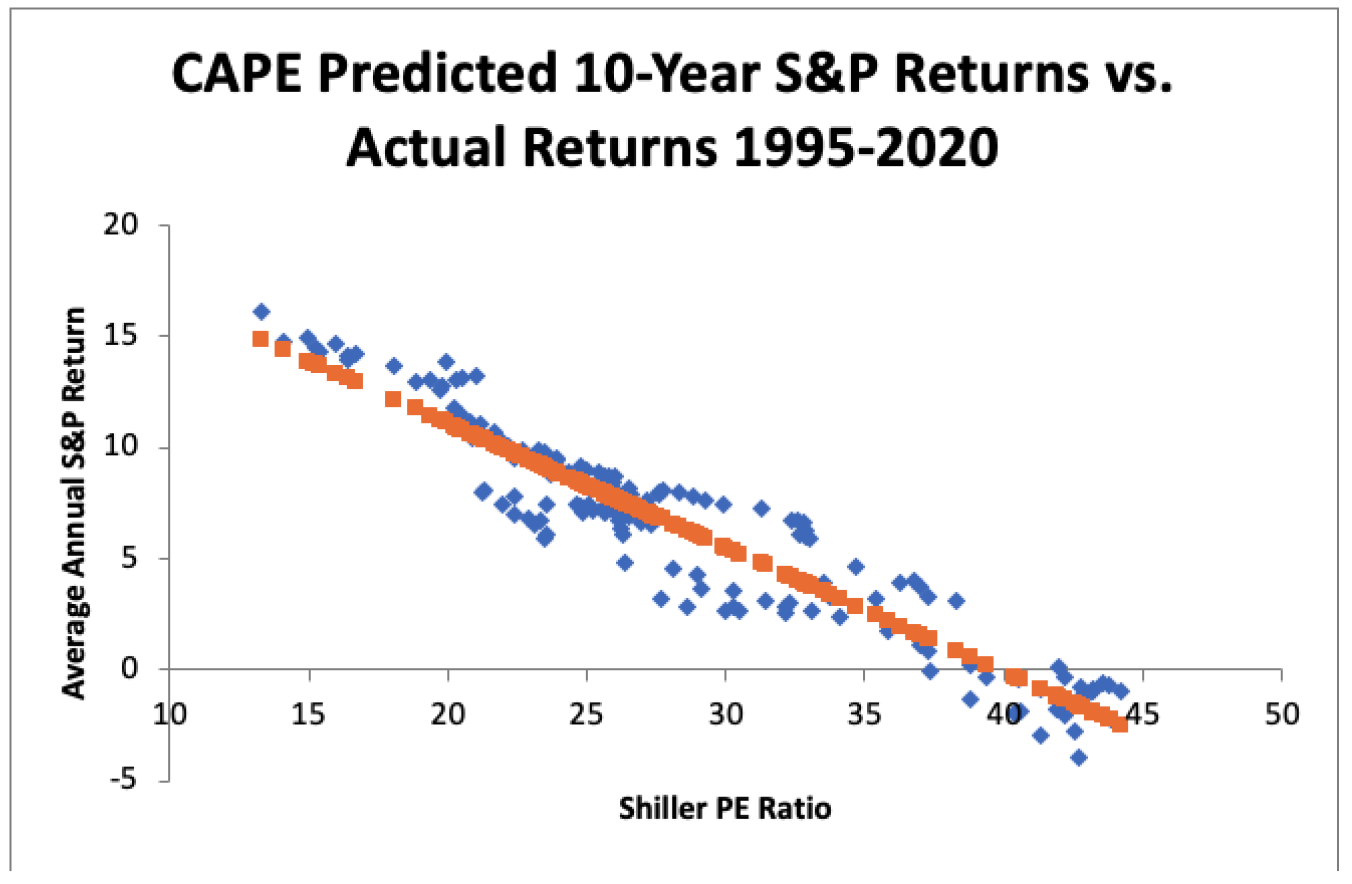 A higher CAPE meant a lower subsequent 10-year return, and vice versa. The R-squared was a phenomenally high 0.9 — the CAPE on its own was enough to explain 90% of stocks' subsequent performance over a decade. The standard deviation was 1.37% — in other words, two-thirds of the time the prediction was within 1.37 percentage points of the eventual outcome: this over a quarter-century that included an equity bubble, a credit bubble, two epic bear markets, and a decade-long bull market. Another Points of Return subscriber complained that Shiller was "changing the narrative" and drew my attention to this comment in a piece on the MarketWatch website: That's Robert Shiller, a Nobel Prize-winning economist and Yale professor, urging a cautious approach to investing in the top-heavy stock market in an op-ed for the New York Times. "The coronavirus crisis and the November election have driven fears of a major market crash to the highest levels in many years," Shiller wrote. "At the same time, stocks are trading at very high levels. That volatile combination doesn't mean that a crash will occur, but it suggests that the risk of one is relatively high. This is a time to be careful."
Meanwhile Albert Edwards, the notoriously bearish investment strategist at Societe Generale SA, said that reading Shiller's article made him feel "physically ill," and compared it provocatively to one of the most famously bad investment calls of all time. According to Edwards, Shiller's article has: echoes of economist Irving Fisher (who coincidently was also a Yale University professor) who in early October 1929 proclaimed, "stock prices have reached what looks like a permanently high plateau" just weeks before the stock-market collapse.
The key objection to the notion that lower bond yields justify lower equity yields is that over history they haven't. That is because bond yields tend to be low for a reason, which is a sluggish economy. Edwards formed his bearish view of the stock market, which he calls the "Ice Age" thesis, in Tokyo in the early 1990s. While there, he witnessed Japanese stocks fall from extreme high multiples, and then drop ever lower, in tandem with ever lower bond yields. In Japan, lower yields were a symptom of deflation, which was as bad news for stocks as it was good news for bonds: 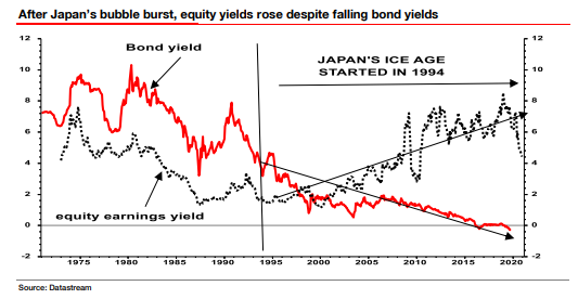 Europe has witnessed exactly the same phenomenon, but the U.S., which saw the peak of its own equity bubble exactly a decade after Japan's, has not. 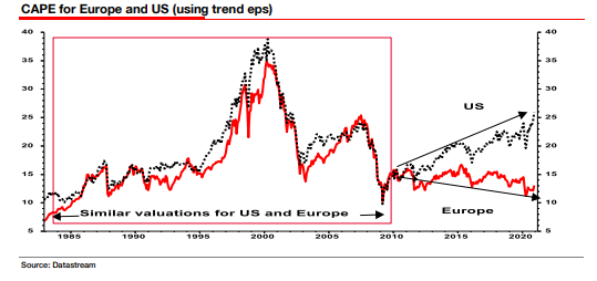 The U.S. and Europe both tanked at the turn of the millennium, and again with the financial crisis. Europe was unable to recover before running into its sovereign debt crisis. But the U.S. has leapt forward once more over the last decade. How? One answer is the FANG internet platform stocks, which have become increasingly dominant over the last few years. They have hoovered up all the earnings while the rest of the U.S. stock market isn't doing much better than Edwards predicted. He points out that on the crucial measure of how cheap equities look compared to bonds, the U.S. is following the Japanese path almost exactly. In the following chart, Japan has been advanced by a decade, so that its peak at the turn of 1990 overlaps with the U.S. high at the turn of 2000. In both cases, equities looked wildly expensive compared to bonds. And in both cases, stocks spent the next decade looking relatively ever cheaper. But the earnings of the biggest American companies are such that investors have earned a much nicer return on U.S. stocks than they did in Japan: 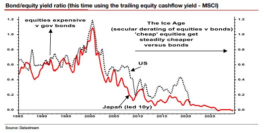 We don't need Japan to make this argument, however. In the U.S., low bond yields (albeit not as low as they are now) once co-existed with low CAPEs. This was true in the 1950s, when "financial repression" was still in force. This was the euphemism for capping bond yields at a low level, and thereby forcing Americans to lend to the government at uneconomical rates to help pay off war debts. But this time around, with conditions that bear more than a passing similarity to financial repression, CAPEs have headed higher again: 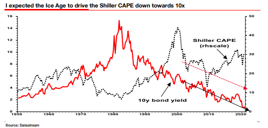 Edwards expected CAPE to be around 10 by now, given the moves in bond yields, and admits he was guilty of a "forecasting error of epic proportions." But his Ice Age thesis has played out as predicted in Europe, and he has also been correct to predict that stocks would look ever cheaper relative to bonds in the U.S. For now, his judgment is clear: "In my Ice Age view of the world, Robert Shiller is dead wrong. In my view, US equity valuations are a QE-fueled bubble waiting to burst." Now the question is whether this is really so different from the Shiller view. His model plainly suggests that stocks will do badly over the next 10 years, and that bonds will do even worse. This was the way Shiller put it in a research piece for Barclays Plc in October, (which can be found on SSRN here): In summary, investors expect a certain return in equities as compensation for investing in a riskier asset class, and as interest rates have declined, the relative expected return for equities has increased dramatically. We believe this may quantitatively help to explain investors current preference for equities over bonds, and as such the quick recoveries we are observing (with the exception of the UK), whilst still in the midst of a pandemic. In the US in particular, we are once again observing stretched valuations and high CAPE ratios compared to history.
Bond arithmetic may help to show that Edwards and Shiller aren't as far apart as they appear. When yields are this low, moving to a higher yield involves serious losses. To get from the current 10-year yield of 1% back to the 3% that 10-year Treasuries were offering as recently as two years ago, the Treasury price would have to drop by two-thirds. (If yields were a more normal 4%, then a two-percentage-point increase would require a fall in the bond price of only one-third.) At this point, bonds offer low income, little upside, and risk of massive downside. Maybe it isn't that big an act of apostasy for someone who remains dubious about the future for stocks to predict that they should still do better than bonds. Further feedback on the subject is welcome. Linked In to LinkedInWhile Facebook follows Google in the eye of the antitrust storm, LinkedIn has kept nicely below the radar. Something about it being a professional tool that we join using our true identities makes its behavior and business model far more seemly. And given the information we post is public and meant to be shared, we aren't so uncomfortable when the company mines its data to discover trends. This leads to some worrying conclusions, though. The following charts were shared by Karin Kimbrough, LinkedIn's chief economist, at a webinar for journalists Thursday. They aren't surprising, but they do show some bad things have happened to the U.S. white-collar jobs market this year. The following chart shows how the hiring rate (the proportion of LinkedIn members moving to new jobs) has moved. 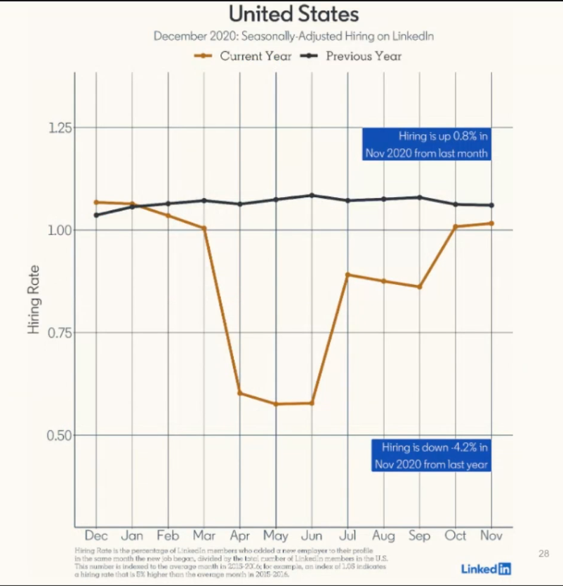 Hiring is still down 4.2% from the same period last year, by this measure; but it was very much worse earlier in the year. Meanwhile, the data show the rude health of China. In France, job movements almost closed down altogether during the first lockdown, while the second doesn't yet appear to be affecting the jobs market so much: 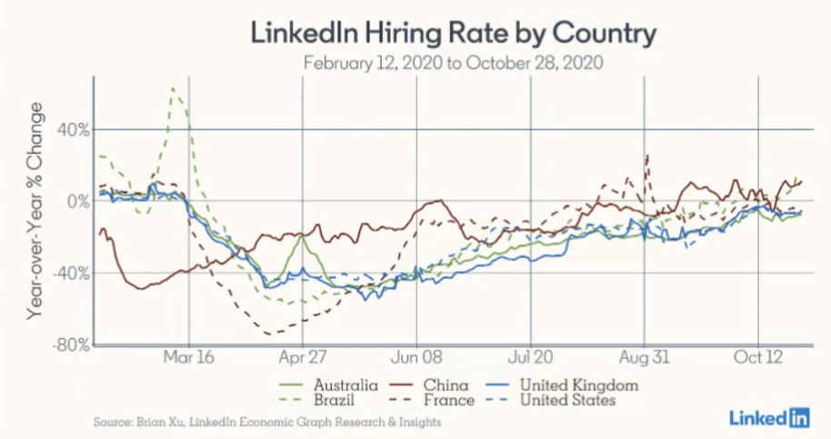 But perhaps the most dramatic findings concern trends in U.S. cities. All the biggest gains in net arrivals (those moving to a city, according to their LinkedIn, minus those leaving) have been made by second-tier cities, led by Jacksonville, Florida. The move away from the wealthiest, most expensive, and politically bluest cities is extraordinary. Moves to New York have dropped by 23.4% and to the Bay Area by 21.1%, while there have also been steep falls in Seattle, Boston and Portland, Oregon: 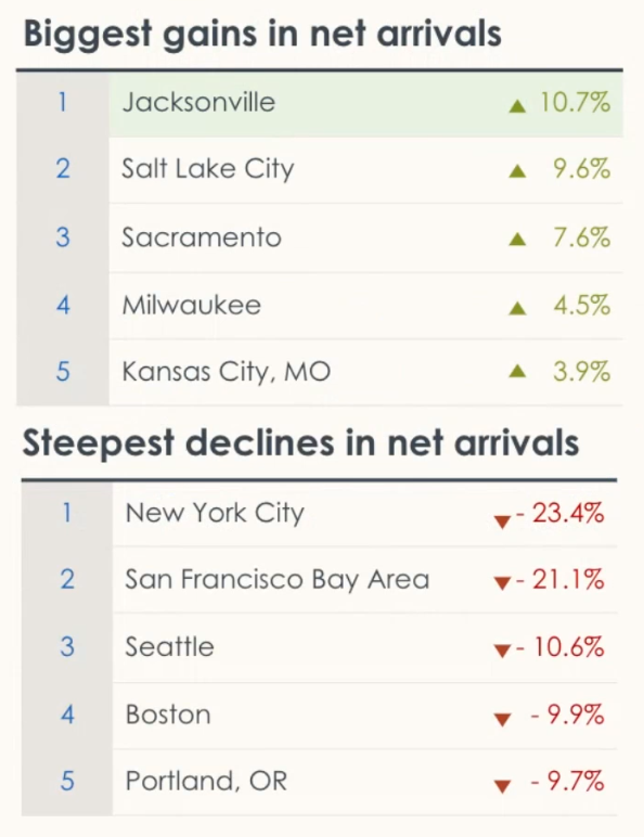 This may be merely an escape from over-expensive city centers as working from home becomes more widespread. It might also mean that the revolt against the growing inequality of the last few decades is at last under way, and that a few elite cities are going to suffer a permanent loss of workforce. Either way, commercial and residential real estate in the most expensive areas of the most expensive cities doesn't look appealing. Survival TipsI hope everyone is having a happy Chanukkah, now about to enter its second day. Yesterday I introduced the Maccabeats, a Jewish a cappella group from Washington Heights, Manhattan, who are big local heroes. I omitted to link to their Chanukkah song for 2020. Here it is: Candlelight. Their name for this song appears as MaccaBTS, and my daughters helpfully explain that this is because the song is a parody of Dynamite by Korean pop sensations BTS, who dance even better than the Maccabeats. Looking at their video, the BTS boys at one point treat themselves to a doughnut (a big Chanukkah tradition); and it starts in a teenage bedroom with pin-ups of the covers of Aladdin Sane and Abbey Road on the wall. So BTS have some good things going for them. Enjoy, and have a good weekend. Like Bloomberg's Points of Return? Subscribe for unlimited access to trusted, data-based journalism in 120 countries around the world and gain expert analysis from exclusive daily newsletters, The Bloomberg Open and The Bloomberg Close. | 

Post a Comment