The Covid Opportunity Covid-19 created a great opportunity for active equity managers to show their worth. With correlations extreme during the sell-off, lack of diversification was no longer a problem. Meanwhile, there was exceptional dispersion in returns — meaning that while all stocks fell, some tanked by far more than others. This offered the chance for big eye-catching performance compared to the market, for those who made the right choices. Charts prepared by Savita Subramanian's quantitative team at BofA Securities Inc. show that the most obvious opportunity from very high correlations beckoned in the large-cap stocks of the S&P 500, rather than the Russell 2000 small-cap index: 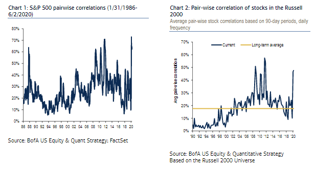 The same is true of dispersion, which reached greater historical extremes for large-cap stocks: 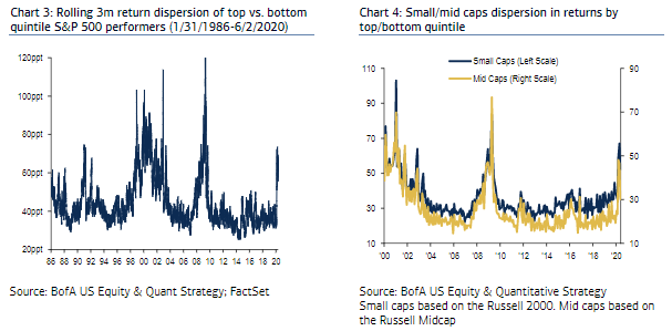 The story of the market disruption caused by the pandemic isn't over. But a picture is emerging of active managers benefiting somewhat — though possibly not by enough to help them reverse the flow of funds toward passive indexed funds. And perhaps more surprisingly, the managers to have benefited the most have been in the small-cap sector. Last week, S&P Dow Jones Indices published its SPIVA report, which normally comes out twice a year, in a special edition to cover the first four months of 2020. It analyzes what proportion of active funds have beaten the relevant S&P benchmark for their style and sector, over a range of time periods, after taking fees into account. It shows that 58.7% of large-cap funds failed to outperform the S&P 500 on this basis for the first four months. But majorities of both small- and mid-cap managers beat their indexes, while lots of small-cap managers took the opportunities coming their way in growth stocks. Only 6.6% of small-cap growth managers failed to beat the index. Here is the full list, as produced by S&P SPIVA: 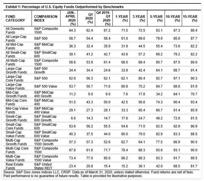 Over longer time periods, the argument for passive investing remains as strong as ever; the great majority of funds in all categories failed to beat their benchmark over 10 and 15 years. So what helped small-cap managers do so well during four months when the market completed an epic dive and then went on one of the greatest rebounds of all time? The equivalent numbers as produced by BofA Securities give us a clue. These show 45% of all small-cap managers beating their benchmark, compared to the S&P number of 61%. (BofA expressed its numbers as a percentage who beat the index while S&P give the proportion who failed to beat it; beyond that the numbers are comparable.) BofA also agreed that growth managers had done better than others, although at 69% of managers beating their benchmark it showed a less emphatic number than S&P: 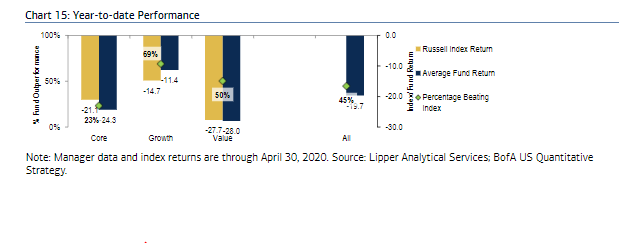 Wherein lies the difference? It probably stems from the choice of benchmark. The Russell indexes, now part of the London Stock Exchange's FTSE Russell Group, grew up as benchmarks to be used by active managers, while the S&P indices were largely produced to provide a benchmark that could be used for index funds and futures. Stocks must pass a number of "quality" thresholds to be included in the S&P Smallcap 600. For example, they have to have reported regular profits, and must show minimal levels of liquidity. The Russell, however, is purely based on market cap. The biggest 1,000 stocks in the U.S. by market cap go into the Russell 1000, and the next 2,000 are in the Russell 2000, no matter their liquidity or their record of profitability. Both ways of compiling an index have their uses — but if you want to track an index, you probably want the S&P 600, and if you are an active manager trying to beat an index, you probably want to take on the Russell 2000. This is how the two small-cap indexes have performed over the last five years: 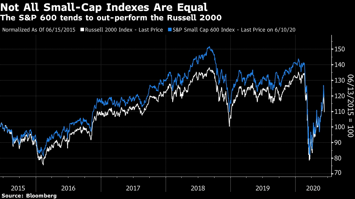 Until the turn of the year, the S&P was noticeably ahead. This year, the Russell has caught up. The following chart shows the Russell relative to the S&P since the turn of the year: 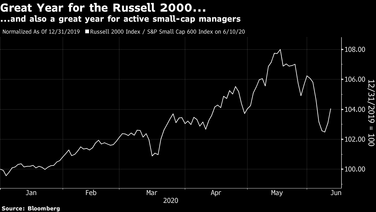 This explains why the S&P numbers suggest more small-cap managers have beaten the market than do numbers based on the Russell. They had a lower bar to clear. The S&P has recovered significantly compared to the Russell in recent weeks, so the phenomenon may not continue. I don't think any of this greatly changes the debate of active versus passive. We can draw two conclusions. First, it suggests that the division between the two is less clear than it appears. The argument for indexing is based on reducing costs. But there is still an "active" decision to be made on which index to track. True passivity isn't attainable. Second, this exercise shows that the effective quality bias in the S&P 600 has been a disadvantage for much of this year. That is strange because companies have been punished for having poor balance sheets. Aye Soe, of S&P, points out that the S&P 600's rules also tend to exclude a lot of small and as-yet unprofitable healthcare and biotech companies that have been popular so far this year. Small-cap growth managers may have done well mainly on the back of these companies. A bias toward low quality is unlikely to endure for very long, which is discouraging for those managers. Still, it is good to see that small-cap growth managers, ready to take some real risks and bet against the market, have been rewarded. Let's Go Logarithmic I received a question from a reader on log scales, and I think it is worth answering. Here it is: (BBO) Arizona Covid Debate Exposes Our Loss of Trust: John Authers
It puzzles me as to how and where it was decided the proper way to interpret the data visually is with graphs using logarithmic scales. The general assumption I think when seeing a "graph"
picture is that it is linear in scale. In my opinion the graphs are there to simplify - but they are made complicated by using a scale most people are not familiar with. I think it would be great if someone explained to us all why that scale works better for helping to explain the problems.
OK, log scales are probably less well understood now than they used to be, because the advent of calculators has meant that the art of doing complex calculations using log tables is now dead. I was probably in the last generation that spent a couple of years in middle school with a book of log tables on their desk at every math (or maths as we called it in England) lesson. A logarithmic scale is set so that percentage increases look identical. On a linear scale, the gap between 4 and 8 is twice the gap between 2 and 4. On a log scale, the gap is the same. In both cases we have seen a doubling. Log scales become very useful when measuring the spread of a pandemic, because a virus spreads exponentially. If everyone who catches it infects one other person, it will double. What matters crucially is to reduce its rate of change. If not many have lost their lives yet, yet cases are doubling from a low level, that is very bad news. Conversely, the same number of deaths later in the spread of the disease can be good news (in terms of the risk of future spread) because it shows that the rate of spread has changed. To show the phenomenon at work, here are New York coronavirus cases on both a linear (right hand side) and log scale. On the log scale, we can see that the rise in cases was deeply alarming in early March, even though the total number of cases was very low. We can also see that the spread of the disease was largely under control by the end of April, even though it would still affect many more people: 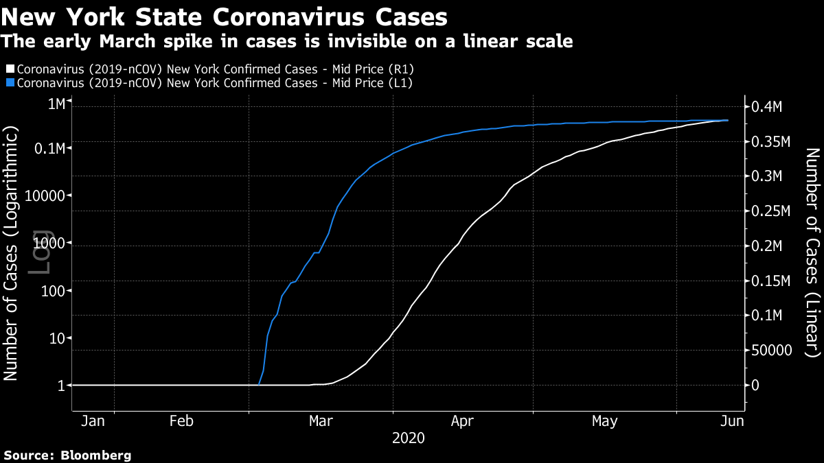 All the references to "flattening the curve," one of the phrases we never want to hear again after Covid-19, are to curves plotted on log and not linear scales. The other great use of log scales is for covering very long time periods. Below, we have the S&P 500 since 1927, on a price basis, on both a linear and a log scale. On a linear scale, it looks as though virtually all the gains over the last century came in the last decade. The Black Monday crash of 1987 is just barely visible; the Great Crash, the Great Depression and the ensuing recovery all appear as a straight line. In a case like this, I think it is obvious that a log scale is far more useful. You can look at it and tell at any given point how well you would have done to invest there. Looking at it this way also helps us maintain a little more calm about the last few months. On a linear scale, the crash from February into March looks by far the worst in history. It wasn't. 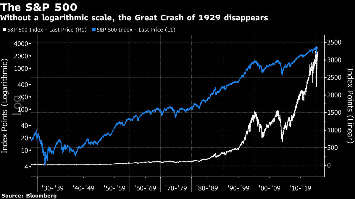 I hope this was useful. I like questions like this, because I can answer them. This doesn't apply to that very popular question: "Will the market go up or down?" Feel free to ask more. Survival Tips It could always be worse. This year's succession of events has gone beyond anything most of us had ever imagined. Covid-19 is still far from over. The reckoning for past racial and imperialist injustice, particularly in the U.K. and U.S., appears only to have begun. It feels like a bolt from the blue, and for many it is also an appalling tragedy. Human life is fragile, as indeed is the existence of Earth itself. Last week, for a book club, I read Chicxulub by T. Coraghessan Boyle for the first time. It's a remarkable short story, which you can find in a 2004 edition of the New Yorker here. Without spoiling too much, it's about how a couple deal with the news that their daughter has been run over in a car accident. The title is taken from the name of the asteroid that hit the Yucatan peninsula and is thought to have brought an end to the dinosaurs. In current times, it provides valuable context, in return for only about 15 minutes of your time. And everyone out there — if you'd be interested in restarting the Authers' Notes book club again, please let me know. It's been on hiatus during the worst of the crisis, but we would be happy to resume if there is interest. Have a good week. Like Bloomberg's Points of Return? Subscribe for unlimited access to trusted, data-based journalism in 120 countries around the world and gain expert analysis from exclusive daily newsletters, The Bloomberg Open and The Bloomberg Close. | 

Post a Comment