Spoilt for Lack of ChoiceWe know life isn't good for active equity managers. But just how bad is it? Andrew Lapthorne, chief quantitative strategist at Societe Generale SA, cheerfully describes the following chart as the most depressing ever. Others might disagree. Graphics of increasing deaths from despair in the U.S., or rising global temperatures, or a number of other miserable phenomena might make you even more depressed. But if you try to make your money by beating the market, this is about as miserable as it gets: 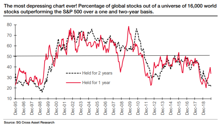 In this chart, Lapthorne took a universe of some 16,000 publicly traded stocks from around the world, and saw what proportion of them had managed a better return than the S&P 500. Over the last two years, barely even 20% of stocks managed this. Bear in mind that the giants in the S&P are probably the best-known and researched corporations on Earth, and should find it hard to come up with positive surprises. Their period of secular growth is behind them. They are based in a highly developed economy whose growth is likely to be surpassed by many in the emerging world. And yet only one in five stocks could beat the index. Add to that that the S&P is the world's easiest and cheapest index to track, and it grows quite unfair. There have even been years when the huge exchange-traded funds tracking the S&P have made enough money from lending stock that they had a negative charge, and managed to beat the index after fees. It is a popular refrain of active managers that index funds are guaranteed not to match the benchmark, because of fees — remarkably, for the huge funds tracking the large and liquid stocks of the S&P 500, this isn't quite true. Challenged by Lapthorne, I explored the terminal to see if I could create any charts even more depressing for active managers. Some of the efforts that follow come close. First, even within the S&P itself, opportunities to beat the index have reduced. The S&P 500 is weighted by market cap — Apple Inc. counts for more than most. The equal-weighted version counts each stock equally, with Apple counting for only 0.2%, like everyone else. It is a measure of the "average stock." Most of the time, smaller stocks tend to do better than the biggest, and the average stock beats the index. Thus there is a wide field that could outperform the market cap-weighted benchmark. The main index tends to win only when there is a big bubble in one particular sector — as happened spectacularly during the dot-com boom 20 years ago. The crash that followed led to years of great performance for the equal-weighted index. Over the last five years, however, we have witnessed the first lengthy period when the average stock has lagged behind. The following chart shows the rolling five-year performance of the equal-weighted index compared to the main index. When it is below 0, this means that the average stock is doing worse than the index. And on that basis, the last five years look truly exceptional, and dreadful for active managers hoping to make a living: 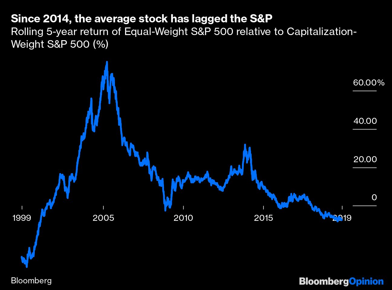 There is also something specific about the sell-off and recovery since the last big market peak in January last year that has been particularly tough for active managers. The following chart shows the MSCI World index (covering developed markets) on a market-cap basis in blue, and on an equal-weighted basis in white. The index has recovered, but the average stock is still 5% below that peak: 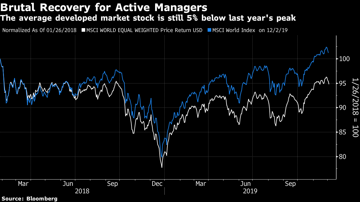 As Lapthorne points out, the S&P has many advantages on its side. The Federal Reserve is loyally helping it out, its biggest companies can buy their competitors, and for those in trouble the most attractive alternative is often to disappear off the map into the arms of private equity. The stock market is our prime mechanism for allocating capital, but it begins to seem an unfair game. This has been a great year for markets, thanks to the sell-off last Christmas. It has been very easy to make money. But the job of many investment managers is to do better than their peers and their benchmark. And that has been stunningly difficult. It is a cruel world. The Big Get BiggerHow much of the problem for the "average stock" is down to the phenomenon that the big are getting bigger? It certainly has a part to play. The "size factor," that small companies tend to outperform large ones in the long run, has long been accepted in finance. Logic dictates that they are riskier and should command a higher risk premium. Further, smaller companies have more room to grow. But the size factor has grown far weaker in recent years. Russell indexes, organized strictly by market cap, make it easy to track the following. The very biggest mega-caps are in the Top 50 index. Its most widely followed index of large-caps is the 1000. Then, its small-cap index, the 2000, tracks the next 2000 stocks, from numbers 1,001 to 3,000. The chart shows how the 2000 has fared compared to the Top 50 since 1999. Impressive outperformance after the dot-com bubble has given way to something else. Since 2006, the 2000 has fared no better than the 50. Over the last five years, the mega-caps have performed far better: 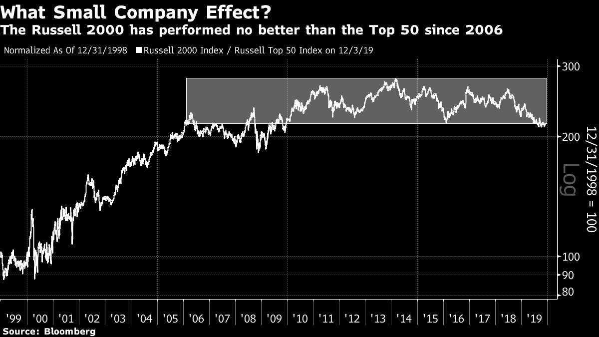 Obviously, life is harder for small caps than it used to be. But it shouldn't be overstated. Within the S&P itself, the dominance of the biggest is far less marked. This chart from the quant team led by Savita Subramanian at Bank of America Merrill Lynch shows how the biggest 10% of companies have fared relative to the S&P 500 as a whole. Underperformance was the norm for many years, and is now over — but it isn't as though mega-caps, which are disproportionately from the tech world, are now leaving the rest behind. They are outperforming the rest, but not dramatically: 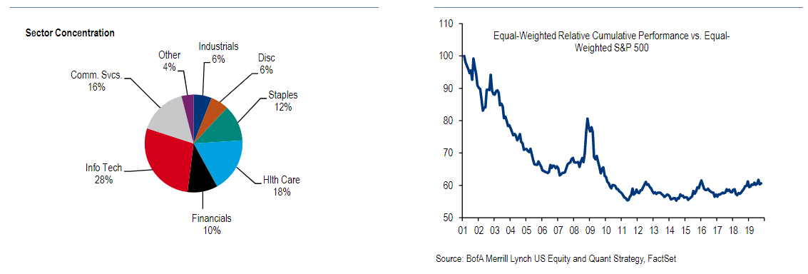 Even if the mega-caps haven't had it all their own way, it is clear that the smallest 50 stocks in the S&P (which might normally be popular picks for active managers) have underperformed badly in the last few years. The market may not perceive a great advantage in gigantism, but it certainly sees no great virtue in smallness: 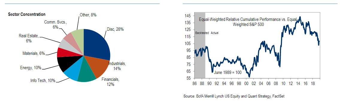 So yes, there do appear to be greater advantages to being big than there used to be, although we should be careful not to overstate this. And that brings me to….. Book Club: The Myth of CapitalismThe latest selection for Bloomberg's book club is The Myth of Capitalism by Jonathan Tepper and Denise Hearn, a brilliantly polemical attack on the lack of competition in the private sector and how it is destroying the benefits of capitalism. You have one more week to read it before we embark on our online discussion on the terminal. If you want to get involved, I will be discussing the book live with both authors (Tepper from London and Hearn from Seattle) on Wednesday next week, from 11 a.m,., to 12:30 p.m., New York time. There will be a Federal Open Market Committee meeting that afternoon so there is unlikely to be much happening in the markets in the hours before it — an ideal opportunity to discuss the problems of monopolies and concentration in the U.S. and the rest of the world. Terminal users can access the live chat by going to TLIV. We will be publishing a transcript on the website later. To ask questions or make points, send emails to the book club's address, authersnotes@bloomberg.net. This is a huge and fascinating topic, so please start the comments and questions coming now, to make this as good a debate as possible. To whet the appetite further, you might want to watch the two co-authors in action. This is a presentation on the book that Hearn gave in Hong Kong earlier this year — in the Foreign Correspondents' Club, which once provided the setting for the opening scene in a John Le Carre novel. This is Tepper talking to Real Vision about the book. Or you can see both of them, and a further cast of characters, in a town hall from Seattle.
A Jaded Final Note
Stocks sold off, and bonds rose, in a rotten "risk-off" day for markets, after President Trump talked down the chance of a trade deal with China this year and suggested it could wait until after the election, still 11 months away. Stocks had their worst day in about two months, and bonds had their best day in some four months. Who can honestly say they are surprised? And what excuse can anyone have if they allocated money on the assumption that we would have a deal this month? Rather than go into any great analysis, I will offer a useful analogy for the current relationship between Trump and the markets, which was suggested to me by my Thanksgiving viewing. I leave it to readers to work out which is Lucy, and which Charlie Brown.  Like Bloomberg's Points of Return? Subscribe for unlimited access to trusted, data-based journalism in 120 countries around the world and gain expert analysis from exclusive daily newsletters, The Bloomberg Open and The Bloomberg Close. | 


Post a Comment