| Summer is ending with the annual celebration of labor, and it looks like labor may have a little to celebrate. Last week's non-farm payrolls data in the U.S. revealed that employment was growing rather disappointingly, but earnings growth was ticking up. This isn't a combination to cheer up anyone who is worried about stagflation, but it does continue to suggest that labor is beginning to gain greater negotiating power in its perpetual battle with capital. So, how seriously should we take this, and what effect will it have on markets? Thankfully, we are publishing the latest update of the regular inflation indicators today. You can find it here. The biggest shifts over the last few weeks have been in two categories — business surveys, which I'll come to, and the wage market. This is the latest version of the labor market indicators, on the right, with last week's on the left: 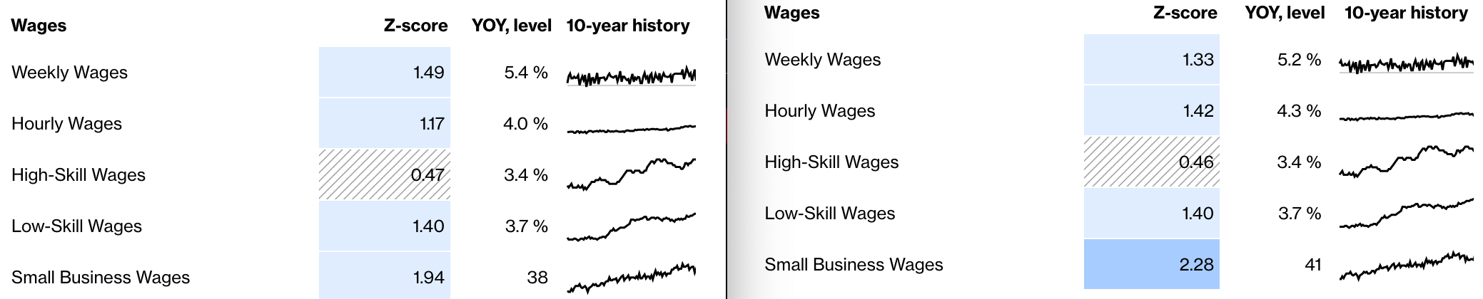 Average hourly earnings are now 1.42 standard deviations above their mean for the last decade, but weekly wage growth has reduced slightly. The two measures are a check on each other. If average hourly earnings are higher, but people are working fewer hours, there will not necessarily be much more inflationary pressure. So the effects are still ambiguous. If we look at the longer term, however, we can see that both hourly and weekly wages look elevated by recent standards. Excluding the first few months of the pandemic, hourly earnings are rising at the fastest pace since the series started in 2007: 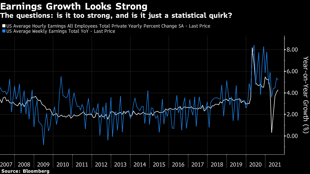 Some of this reflects a compositional effect. In the big layoff of spring last year, the lower-paid bore the brunt. That meant that the average earnings of those left in work rose. It looks as though that compositional effect has now passed through the python. Labor statistics are still hard to trust, but on the face of it, this latest rise looks meaningful. Compared to two years ago, it looks as though wage growth is clearly trending upward. We also include indicators from the Atlanta Federal Reserve which look specifically at wages for different sectors, which aren't out for this month yet. These could help to confirm that significant wage growth is underway, or provide some reassurance that the market is still distorted by the pandemic. If the pattern of wages is on balance a little concerning, from the point of view of inflation, the latest editions of the ISM surveys of supply managers provided some cause for relief. For both manufacturing and services, the ISM numbers for prices paid, covering the inflation companies are experiencing, reduced last month. This is the heat map for those indicators:  Again, the latest numbers are on the right, and we can see businesses' anxiety is falling a little — although consumers remain braced for much higher prices. If we look at the ISMs, the change in the trend is clear: 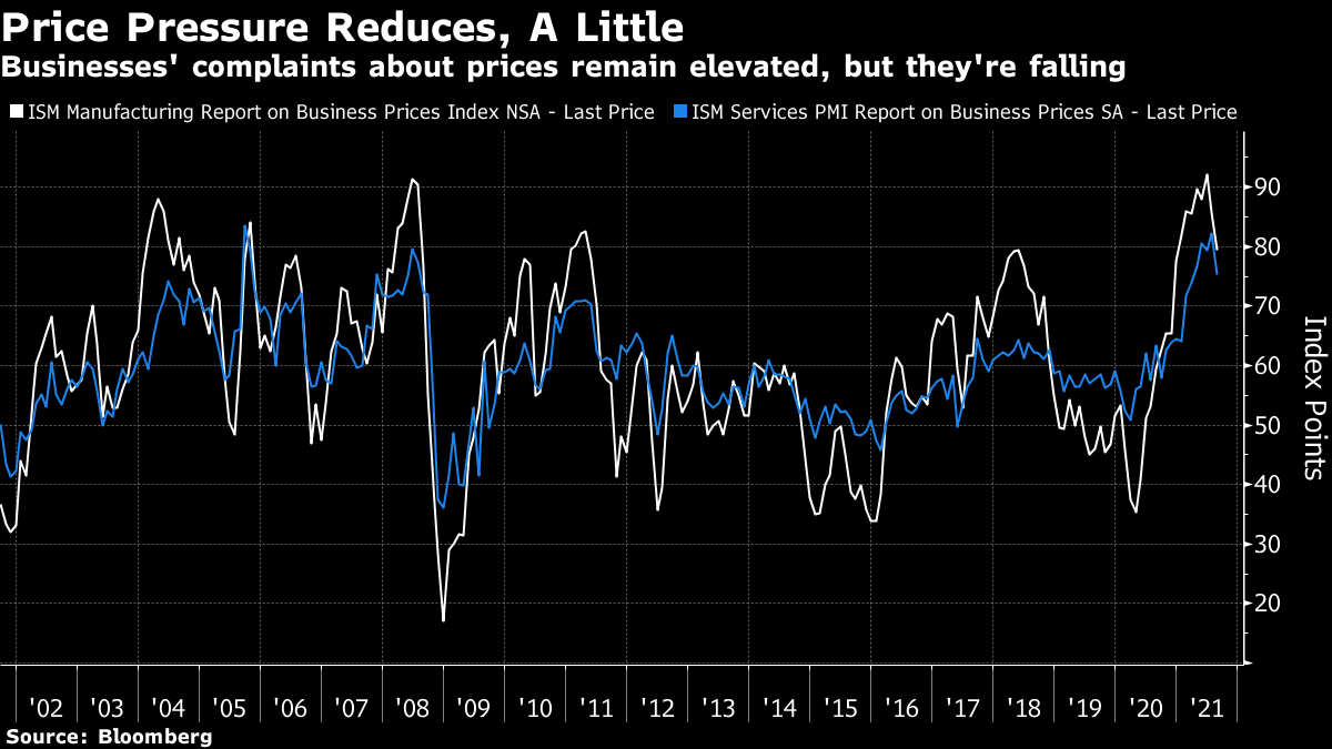 The survey took place amid many angsty headlines about fresh supply blockages in China; it really does suggest that businesses in their day-to-day operations are seeing reasons to be less concerned about price pressure. The argument of inflation "bears" is that the pandemic will lead steadily to a wage price spiral, and the figures are consistent with that. The argument of inflation "bulls" is that the bottlenecks caused by the pandemic will prove transitory, and the figures are also consistent with that. If you want to stay rooted in empirical evidence, the debate will have to drag on. Where does that leave markets? Whatever the impact on inflation, the Fed is committed to caring about unemployment these days, and last week's data suggested that there is indeed a long way to go. This is the employment rate as a proportion of the total available population, and it is still barely any better than at the nadir of the last recession, even if it shows clear improvement over the last few months: 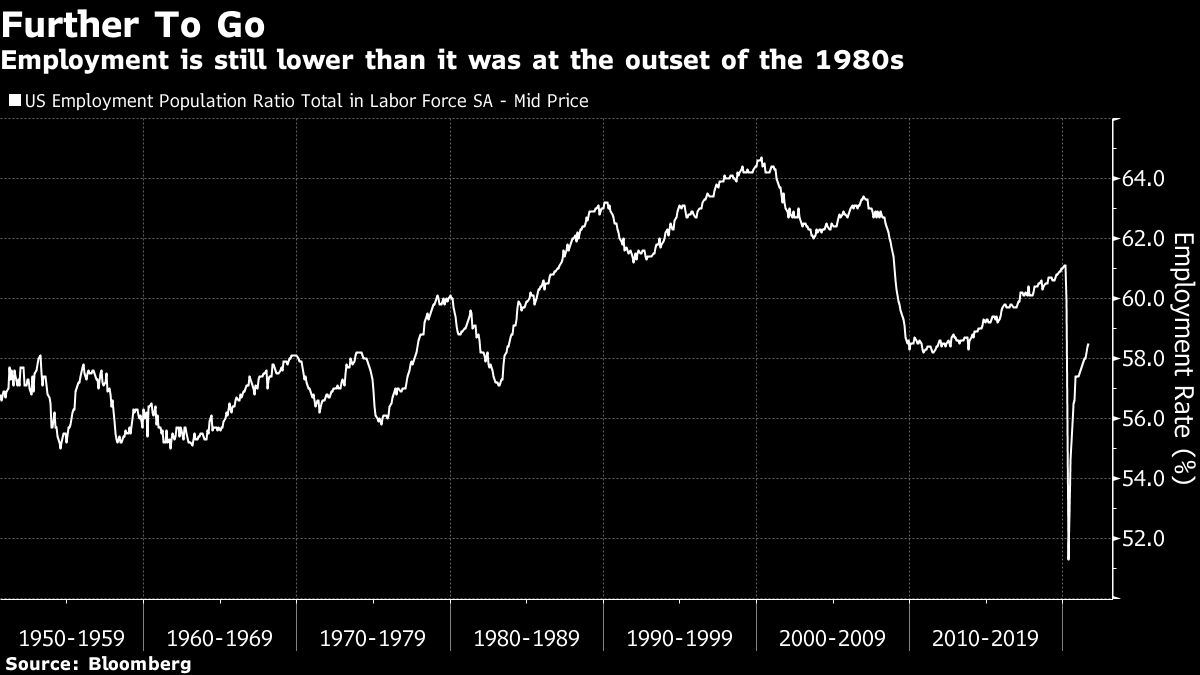 Belief in a genuine "reflation" trade, with people surging to spend more money, seems to be on the decline. That is a shame. But because of this, hopes that the Fed will take its time over tapering asset purchases, and then over raising interest rates, are rising. Judging by Monday's reaction in non-U.S. markets, this is deemed good news for stocks. The FTSE all-world excluding the U.S. index has rallied sharply: 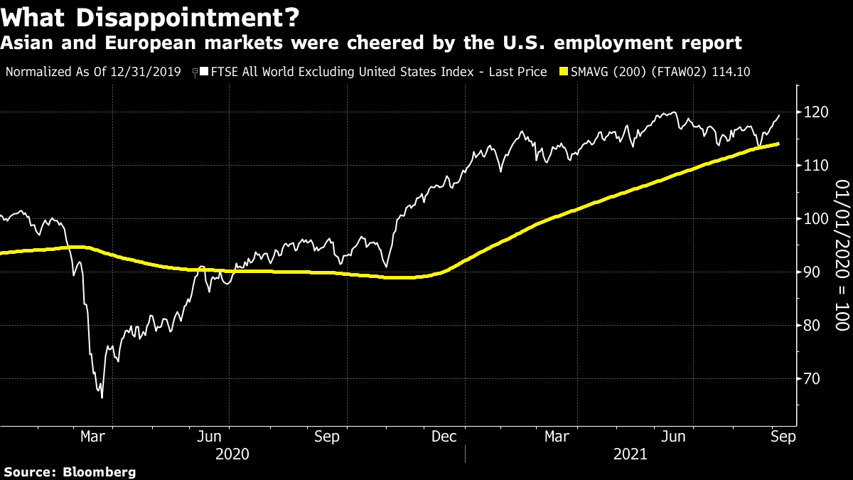 The sad fact for now is that the rally is now less about the excitement of post-pandemic reflation, and more about a return to the low-rate Goldilocks pre-pandemic reality, in which investors kept buying stocks because low yields on bonds left them no choice. The relative fortunes of value (which does well when growth is plentiful) and growth stocks have shown the course of the reflation trade since the beginning of last year. For much of this year, the tide appeared to have turned decisively in favor of value and the reflation trade. No longer: 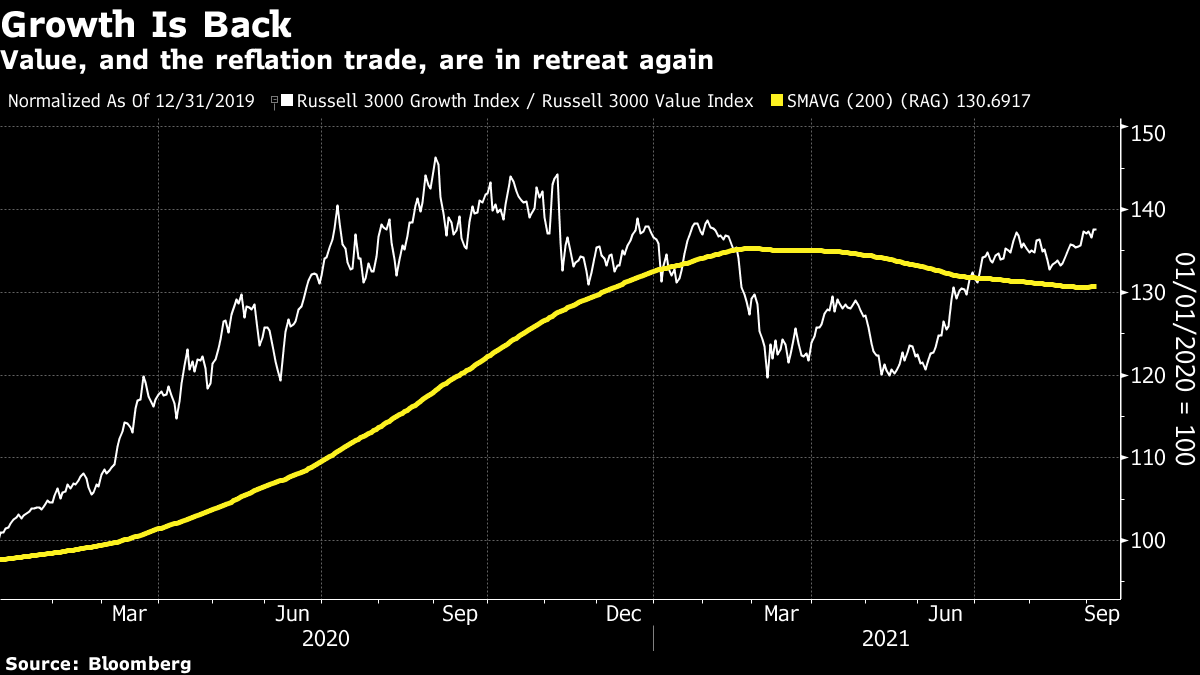 It's never wise to put too much weight on one month's data, particularly when so many figures are distorted by the pandemic. But the latest flow of statistics has led the market to position for more of the depressing post-crisis decade economy, and not for a strong and buoyant reflation. Happy Labor Day. It's time to return to the eternal debate over the Shiller CAPE. For the uninitiated, this is the cyclically adjusted price-earnings multiple, as popularized by the Yale University Nobel laureate economist Robert Shiller. Rather than compare share prices to last year's or this year's earnings, this multiple recognizes that valuations adjust for the point in the business cycle. When profits are likely to rise in future, the P/E will be higher than usual, and vice versa. To correct for this, Shiller compared prices to average inflation-adjusted earnings over the previous 10 years. This showed a series of long trends, and correctly suggested that the U.S. stock market had grown extreme before the great crashes of 1929 and 2000. Shiller publishes updates of his spreadsheet every month. The problem at present is that it suggests the market is far more expensive than at the 1929 top: 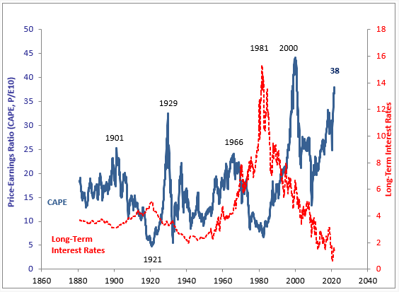 Before everyone panics, interest rates are far, far lower than they were in 1929 or 2000. That leads to a frantic debate over how much low rates can justify paying a higher earnings multiple for stocks. But is the Shiller CAPE really as high relative to history as it looks? There is a new and interesting entry in the cottage industry of investors and financial academics who have attempted to adjust the CAPE over the last decade or so. Damien Klassen of Nucleus Wealth in Australia suggests that Donald Trump might have broken the indicator — or more precisely, that his decision to slash corporate tax for 2018 has distorted the index. The basic intuition is that a change in the tax rate will change the multiple of earnings per share that people are prepared to pay. If earnings are $10 and there is no tax, then a $20 share price means a P/E of 2. If the tax rate raises to 50%, a $20 share price implies a P/E of post-tax earnings of 4. In practice, share prices would likely fall if a 50% tax on profits was suddenly levied. Similarly, we would expect the share price to rise if the tax rate fell. Klassen produces the following chart of what the CAPE might look like once the Trump tax cut is taken into account: 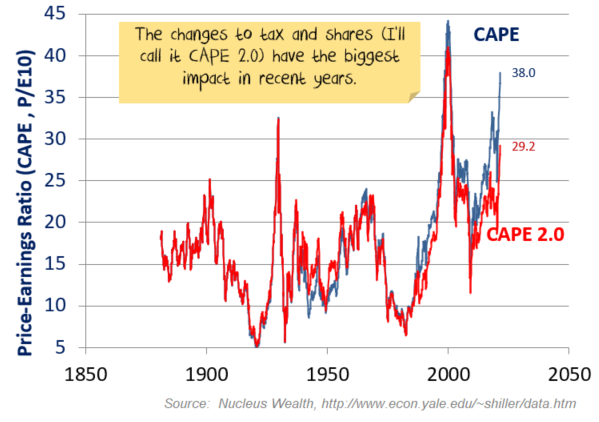 On this basis, CAPE is still elevated. Indeed it is more expensive than at any time other than the tops of the 1929 and 2000 bubbles. But at least it is now in the territory where historically low interest rates can make us all feel more comfortable. Klassen's spreadsheet, showing his adjustments of Shiller, can be found here. Taxes, either on a statutory basis or on an effective basis, taking into account companies' use of loopholes, have reduced dramatically over the last two decades, as Klassen shows. It only makes sense to assume that these changes would have an effect on the multiples that people will pay of the earnings that are being taxed: 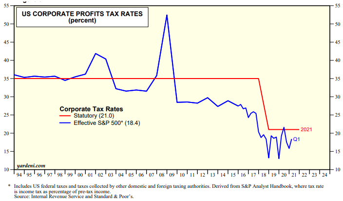 Does this make sense? Klassen isn't the first to suggest adjusting for tax rates, and his results are similar to those of a predecessor. Alain Bokobza, head of asset allocation at Societe Generale SA, produced a tax-adjusted CAPE a decade ago, which I covered here. (Yes, I've been covering this topic a long time.) You can also see Bokobza discuss his version of the CAPE with me in a video, produced for my old employers, here. His changes to historic CAPE levels were more radical than Klassen's, rendering the 2000 peak barely any higher than 1929, and showing a clear buying opportunity in 2009. In general, I think it is best to avoid the temptation to adjust Shiller's numbers for changes over history. Accounting conventions have also changed over time, as has the use of share buybacks; intangible assets are far more important than they used to be; and so on. These changes tend to be gradual, and CAPE long showed a propensity to revert to a mean, so it is questionable whether it is worth the time that goes into readjusting century-old data. But Bokobza did point out that corporate tax has changed mightily, several times, over the last century: In 1932, according to his data, the tax rate rose from 12% to 14%, and then increased steadily until it exceeded 50% in the 1960s. By the end of the Ronald Reagan era it was down to 35%, where it stayed for a long time before Trump's dramatic cut. On balance, the case does seem to be well made that the CAPE isn't as extreme and so clearly in a bubble as its headline number suggests. But even so, the fact remains that a cyclically adjusted P/E makes the U.S. stock market look more expensive than at any time other than the closing stages of the two biggest speculative rallies on record. That's sustainable if rates stay where they are, but not if they rise significantly from here. Which explains why it's necessary to spend so much time talking about inflation. I'm fresh from two weeks in England, which has reminded me how much I love that incomprehensible (to most people in the U.S. and much of the rest of the world) institution of cricket. England's national men's team has just lost a five-day international match against India, which ebbed and flowed in absorbing fashion. Much of the fun of cricket, like America's pastime baseball, lies in the listening to it. Both sports are perfect for radio. This week's match marked the 30th anniversary, in cricketing terms, of the most famous piece of cricket commentary on record, known as "the leg over." Summarizing the day's cricket, the youthful Jonathan Agnew (now the BBC's chief cricket correspondent) commented that one of England's batsmen had been out after he failed to get his leg over the wicket. This rather basic double-entendre led to a minute of desperation as his senior partner, the late Brian Johnston, a legendary broadcaster who was then 78, tried unsuccessfully to suppress his laughter. It was infectious. Across the country, there were reports of cars rushing to park on the shoulder of the highway as their drivers, listening to the cricket, themselves succumbed to helpless laughter. A recording of the "leg over" has even become one of the most popular requests on another BBC institution, Desert Island Discs. It's all such a big deal that the Beeb has marked the anniversary of the leg over with a half-hour documentary. Yes, it's more than a little ridiculous that two grown men laughing over a childish double-entendre has turned into a national event suitable of being memorialized by the national broadcaster. But there's something about the honesty of the moment, and their desperate struggle to do their job while the fit of the giggles makes it impossible to continue, that somehow everyone can relate to. It still makes me laugh, a lot. Have a good week everyone, and a happy new year to Jewish readers. Like Bloomberg's Points of Return? Subscribe for unlimited access to trusted, data-based journalism in 120 countries around the world and gain expert analysis from exclusive daily newsletters, The Bloomberg Open and The Bloomberg Close. | 


Post a Comment