Authers' IndicatorsWe're launching a new regular series today, with my name on it. So let me explain what Bloomberg Opinion is trying to achieve with Authers' Indicators. The last six months or so have generated plenty of heat and light over inflation in the U.S. Inflation isn't necessarily a bad thing; the Federal Reserve is actively trying to increase inflationary expectations in the hope that this will stimulate more economic activity. But it plainly carries risks. In today's polarized dialogue, the Weimar Republic and Zimbabwe often get invoked on one side of the debate, against contemporary Japan or the deflation that accompanied the Great Depression on the other. There's no need to be so hyperbolic. Inflation could rise enough to change some of the basic economic and investment assumptions of the last four decades without subjecting us to Weimar-style hyperinflation. The West saw double-figure inflation as recently as 1990; that would have quite an impact if it returned. I've covered the intellectual cases for and against a return to an inflationary paradigm in these newsletters, and will continue to do so. There are great arguments to be made on both sides. Again, many of them are subtler and more susceptible of middle ground than might appear. There are also plenty of attempts to measure where economics is going in more or less real time. The latest forecast from our own Bloomberg Economics, adapting a model from former Fed Chairman Ben Bernanke, suggests headline inflation of 3.7% at the end of this year. But it comes with a wide confidence interval. Inflation could be much lower than this, but it could equally easily still be as high as 5% in December. That would test the definition of "transitory," and shake the assumptions in many economic models. We tend to think in terms of narratives (as Robert Shiller told us last week), and it's easy to pick the right data to support your pre-existing deflationary or inflationary narrative. The Indicators will attempt to guard against this and force us to look at the balance of the evidence. I've picked 35 to monitor. We'll update them weekly. There'll be a write-up in the Monday Points of Return each week. For ease of presentation, we are presenting the indicators as a heat map, with each square determined by its Z-score for the last 10 years. In other words, they will be colored according to how far they are from the average for the last decade (in which everyone grew accustomed to a "low-flationary" paradigm). A Z-score above 2 implies that a measure is higher than it was for 95% of the time over the last decade. Much higher numbers suggest a clear and present danger of inflation. The 35 were my call. We will stick with them, although I'd be interested to hear other suggestions. The point is to look at how all compare with the kind of numbers we've come to expect in the post-crisis decade. The overall heat map then gives you a great snapshot of where the inflationary debate stands. This is what the current heat map looks like (you need to follow the link to look at the beautiful interactive version), with darker blue signifying greater risk: 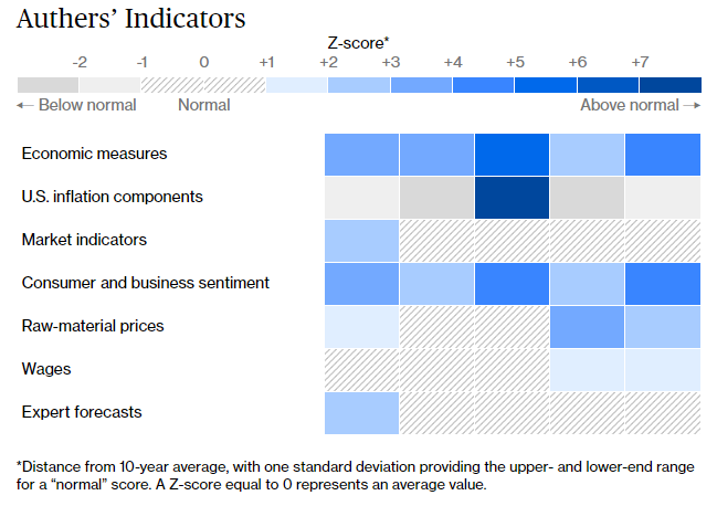 So what this tells us, is that official measures of inflation are flashing alarm (after May's very high numbers), and that surveys of consumers and businesses also suggest elevated concerns. Beyond that, there is little reason for anxiety. Of the five inflation components I chose to follow, one is at an extreme high, and all the others are below normal. As for the bond market, most of its measures have inflation expectations below where they've been for much of the last decade. Commodity prices aren't yet suggesting we need to be terrified, wages remain almost completely under control, and the experts surveyed by Bloomberg, whose forecasts often become self-fulfilling prophecies, are almost totally unconcerned. If anything, central banks will be worried that professional economists still expect inflation to be so low. In short, the heat map shows that these latest numbers really were something different, and that people really are scared — but that virtually everything else is still consistent with this being transitory. This is liable to change. We've been working on this for a number of weeks, and the first heat map we produced showed that actual inflation was nothing to write home about, while the market appeared to be terrified, with breakevens significantly higher than their normal range for the last decade. Raw material prices have also calmed somewhat since then. Why these indicators? In several cases it's a straight judgment call, but here goes: This one was reasonably straightforward. We offer you the U.S. consumer price index; U.S. CPI excluding food and fuel (or core CPI); producer price index; "trimmed mean" inflation, another version of core inflation that automatically excludes the constituents that have risen the most and least; and the PCE deflator, because it's measured in a different way from the CPI (surveying what businesses charge rather than what consumers pay) and because it's the Fed's favorite indicator. There's room for some argument around the edges but this gives a broad picture of where official statisticians see inflation. - U.S. inflation components
This is where judgment calls start. It would be confusing to include all components in the Bureau of Labor Statistics' basket, but I think it is worth looking at a range of indicators that might have particular significance. I chose shelter because it's the single biggest, and because if the inflationistas are right, we might see it start to rise in a significant way quite soon; rental car prices because they have had an obvious extreme boost from reopening; recreation, as the sector should logically be exposed to inflationary pressure amid reopening; medicine, because it is important and hugely politically sensitive; and college tuition, because it is the most frequently cited measure by those who complain that official numbers are deliberately understated. For those subject to this expense (full disclosure: soon to include me), tuition fees have inflated far ahead of CPI year after year. At present, the broad picture is consistent with a deflationary environment, with some pockets of extreme (and therefore probably transitory) inflation. Current car rental inflation is a nine-standard deviation event; that doesn't happen often. There are many ways the bond market gauges inflation. I went with the 5-year and 5-year/5-year measures, as the latter is the most closely watched by the Fed, and the two between them mean we can do without the 10-year. Usually, markets are geared for inflation to be higher further into the future; this is one of the rare times when the 5-year/5-year measure is lower than for the next five years — and indeed only the measure for the next five years is particularly high. Between them, these suggest a transitory phenomenon. Then we have the 2-year/10-year yield curve, which incorporates shorter rates, and I thought it worth including breakevens for Germany and Japan, the two countries where conviction is strongest that there is no inflation to worry about. - Consumer and business sentiment
We need to know what consumers expect, so we have both the Michigan and Conference Board surveys. They almost always predict that inflation will be worse than the actuality, but we cover for that by presenting these surveys in terms of Z-scores. Both are currently high in comparison to their own history; this is more significant than their actual levels. Then we have the National Federation of Independent Business survey on whether members' prices are rising or falling — a good leading indicator — along with the "prices paid" data produced by the ISM surveys of both manufacturing and services. The ISM surveys are hugely influential, and much trusted. The common feature of all these numbers is that there is a lot of worry about inflation, along with a belief that it is already with us. This could be an artifact of narrative fallacies of one kind or another. Business executives, and members of the public, are human and prone to over-emphasize things that fit their existing prejudices. But these surveys are long running, and detailed. It would be unwise to ignore them if they stay elevated for long. Again, there are umpteen measures of commodity inflation. As Bloomberg has sectoral indexes for agriculture, energy and industrial metals, I used those. That should guard against over-excitement caused by outliers. I included lumber futures because they have seen sharp inflation over the last few months, and there is good reason to assume that this will be transitory. And as there is (good) reason to fear that numbers in futures markets could be driven by speculation, rather than supply and demand in the real world, I included the Commodity Research Board's RIND index, which includes industrial materials for which there are no futures markets. Note that it's pretty elevated at present. Commodities have dipped somewhat in the last few weeks, but I'd say it still isn't clear that they've peaked; they are important to watch for the next few weeks. We have average hourly and weekly earnings, both buffeted by weird compositional effects entering and leaving the pandemic shutdown, and the Atlanta Fed's Nowcast for wage rises for both the low-skilled and highly skilled. This could be critical to monitor, amid fears about skill mismatches, and concerted political attempts to lever up incomes of the lowest paid. Finally we have the NFIB survey on compensation, which should catch up with the complaints of small businesses that they are under pressure to pay more. Obviously, wage inflation and expectations are fundamental to any significant return of inflationary psychology — beyond anecdotes, there's no sign of any increase yet. This was the simplest one. Bloomberg regularly surveys economists offering forecasts for this year and next. They may be wrong, but their opinions are influential and can become self-fulfilling. We have numbers for the U.S., which has now bumped up to the still not very high level of 2.5% for this year, and for Germany and Japan (the two countries most believed to be mired in deflation), China (the only country whose economy rivals the U.S. in importance), and the U.K. (the developed country that appears most prone to inflation). Some international perspective is necessary; the influence of China will generally make itself felt in wages and commodity prices, but the economists' outlook for it is important. At present there is almost no concern at all. These are the measures I chose. I hope they will be useful. Comments are welcome.
Weekly ClippingsOn Friday, Lisa Abramowicz and I recorded our first conversation in what will, we hope, turn into a weekly feature, in which we will discuss the most important story of the week, and also name our most under- and over-rated risks and opportunities. There's some hope that we become a Bloomberg Opinion version of Siskel & Ebert, but we tended to agree in the first episode. We'll try harder to have an argument next time.  I thought the most interesting point was Lisa's, that the most underestimated risk at present is that investors are braced for the reopening bounce to dissipate quickly, with a return next year to the grinding lowflationary slow growth we have learned to know and dislike. That would justify bond yields at their current level; it wouldn't be great news for stocks. She might well be right. Put differently, the undeniable "tantrum" in the first quarter, as bond yields rose sharply, might be attributed to changing views of fiscal stimulus (and hence chances for growth) rather than shifting fears about inflation. Looking at a chart of the 10-year Treasury yield this year, it's impossible not to notice that it started rising on Jan. 5 after the shock of the Georgia Senate elections, which gave Democrats a majority in both chambers and suddenly made a spending splurge possible, and ended on March 31, the day when President Biden unveiled the American Jobs Act — which included proposals for higher corporate taxes, and with them fiscal drag, next year:  Could this be a coincidence? Of course. But with prospects of a big fiscal stimulus ebbing in recent weeks, in line with general bullishness about Biden's prospects, it's notable that people seem to have become happier to pay more for bonds. Anyway, I'm hoping for more such insights from Lisa in the weeks ahead.
Survival TipsHaving recommended enjoying the European soccer championships last week, I should commend the efforts of the medical professionals who kept Danish footballer Christian Eriksen alive before our horrified eyes on Saturday. Let's be thankful for them, and remember that not all will be lucky to be so close to so many good first-aiders should something similar happen. So let's enjoy life while we have it. That helps segue to my appeal on behalf of the the British charity Guts UK, which is being broadcast on BBC Radio 4 this week, in which I recount the time I had to confront my own mortality most directly. Please listen and consider giving. I am trying to find similar charities in other countries for those interested. It's a strange experience to share this, but it would be very meaningful if it helped a good cause. Treat every day like it's your last, everyone, and have a great week. Like Bloomberg's Points of Return? Subscribe for unlimited access to trusted, data-based journalism in 120 countries around the world and gain expert analysis from exclusive daily newsletters, The Bloomberg Open and The Bloomberg Close.
| 


Post a Comment