Stocks vs Bonds: The RematchThis is going to be a piece about the relationship between share prices and bond yields, so I had better start with a public health warning. A lot of nonsense has over history been spouted about this link, and it was brilliantly denounced in this article by veteran British economist and fund manager Andrew Smithers in 2006: The greatest single triumph yet achieved by data mining is the invention of the bond yield ratio. This claims that equities can be valued by comparing bond yields and earnings yields. These ratios showed a strong correlation in the US from 1977 to 1997. But the exact opposite relationship ruled from 1948 to 1968. It is, of course, possible to use all the available data, thereby flattering the prejudices of economists but offending the key principle of data mining. If this is done, it shows that there is no relationship at all between bond yields and earnings yields.
Readers can, nonetheless, be confident that the use of the bond yield ratio will not disappear simply because it cannot be supported by either theory or experience. Claims based on data mining are not discarded simply because they do not work. They are put into the pending tray with the standard excuse that "the relationship has broken down". While this cannot be logically distinguished from "there never was a relationship", it has two great advantages. First, it sounds a great deal better and, second, it demands less effort to reuse old nonsense than to invent new follies.
So, there is no permanently stable connection between the yields on stocks and bonds, and we have to be careful about any definitions. This should be a reminder for caution about claims that U.S. equities aren't expensive at present, when ultra-low bond yields are taken into account. All of this said, something interesting has happened to the relationship in the last few months. While this isn't because of some iron-clad affinity between stocks and bonds, it does tell us something about a factor that affects both: inflation. For the last three months, there has been the strongest positive correlation between bonds and stocks (meaning that their prices move in the same direction, and bond yields move in the opposite direction to share prices) in this century. This is from London's Absolute Strategy Research Ltd.: 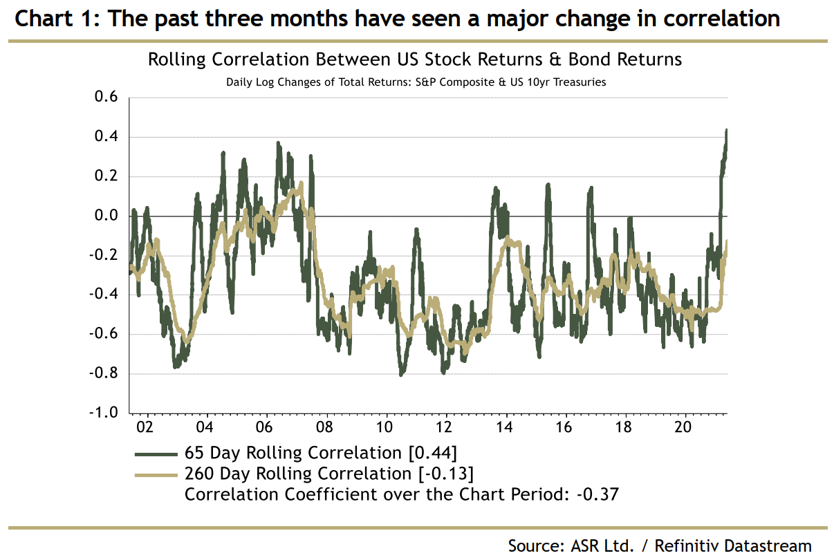 For most of the time since the internet bubble burst, there has been a negative correlation; bond yields have tended to move in the same direction as share prices. Why might this tell us something about inflation? Scanning the charts over the long term, we see that the correlation was positive from the late 1960s through until the late 1990s, before falling sharply after the bubble burst. After that, the correlation was consistently negative, until now. The period during which the correlation was positive stretches from the era when the Bretton Woods partial tie of currencies to the dollar and to gold was coming apart, through to the round of financial crises in the late 1990s which reached their most frightening moment when the Federal Reserve under Alan Greenspan cut rates in the wake of the Long-Term Capital Management meltdown. During this period, inflation seemed a significant concern. Before, the tie to gold tended to keep inflation concerns under control. After LTCM, and the melt-up and asset price collapse that followed, fear of inflation went off the agenda almost completely. The Fed was acting to avert deflation, which Japan had shown could be a real possibility. Inflation was a consummation devoutly to be wished. So, stocks and bonds were positively correlated during the era when inflation was a real concern, but negatively correlated in the periods before and after: 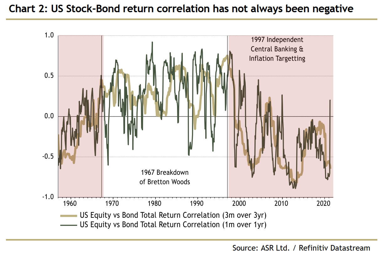 Over the past 20 years, this has made asset allocation relatively easy. If stocks don't go up, the chances are that bonds will. That means, as Absolute Strategy points out, that many risk officers have come to rely on bonds when equities sell off. They have been a great diversifier. Meanwhile, the environment of the last decade has been dreadful for esoteric absolute return hedge funds that aim to offer diversification for stocks. There hasn't seemed to be much point in their services when bonds work just fine. That might now change: 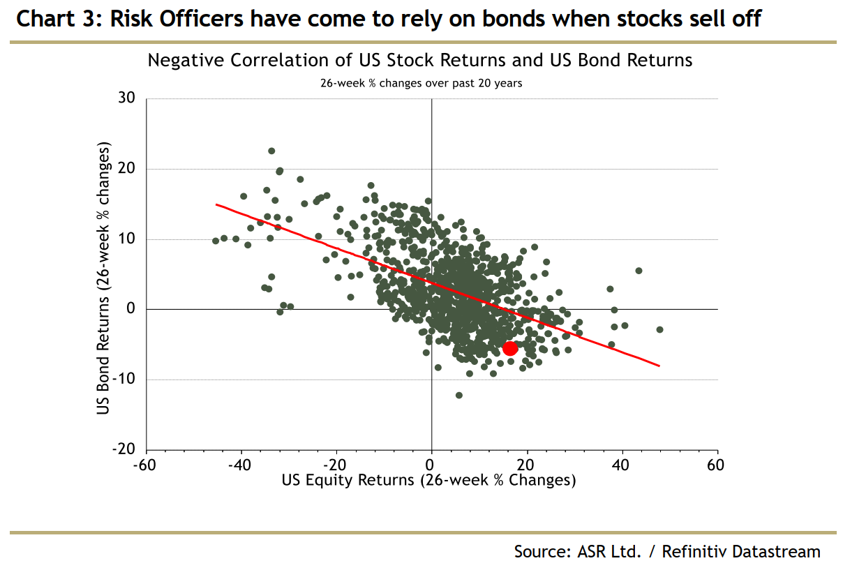 So this could be a problem for a lot of people. But the deeper issue is that the raised correlation of recent weeks shows concern about inflation. Ever since the dot-com bubble, higher bond yields (and lower bond prices) have generally been seen as good news for stocks, because they show that there is a chance for growth. The two big equity crashes of the last two decades both came against a backdrop of sharply falling yields; in both the global financial crisis and the Covid-19 scare, the great concern was a lack of growth and inflation. Rightly or wrongly, investors are now beginning to think that inflation might actually happen, and to dislike the prospect. That means bonds and stocks are correlated for a while. The Fed ModelThe most celebrated attempt to link stocks and bonds was the Fed model, which became famous in the late 1990s because Alan Greenspan himself appeared to be using it in some of his congressional testimonies. The Fed model compared the earnings yield on stocks (the inverse of the price-earnings multiple), with Treasury bond yields. When equity yields were higher, they suggested stocks were undervalued, and when lower that stocks were overvalued. In neutral, bond and equity yields would be equal. It never worked perfectly, but for a while in the 1960s and 1970s it did look as the relationship would revert to a mean where they were roughly equal (at least if you squinted, and crossed your fingers). Applying the Fed model would have given you a strong and correct signal to get out of the market ahead of the Black Monday crash in 1987, so that's something. Greenspan's post-LTCM monetary policy utterly destroyed his model. Bonds briefly yielded almost double equities at the top of the insanity in 2000, then the gap disappeared. These days, bonds seldom yield even half as much as equities: 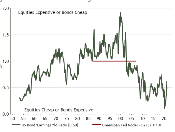 Either the stock market has been hugely undervalued for 20 years, and remains hugely undervalued now, or the Fed model is wrong. I'm inclined to go with the latter. Absolute Strategy's Ian Harnett also offers this chart which includes all the equity corrections, and shows that, with the partial exception of 1987, the Fed model was of no use whatever in spotting a fall coming: 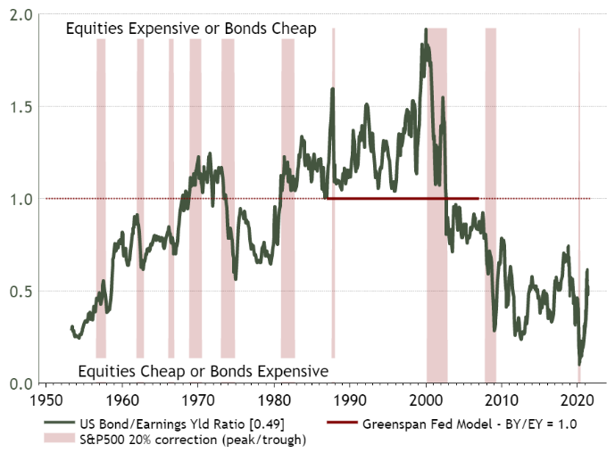 Another version of the same idea is to compare the dividend yield on stocks with bond yields. Decades went by without anybody thinking these should be roughly equivalent. It was taken as read that equities' chance of higher returns meant that bonds must inevitably offer a higher cash yield. The moment at the end of 2008 when dividend yields rose above bond yields was a shuddering blow, and led to predictions (reasonable given the history of the previous half century) that stocks were poised for massive outperformance of bonds. As we now know, bonds did very well themselves over the last few years. If someone had posited some kind of new Fed model that dividend and bond yields should be equal, the last 10 years might have made that position look sensible. (And before you write in, no I'm not seriously suggesting this, I'm making a point about data mining, and also trying to show that the relationship between stock and bond yields isn't remotely stable over time). This chart was also produced for me by Harnett: 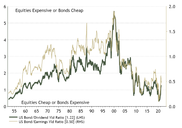 The Rule of 20Before the Fed model, there was also the Rule of 20. This held that inflation was the driving force of equity valuations, and cut out bond yields. The idea was that you could subtract the rate of inflation from 20 to get the ideal price-earnings ratio. The higher inflation is, the lower the multiple of future earnings you will be prepared to pay. That in principle makes some sense. And for the three decades from 1960 to 1990, the sum of the S&P 500's P/E ratio and the inflation rate scarcely ever varied from 20 by more than five in either direction. Unfortunately for the rule of 20, investors briefly decided they didn't have to worry about inflation at all at the end of the 1990s — but the rule again hasn't performed that badly in the two decades that followed, even though nobody at all was using it. Covid, however, seems to have laid waste to it. By my brutally simple calculations, the current sum of the P/E and the inflation rate is the highest on record. This implies that if inflation is on its way back and investors are beginning to take it seriously, equity multiples have a long way to fall: 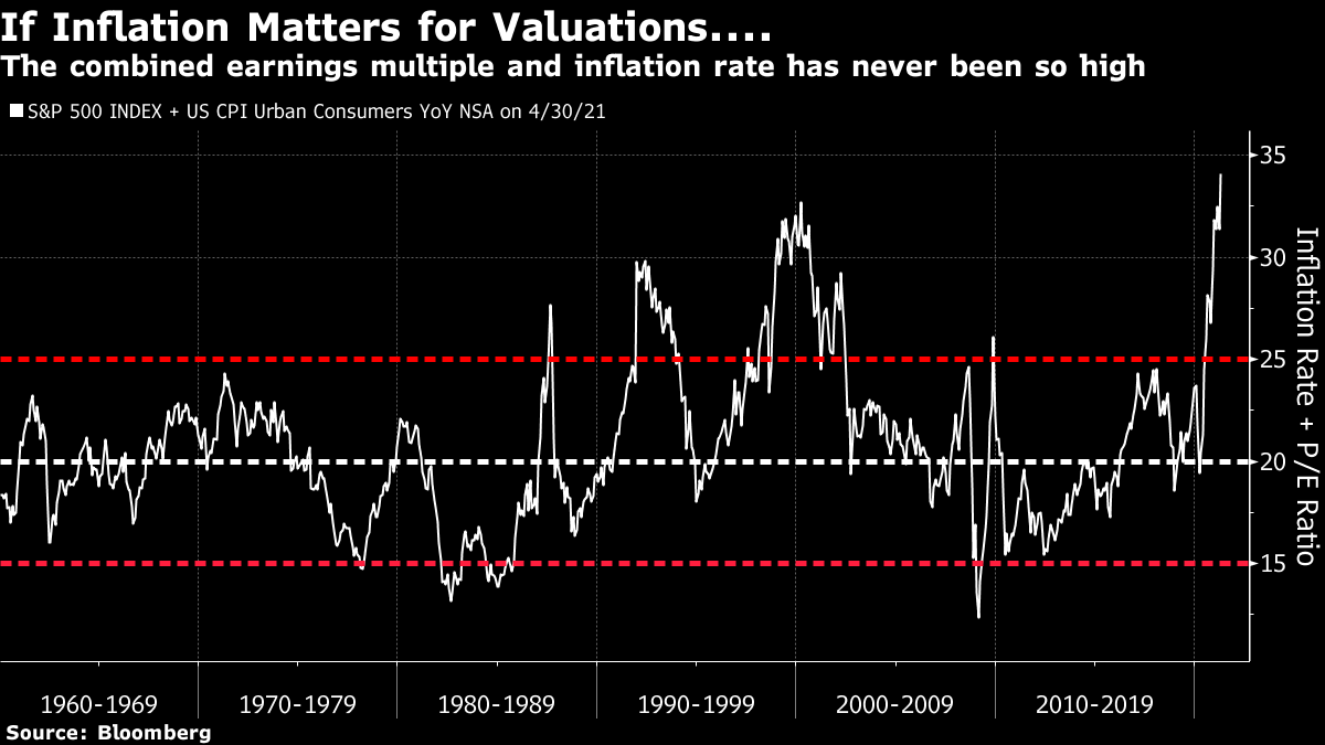 When I tried running the same calculation using the Shiller cyclically-adjusted price-earnings, or CAPE, multiple, looking at average earnings for the previous decade rather than one year, the rule of 20 did work surprisingly well for a long time. Calculated this way, the bubble of 2000 looks even more of an outlier. And the sum of inflation and the CAPE has just topped 40 for the first time since then, so we should be concerned. (My apologies for the trend line in the following graphic; I have no idea why the graphics software insisted on drawing it for me). 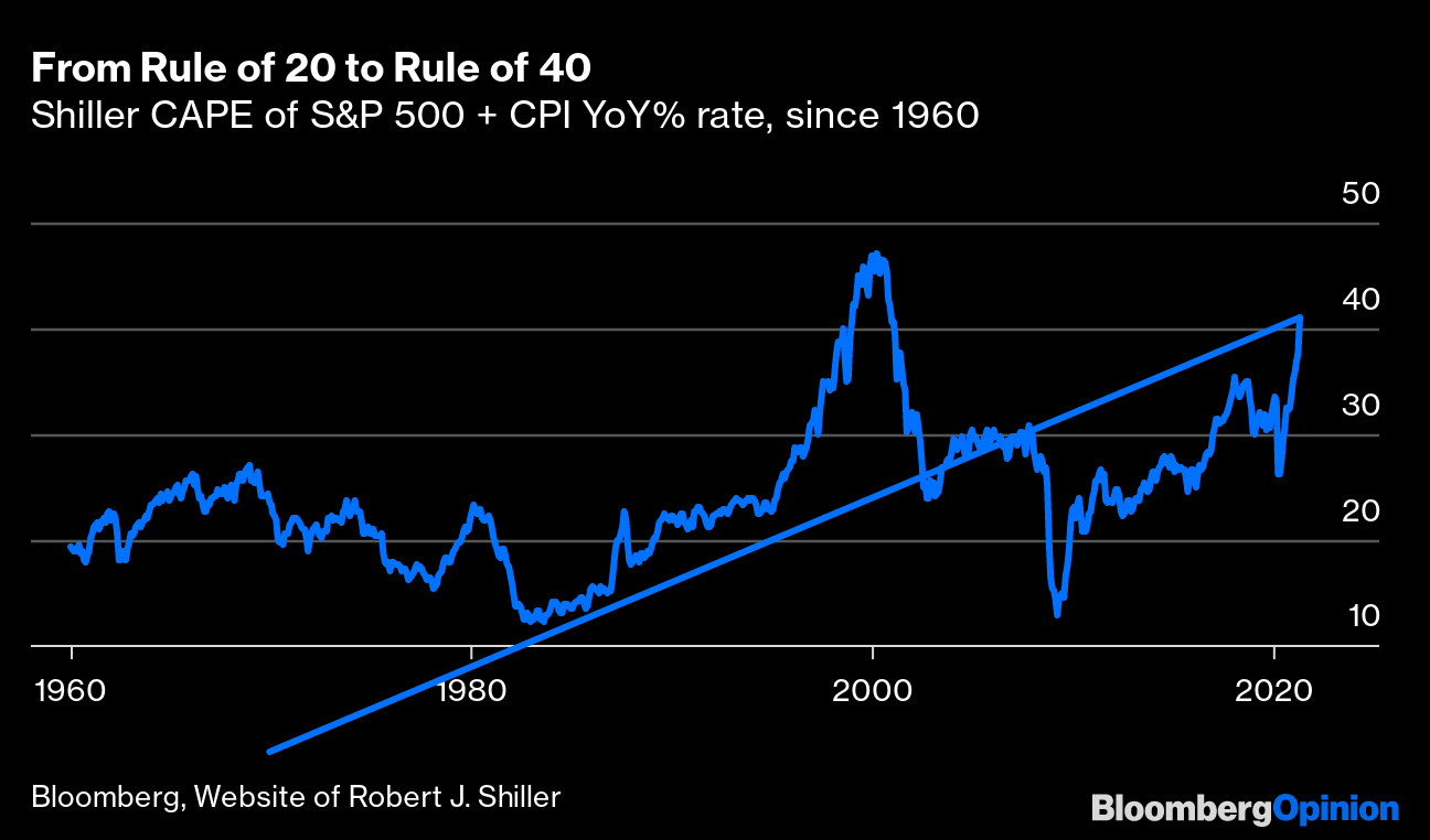 Is there a better, modernized version of the rule of 20 out there? The long weekend allowed Harnett to produce this, the "Inflation Dart" (although to me, thanks to a boyhood fascination with aircraft, it looks more of an "Inflation Concorde" or "Inflation Vulcan Bomber"): 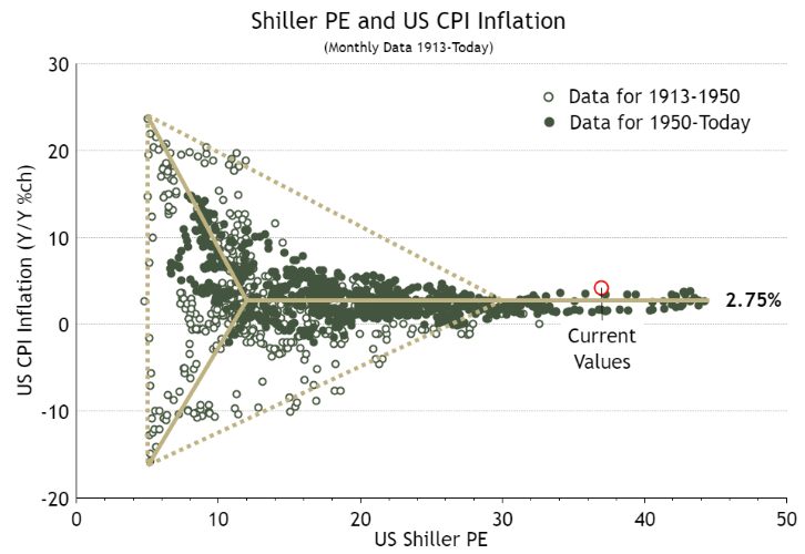 Before you dismiss this as ridiculous sophistry, it does contain a lot of intuitive common sense. While inflation remains broadly under control, the Shiller P/E can be more or less anything. Once inflation gets into the high single digits or beyond, or once it lapses into outright deflation, however, equity multiples suffer. Under inflation, the value of earnings streams will be eroded, and under deflation the earnings themselves will be eroded, so this makes sense. What this tells us is what most of us could have guessed. If inflation really does pick up from here and gets to the historically unremarkable but these days almost unimaginable level of 5%, history tells us it's a racing certainty that equity valuations will come down a lot. Inflation needs to rise first before that happens. And higher inflation isn't a given. There are plenty of reasons to believe that it is transitory, and we will need many more months of data to tell whether we really are entering a higher inflation regime. But the Inflation Dart does say very clearly that this would be bad news. And that helps explain why bonds and stocks are suddenly more correlated than they've been in decades. Expect that to continue unless and until the inflation fears are decisively put to bed. Survival TipsOver the long weekend, I read The Premonition: A Pandemic Story, a brilliant telling of how a group of disparate doctors and scientists initially pulled together by the George W. Bush administration spotted the pandemic coming, but were thwarted from taking the actions that might have dealt with it. Far subtler than many treatments of Covid-19, it taught me a lot, and was also a page-turner. It was written by the highly successful author, and these days my Bloomberg Opinion colleague, Michael Lewis, who has a happy knack for condensing complicated concepts into straightforward tales about sympathetic characters. I am sure there will be claims that Lewis over-simplified, but I recommend reading it. Then I heard the news that Dixie Lewis, his daughter, had been killed in a car crash last week. She was 19. "We loved her so much and are in a kind of pain none of us has experienced," he said. "She loved to live and our hearts are so broken they can't find the words to describe the feeling." Nobody should ever have to bury their child, and there are indeed no words to describe such loss and such pain, or to provide any meaningful comfort. The work of art that comes closest to capturing the pain of bereavement that I know of is Cantus In Memoriam of Benjamin Britten by Arvo Part. I've mentioned it in this slot before, but I cannot get beyond it. I commend it. And I continue to think it would be a great idea to read The Premonition. My sympathies to all who knew and loved Dixie Lewis. Like Bloomberg's Points of Return? Subscribe for unlimited access to trusted, data-based journalism in 120 countries around the world and gain expert analysis from exclusive daily newsletters, The Bloomberg Open and The Bloomberg Close. | 

Post a Comment