Negative Yields Are All Too Real More round numbers and more esoteric records. On Wednesday, the real 10-year Treasury yield (the nominal yield minus the inflation breakeven) dropped below minus 0.9% and briefly dipped under the previous all-time low set in December 2012 (marked in the chart). Meanwhile the nominal 10-year yield fell below 0.6%. 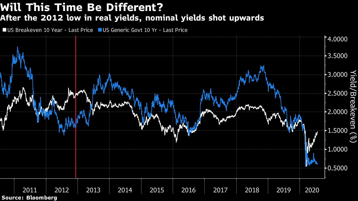 These developments are awful news for savers and anyone trying to run a pension fund. They also helped to power a fall for the dollar, and a big rise in gold, which is now closing in on its record high, set earlier in 2012. The combination of cheap money and a weaker dollar that flatters multinationals' profits also helped the stock market. But what exactly is going on? On the face of it, rising inflation expectations — even if they still stay very low at about 1.5% — in combination with nominal yields at a record low should mean economic stagnation plus inflation. But the extent of central bank involvement in the markets makes it hard to say that investors are truly positioning for stagflation. It's instructive to look at the last time real yields dipped this low. At that point, inflation breakevens were around 2.5% in the wake of President Barack Obama's reelection (they have never been so high since), while the Federal Reserve had embarked on what was popularly known as "QE Infinity" — purchases of bonds every month, to continue indefinitely. Under such circumstances, nominal yields dropped, but there was some expectation of a pickup in inflation. That episode ended with the "taper tantrum," as nominal yields shot up in the spring of 2013 when the Fed's chairman, Ben Bernanke, began to broach the subject of tapering off the bond purchases. Bond yields that effectively erode the buying power of people who lend to the government by 0.9% per year may seem an aberration, just like they appeared last time. It is tempting to think that they will soon rise again. Inflation expectations are still a full percentage point lower than they were at the end of 2012, and it shouldn't take much to bring nominal yields above them once again. But unfortunately there are some differences. It is just about conceivable that Fed Chairman Jerome Powell will soon start talking about tapering off QE (the current program has the nickname QE4Ever from the independent economist Edward Yardeni), but there is far less of a case for him to do so than there was for Bernanke seven years ago. Back then the economy was growing steadily if rather anemically; that is not the case now. And the disastrous market reaction to Powell's comments that he intended to continue shrinking the Fed's balance sheet "on auto-pilot" at the end of 2018 may well have deterred him from taking any risk of a repeat. The following illustration from Deutsche Bank AG's chief U.S. economist Matthew Luzzetti shows the problem neatly. The Cleveland Fed offers an online tool that allows the user to plug in different projections for inflation and unemployment, and see what various monetary policy rules would spit out for future interest rates. With unemployment expected to stay high for a couple of years yet, and nobody seeing much inflation for a while, the results are grim. Even the public projections of the Fed's own governors imply an effective fed funds rate of minus 5% — and there appears to be more downside than upside.  In practice, there is no way nominal interest rates will be set that low, and the likelihood is instead that we will receive ever larger doses of QE. Further math from the economists reveals that each $100 billion in QE is equivalent to a rate cut of about 3 basis points. So that yields a ball park estimate that another $12 trillion in asset purchases will be needed, just to keep the economy ticking until somehow the brake imposed by the pandemic can be lifted. If this analysis is anything like right, there will be no taper tantrum II any time soon. And real yields could go yet lower. Value in Europe? That brings us to the question of which assets could benefit. One natural consequence of all these developments should be a weakening of the dollar — particularly as other developed economies have fared much better to date in dealing with the pandemic. Most importantly, this might just be the moment for the euro to start gaining once again. The gap between U.S. and German nominal yields has dropped sharply this year, while the gap in inflation expectations is unchanged — which should mean far more support for the euro: 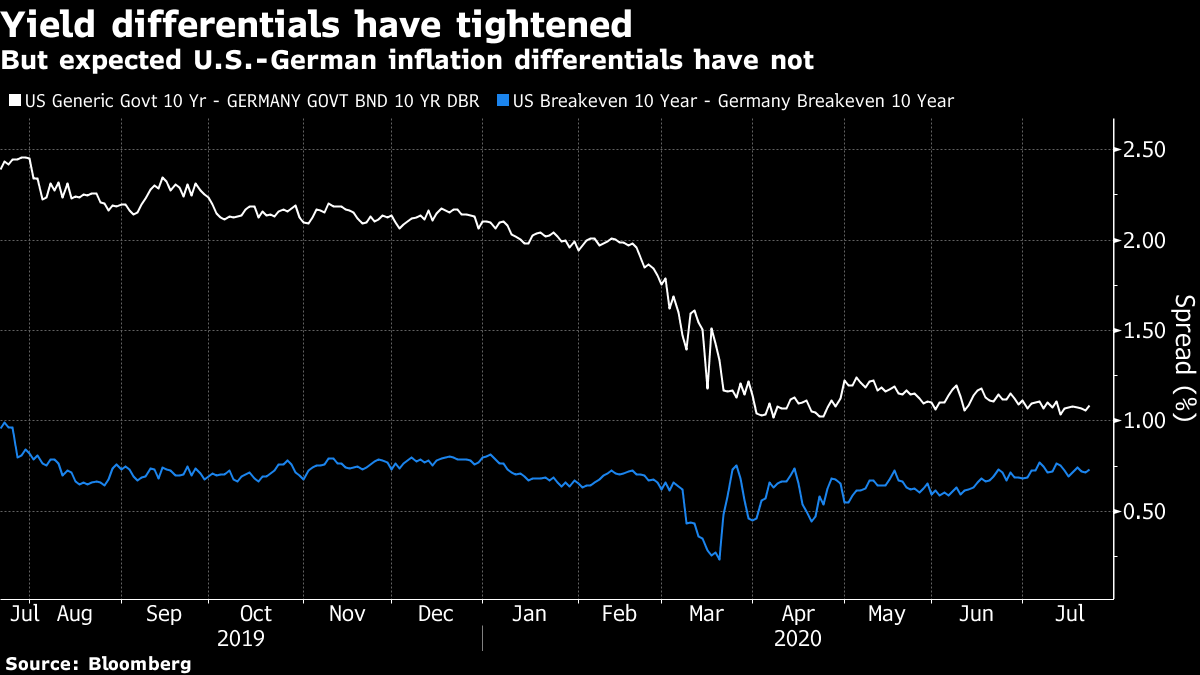 Meanwhile the euro's current weakness looks to be an artifact of dollar strength (driven in large part by haven flows the U.S. currency receives when sentiment is "risk-off"), rather than a specific European issue. If we compare the euro's performance since it peaked against the dollar in early 2018 with its value in nominal and real terms against a trade-weighted basket of currencies, it has actually grown slightly stronger after accounting for inflation. If the dollar is in the process of losing its supports, that could bode well for the euro against the dollar: 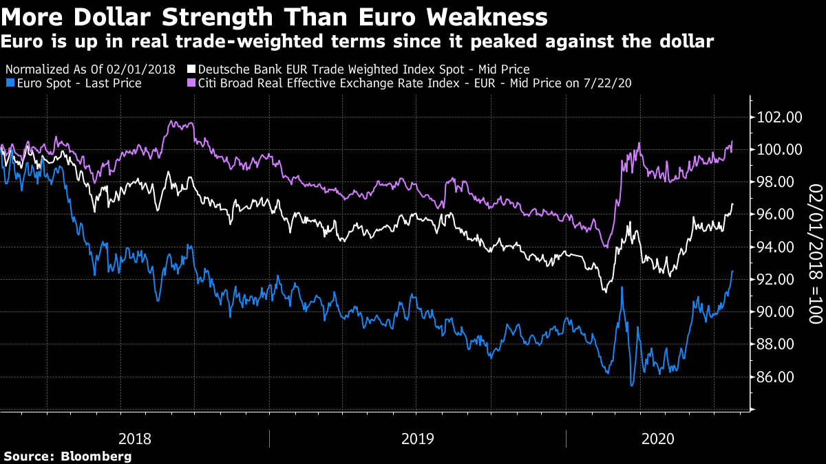 But this leads to another issue, which is that prognosticators (myself included) have been saying it is time for European stocks to start beating the U.S. for years, and it has never come true. Even if we grant that the European Union's marathon negotiation session at the weekend did end with a significant step toward a common fiscal policy, the fact remains that it could only agree on such drastic action because its problems are so great. The divergences within Europe are deep, but the economic failure to stage any real recovery from the 2008 crisis spreads across the entire EU. The following chart is from the Institute of International Finance:  Having said all that, however, there is a case to be made for European stocks to start to outperform. And it need not rely on continuing success in the battle against the coronavirus, or on sweeping reform of the EU. Exclude the Fang internet stocks that cause much excitement, and the U.S. stock market looks very much like Europe — only more expensive. Looking beyond the genuinely impressive Fang companies, Europe appears to offer greater value. The following chart shows that European value stocks have now made up almost all of the ground they lost to U.S. value stocks earlier this year, even while the main indices lag a bit further behind: 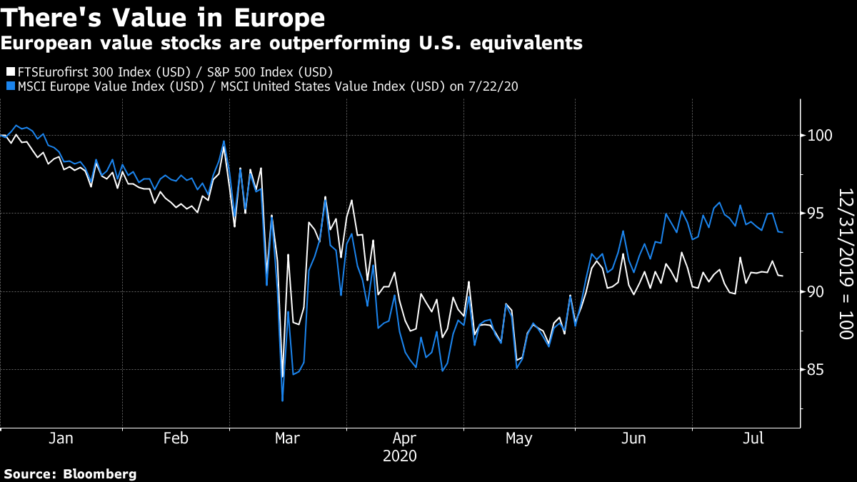 Despite this, they remain much cheaper than their U.S. counterparts, on a variety of metrics:  Things grow more interesting if we exclude the Fangs (which in the following exercise are Facebook Inc., Amazon.com Inc., Apple Inc., Netflix Inc., Microsoft Corp. and Google's parent Alphabet Inc.) from the S&P 500. The great problem with making any kind of bet against the U.S., or underweighting its stocks, is that you automatically also make a bet against the Fangs. If you split those few companies out of the S&P, things look a bit different. The remaining companies in the S&P 500 still command a slight valuation premium to overall European stocks (the chart is from StoneX Group Inc.'s chief macro strategist, Vincent Deluard): 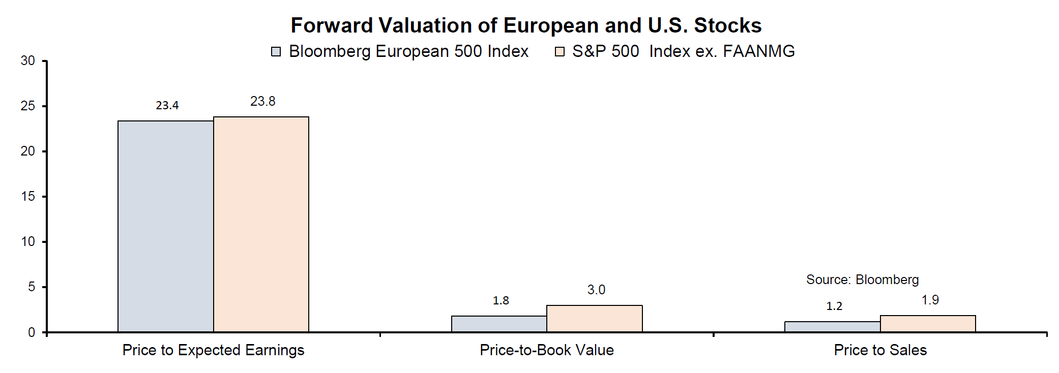 Now, if we take a look at the Bloomberg projected earnings for the Fangs, the rest of the S&P, and European stocks, we find that the de-Fanged S&P is expected to see earnings growth every bit as lackluster as that in Europe:  So you are paying slightly more for de-Fanged U.S. equities, but expecting no extra earnings growth in return. Now Deluard shows that European value stocks tend to beat U.S. value stocks when the euro is strengthening — which helps explain why they have done so badly while the dollar has been appreciating. Naturally that implies that more dollar weakness would be helpful:  Many careers have been lost betting on European value, or betting on the continent to outperform the U.S. But if you have exhausted the other opportunities created by negative U.S. real yields (such as gold and other commodities), it might be worth a try. Also, for indexers and exchange-traded fund issuers, the power of the Fangs might now mean there would be demand for a Fang ETF (there are a few of those), and also maybe a de-Fanged S&P ETF. You read it here first. Survival Tips It's cartoon time. The Extra History series on the Spanish Flu pandemic of 1918 seems to have been a hit with many, so now I suggest you move on to Extra History's brilliant cartoon treatment of one of the first and greatest episodes of financial excess — the South Sea Bubble. Enjoy. Like Bloomberg's Points of Return? Subscribe for unlimited access to trusted, data-based journalism in 120 countries around the world and gain expert analysis from exclusive daily newsletters, The Bloomberg Open and The Bloomberg Close. | 

Post a Comment