| A picture is worth a thousand words, so they say. So prepare for some pictures. This Points of Return will tour the prospects of recovery for the U.S. and world economy in pictorial form, to assess how much more human and economic damage we can expect from the coronavirus. The markets are enjoying a hot "risk-on" phase, largely because U.S. economic data have been surprisingly good. The widely followed Citi U.S. Economic Surprise index is at its highest ever (the global version is also up, though nowhere near so high). The index is constructed so it will revert, and the extent of the positive surprise in recent weeks owes much to the extent of the prior negative surprise. But in the moment, it will still help the market to go up: 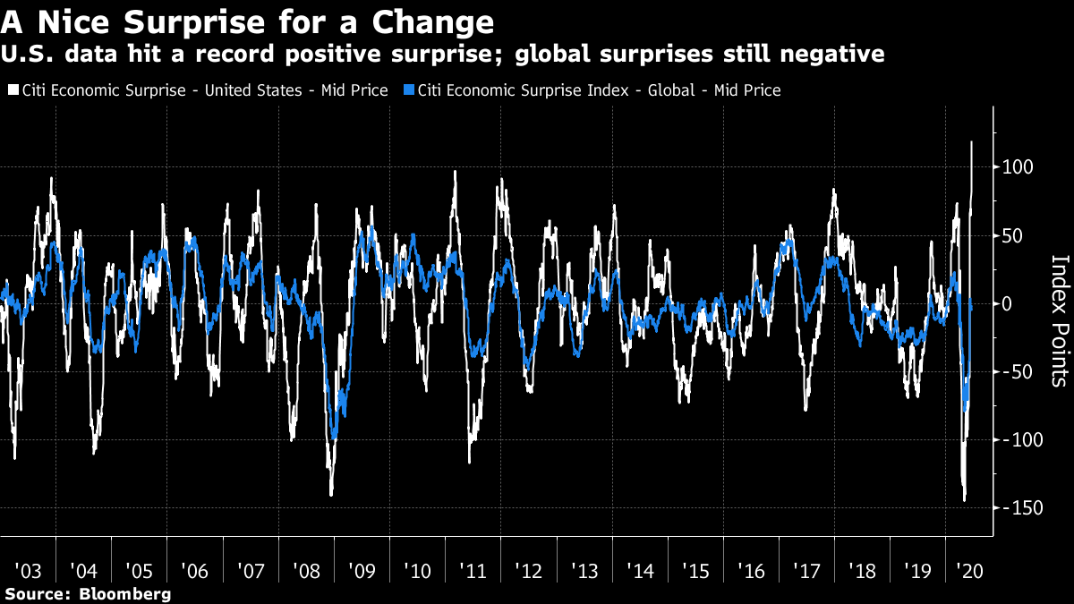 The two big attention-grabbing numbers Tuesday were U.S. retail sales, which showed the greatest month-on-month improvement ever, and industrial production, which showed a smaller gain. Confirmation that May had seen a significant upturn in retail activity was great for animal spirits. In absolute terms, retail sales have a way to go before they catch up with pre-Covid levels, while industrial production is near its lows from the Great Recession: 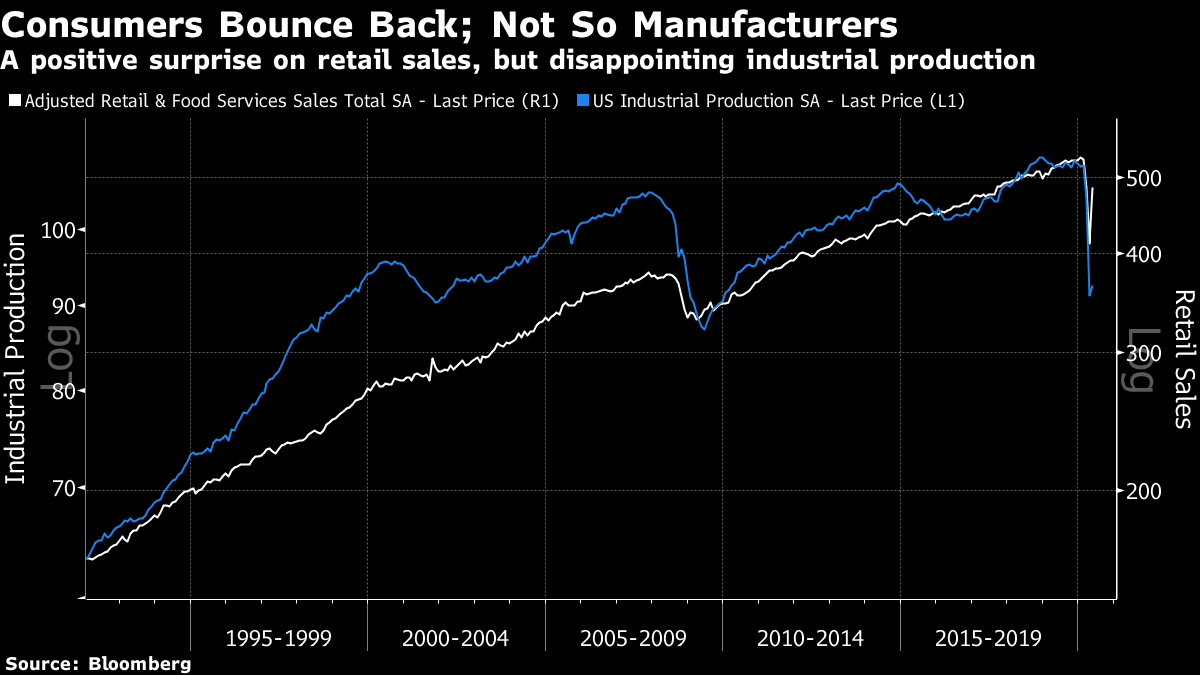 When it comes to "now-casting," or attempting to gauge the economy in real time, we see some farcical results. GDP growth is generally expressed as an annualized version of quarter-on-quarter growth. Thus when the Atlanta Fed's widely followed GDPNow forecast had GDP growth of -50% last month, this meant that the economy would contract by that much if it kept falling at the same rate for a year. Thus a -45% GDP growth rate isn't as terrible as it seems, and shows that the inflection point has been reached. It does, however, show that there is much more climbing out still to be done: 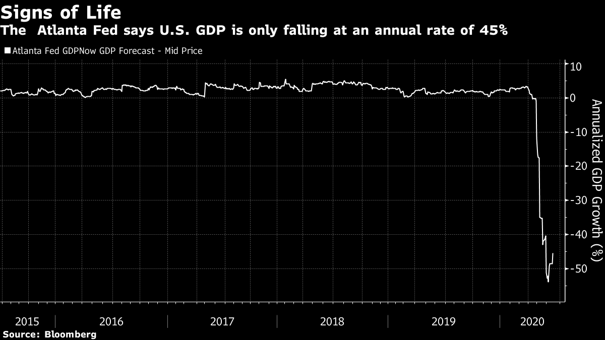 If there is reason for optimism in the U.S., the worst affected of the major economies so far, it is that animal spirits are fast returning in the rest of the world. German business expectations are now as positive as they have been in a decade, even if current conditions as measured by the ZEW survey remain almost as low as at the nadir of the Great Recession: 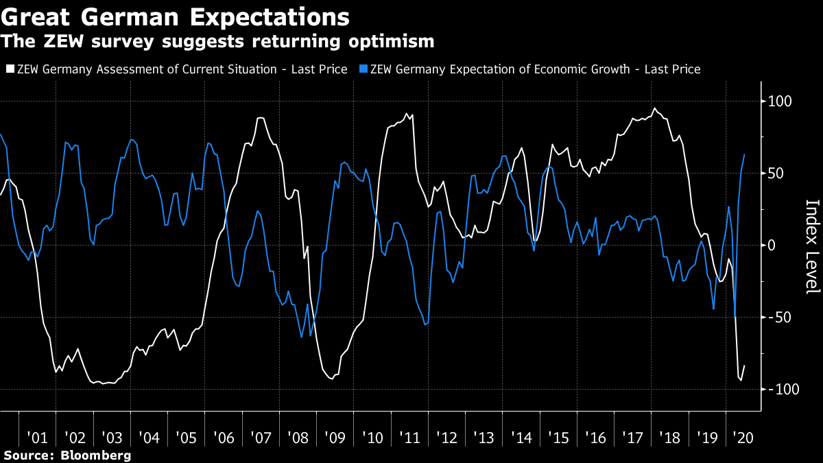 As for signs of real-time economic activity, there is a steady and gentle increase in commercial flights (cargo, charter, commercial passenger flights and some private jet flights) according to FlightRadar24. But they remain a long way below pre-Covid levels: 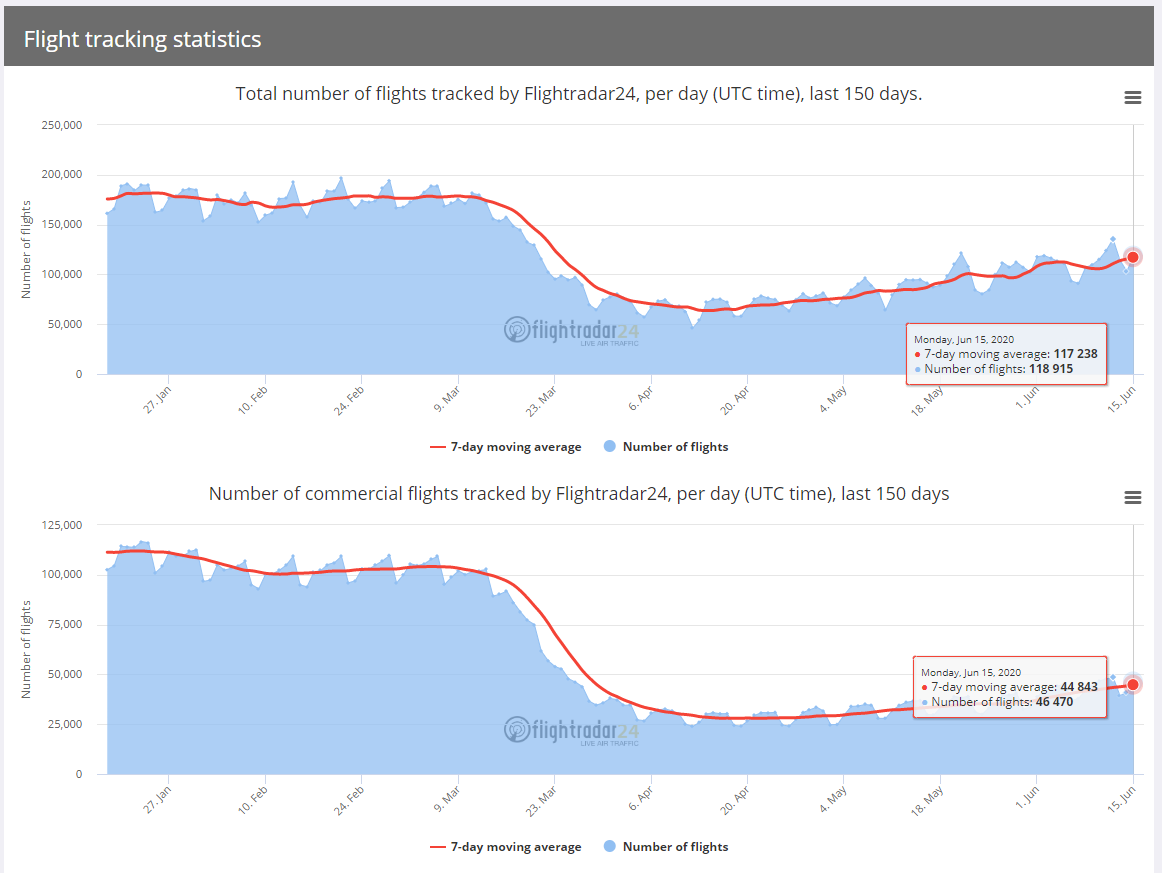 The number of passengers using U.S. airports remains tiny compared to a year ago: 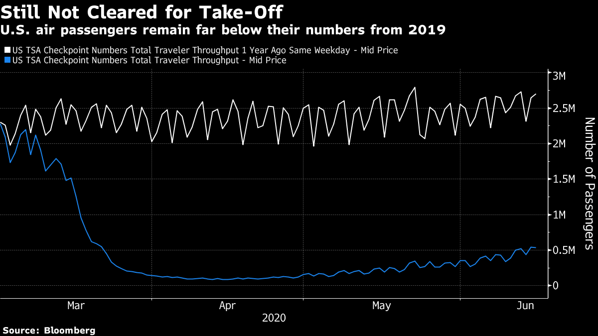 Globally, the Baltic Dry Index, which measures demand for shipping, is recovering and is back to roughly where it started 2020: 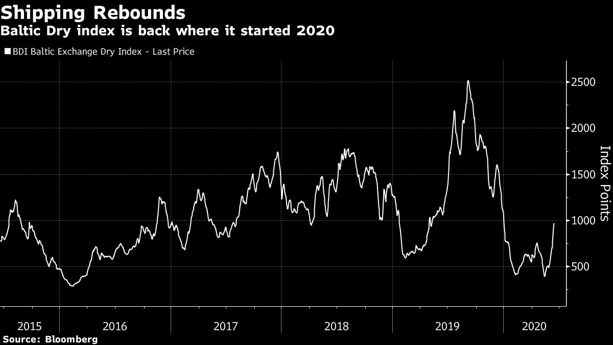 Within the U.S., there is also an encouraging pickup in demand for trucking services: 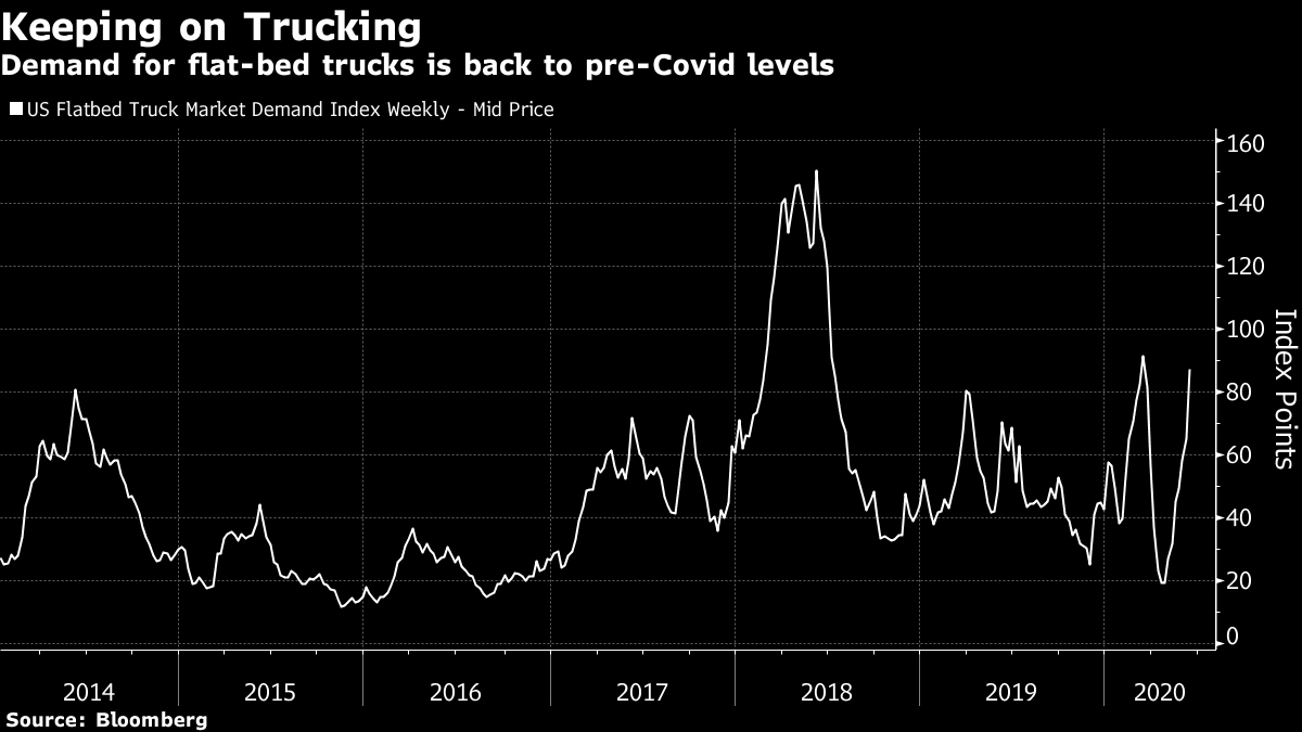 When it comes to indoor entertainment, there is still a problem. This chart shows weekly box office receipts at U.S. cinemas. It is denominated in hundreds of millions, so it is hard to see that cinemas have reopened, and receipts have risen to just over $600,000: 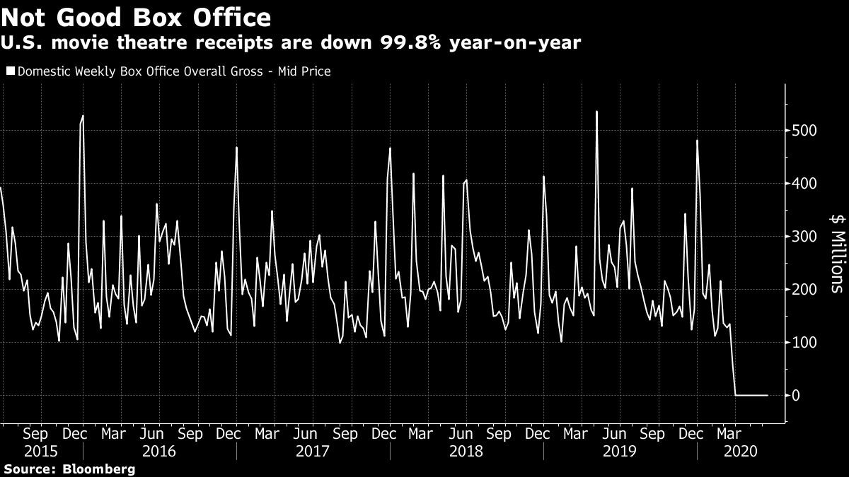 To all intents and purposes, this sector remains closed — and the difficulties agreeing on a template for Major League Baseball to return suggest that the entertainment economy is going to be depressed for a while. There is plainly a recovery, and there is plainly further for it to go. The numbers are better than the realistic worst cases that confronted the U.S. back in March. Every state has reopened to some extent. But there's no good evidence yet on the critical question: Can the economy return to full capacity before a vaccine is widely available? For that, we need to dive into the politicized thicket of Covid-19 data. Pick Your Confirmation Bias Covid-19 data are a minefield. There are enough lags, distortions and definitional quibbles that you can find data to confirm any pre-existing bias. Globally, the pattern is reasonably clear. China and Japan kept the virus under remarkably tight control (which is why news of a fresh outbreak in Beijing was so unwelcome on capital markets). The euro zone, after a tragic spring, has brought the disease impressively under control. In the U.S., the epidemic appears to have peaked, but progress is far slower. And there is what looks worryingly like a tragedy in the making in Brazil (and in a number of other emerging countries not included in the graphic, which comes from Cornerstone Macro via Richard Bernstein Advisors): 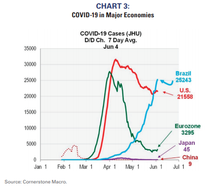 Within the U.S. there is a plain disjunction between the "tri-state area" of New York, New Jersey and Connecticut, which suffered arguably the worst outbreak in the world to date, and the rest of the country. This chart was produced by Jonathan Golub, chief U.S. equity strategist at Credit Suisse Group AG: 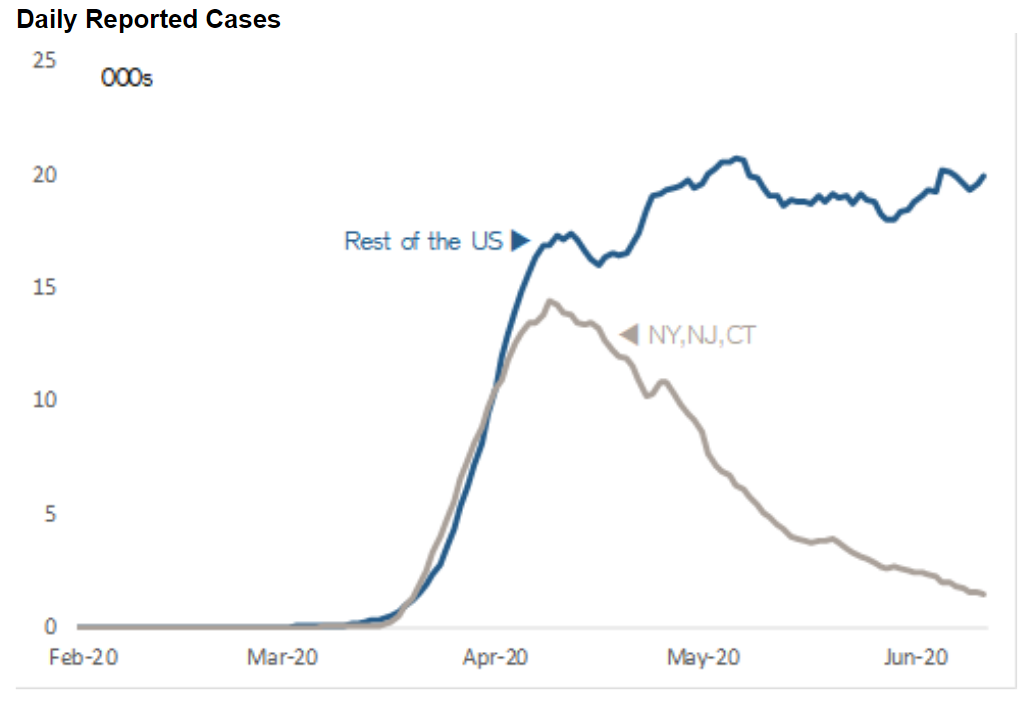 This doesn't show the clear "second wave" that appears in many headlines, but it does make clear that in the nation beyond the New York metropolitan area, the disease is continuing to spread. That said, there is one very important development, which is that throughout the country the medical community is evidently getting better at fighting the disease and saving lives. Even outside the New York area, the number of deaths each day is steadily declining: 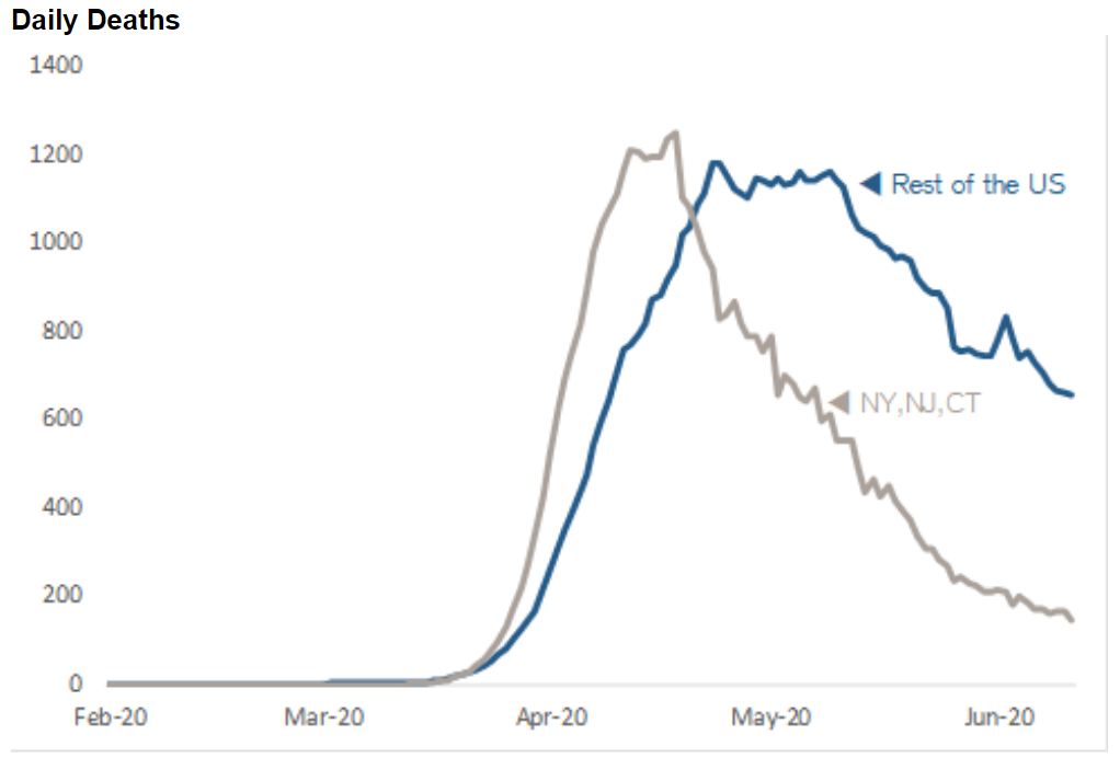 Couple this with Tuesday's news that a team at Oxford University had found a readily available steroid that can reduce Covid-19 death rates significantly, and there is good reason to believe that any future lockdowns can be far less draconian. Improving ability to treat the disease is lowering the stakes. However, the stakes in the U.S. remain high. That is partly because the issue has become politicized in an election year, and partly because many states have reopened their economies, and now face the growing likelihood that they will need to close them again, at least partially. The states most often mentioned appear in the chart that follows. Although it's on a linear scale, the point is clear: The disease is still spreading. 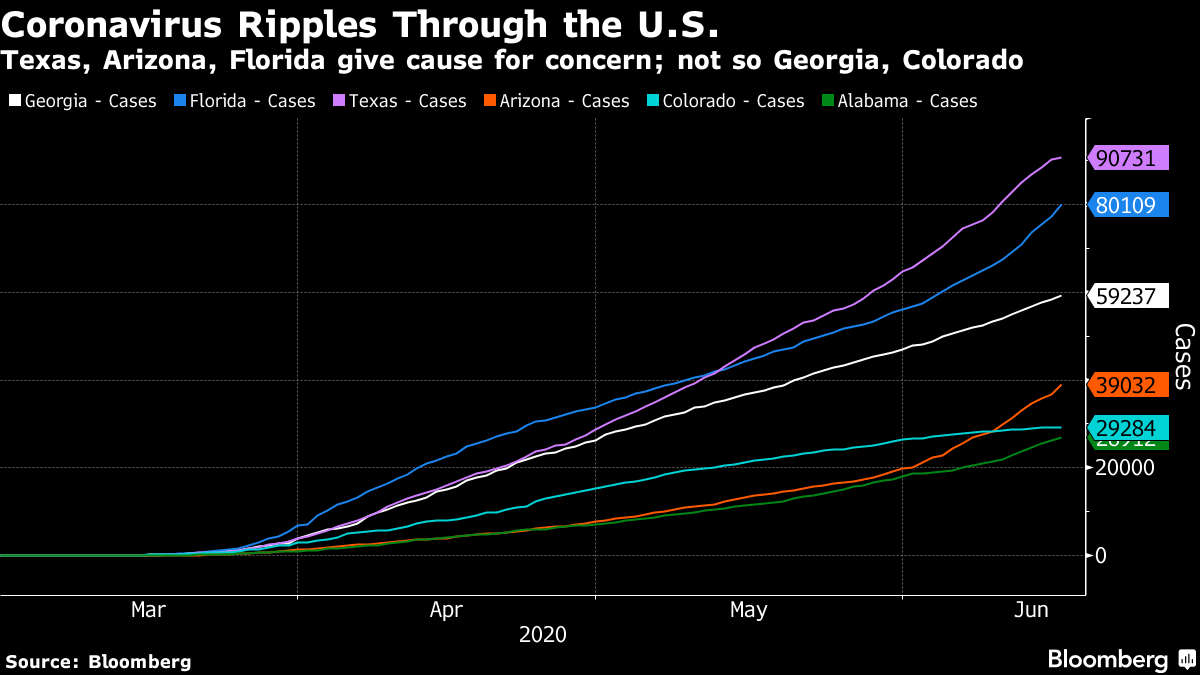 Now to look at them in detail: Georgia:
Cited by those who think that reopening can be done safely, disaster was widely predicted when the state's Republican governor opened even hairdressers and tattoo parlors. Disaster hasn't happened, but the figures kept by Johns Hopkins University show a rising trend: 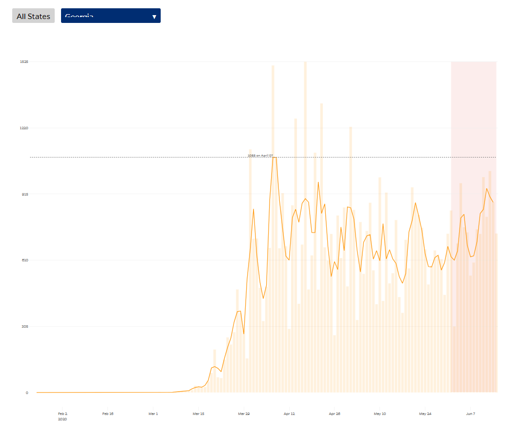 Colorado: A purple state currently in Democratic hands, with a Republican senator facing reelection this year, Colorado reopened at the same time as Georgia. It has been unambiguously successful: 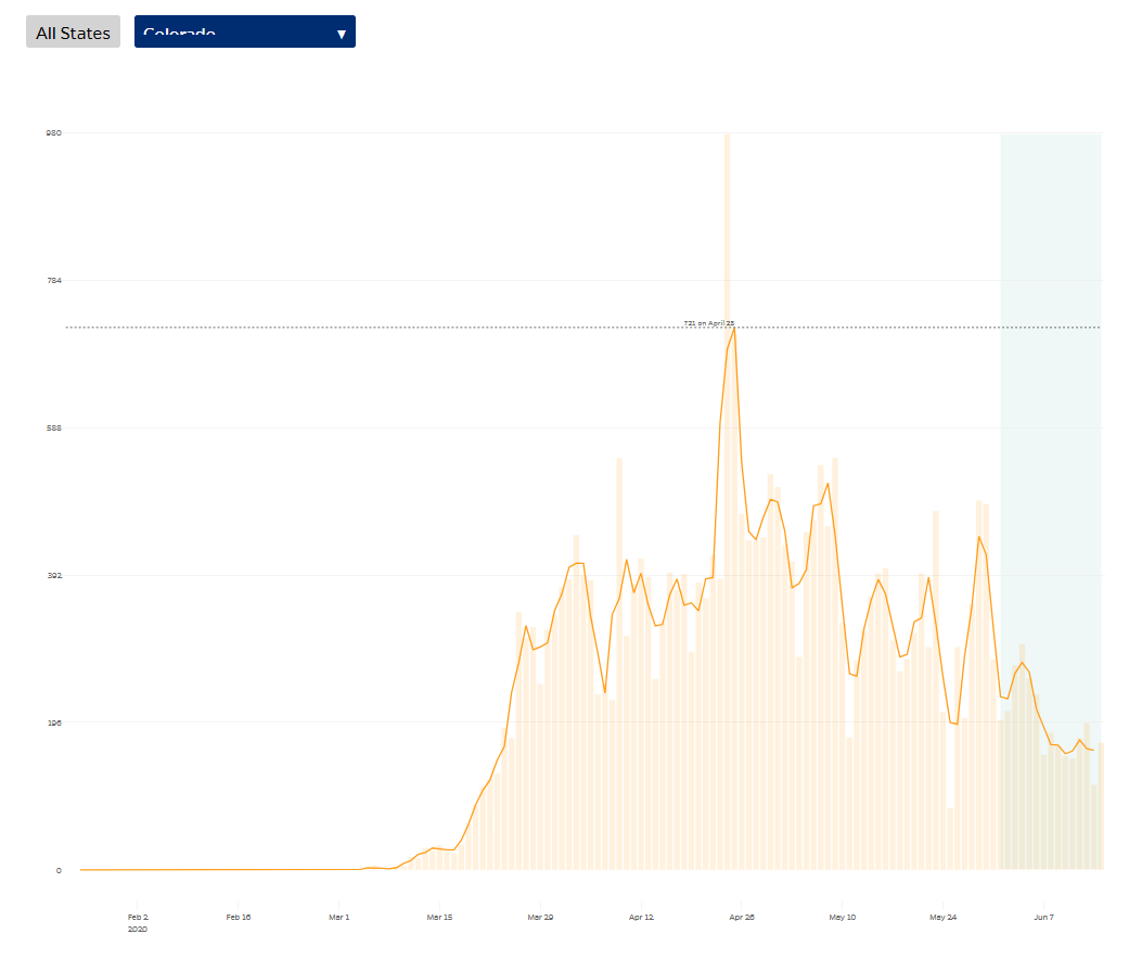 Florida: Another purple state which will be crucial in the presidential election, it was reopened early by its Republican governor amid much criticism. Cases are now rising at a concerning rate: 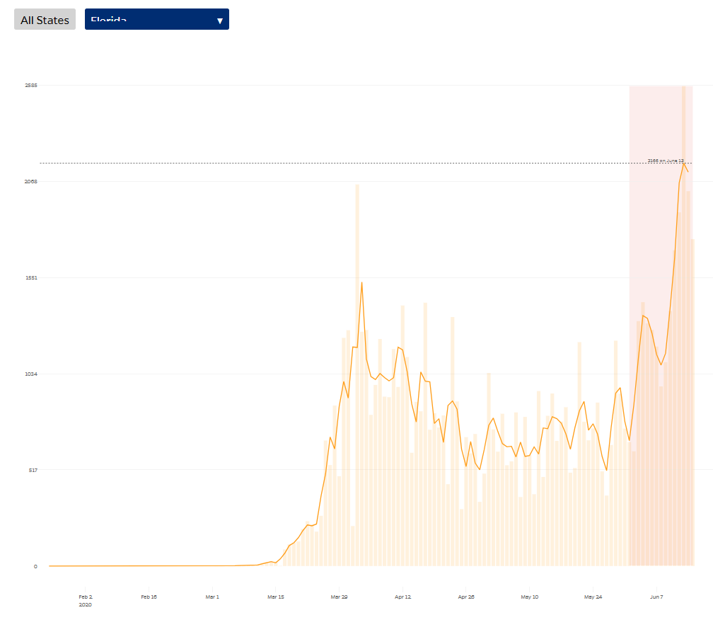 California: The biggest state in the nation and one of the bluest, its Democratic leadership has faced criticism for keeping its lockdown unduly strict — yet cases continue to rise. 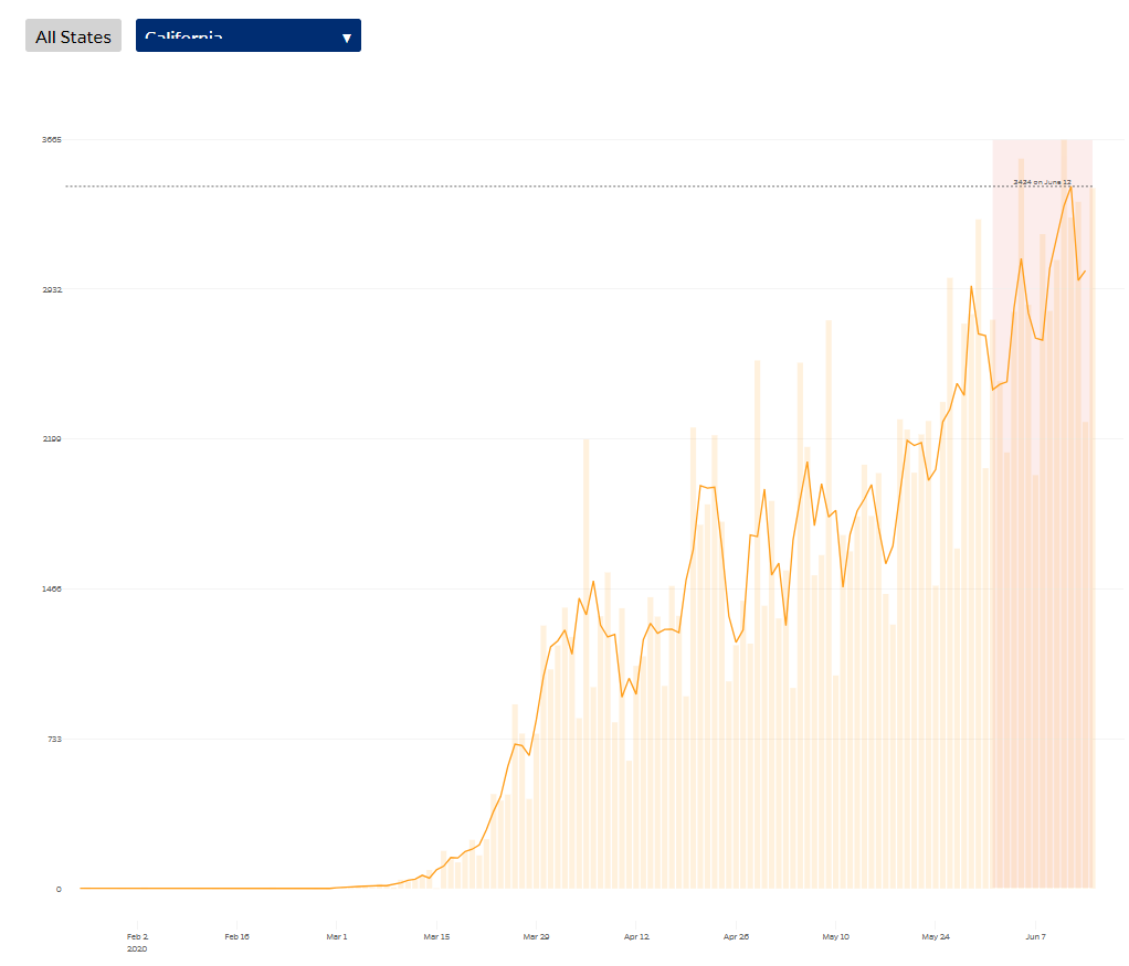 Texas: The next biggest state, and a Republican bastion, Texas was also opened early by its Republican governor, and it appears to be suffering the consequences. Despite their different politics and the very different approaches they took to the outbreak, the outcomes for California and Texas have been remarkably similar: 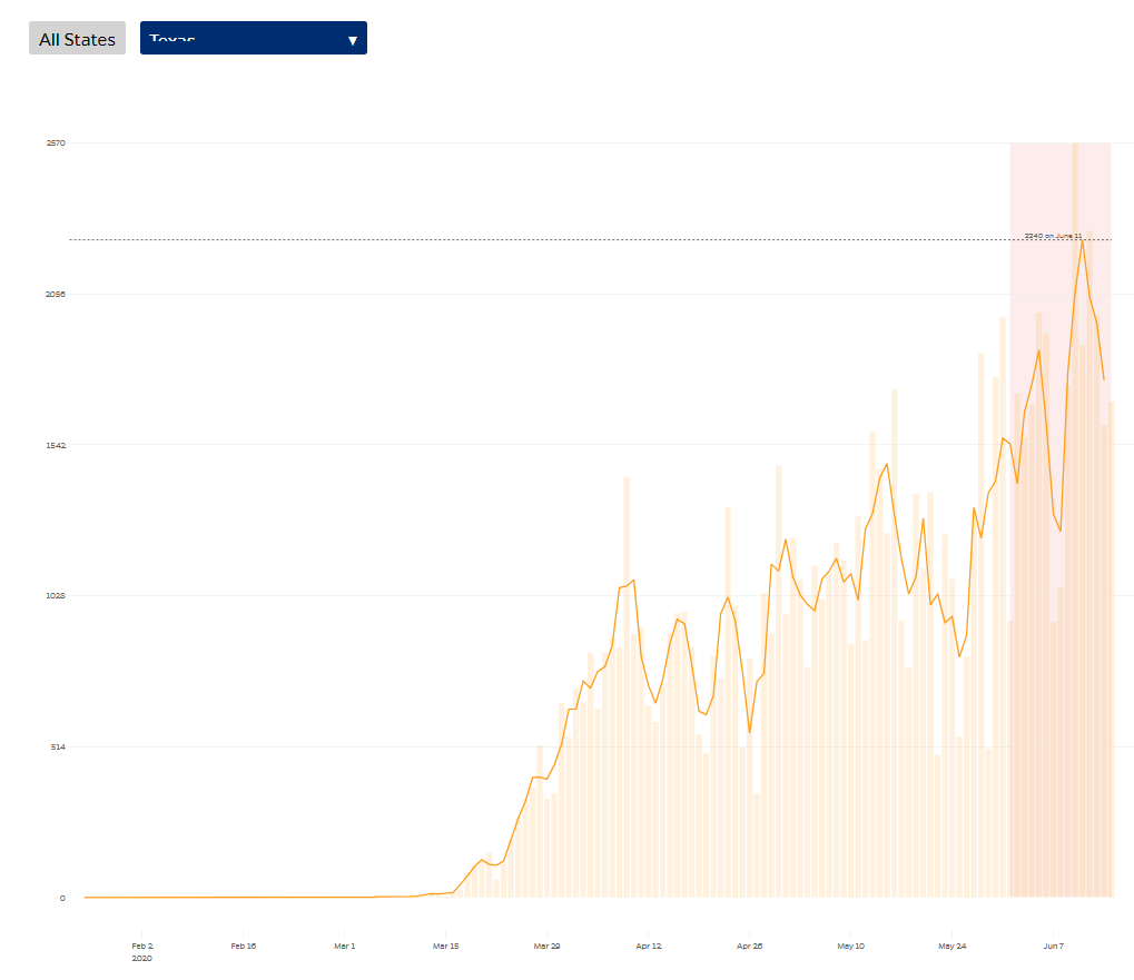 Michigan: It is two months since President Trump tweeted "LIBERATE MICHIGAN!" in support of protesters who were demonstrating against the strict lockdown imposed by its Democratic governor. Armed protesters entered the state capitol. The disease wasn't clearly under control at the time of Trump's tweet on April 17. It is under control now. 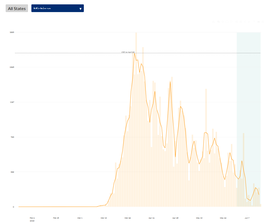 Arizona: This is the state that is now generating the most controversy, for reasons I'll cover below. Even night clubs have been reopened, and temperatures are such that Arizonans spend much time in air-conditioned spaces ideal for spreading germs. The increasing trend of cases has provoked alarm beyond the state's borders. 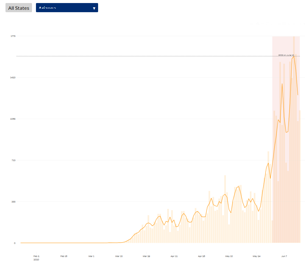 I hope this has shown that you can support any political party, and any reopening strategy, if you choose your state wisely. The bottom line is that there is no generalized "second wave" but a number of states are losing control over the epidemic and may have to put some limits on economic activity again. Raising Arizona Last week I wrote about Arizona and its confusing figures, and was greeted with the most heated postbag I can remember. The problem lies in the data and the way they are presented. While I have no reason to think that they are intentionally misleading, they have certainly misled a lot of people. So I return to Arizona. The Arizona Department of Health Services' official Covid-19 website carries this chart of the number of people hospitalized, by date of hospitalization. It looks like the disease is firmly under control, to the excitement of investment bulls: 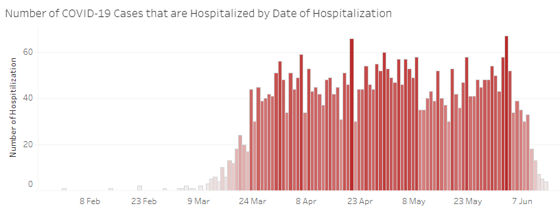 But the footnotes make clear that this is only confirmed cases. People who are hospitalized with a suspected case aren't included until they have tested positive, which can be a week or more later. The following chart, under "Hospital COVID-19 Specific Metrics" covers "positive or suspected" Inpatient Covid-19 Patients. It suggest a sharply rising trend. It also gives figures for June 14, despite a footnote saying that it was last updated June 7. 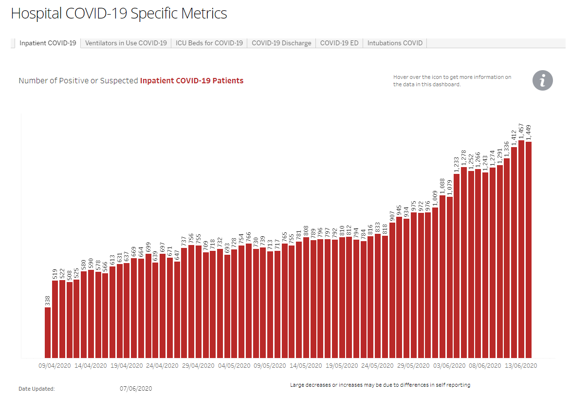 Hospitals know what a Covid case looks like by now, so we can assume that the "positive or suspected" number is a good forward indicator. Meanwhile, the official tally of hospitalizations is misleading. To ram this point home, this is the number of intensive care unit beds in use by people with "positive or suspected" Covid-19. It is at a new high. Very few people will be put in the ICU unless there is something seriously wrong with them: 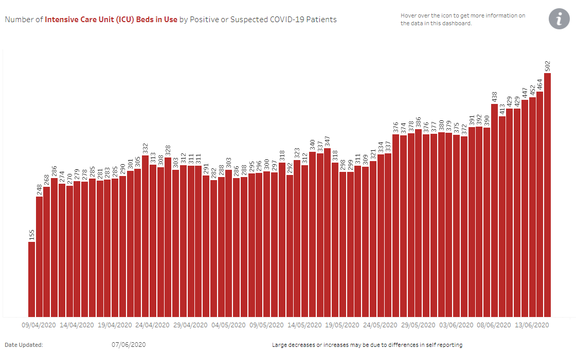 How alarming should this be? This next chart shows the proportion of ICU beds that are currently in use (by all patients). Some slack remains in the system, though it is plainly being eroded. It looks too soon to start talking about hospitals overflowing, though we can see why hospital administrators are voicing alarm: 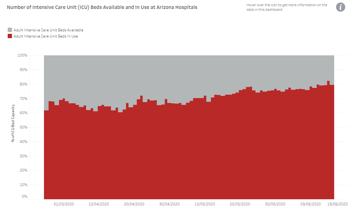 Now for the good news. Here are Arizona's numbers for Covid-19 deaths. As before, the last few days' figures will probably rise in due course. But deaths aren't increasing, despite the palpable spread of the disease. On this most important measure of all, the problem is getting no worse. 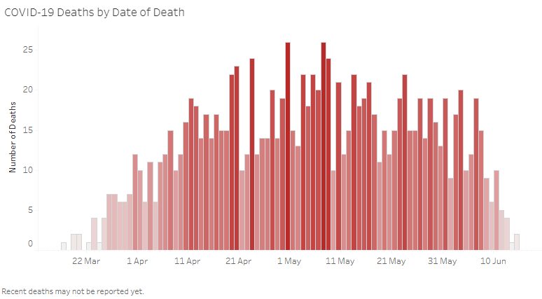 I have covered Arizona in detail because I know how much confusion its data have caused. Lots of people with a great interest in finance and no knowledge of Arizona or epidemiology have been delving through the numbers. Different charts, selected to confirm different biases, are whirling around on social media. These numbers weren't meant for investors. The people running Arizona's health system are busy fighting a pandemic and should have hedge fund managers and investment strategists a long way down their list of priorities. Nevertheless, the data have added to confusion on financial markets. If there is a moral from all these cases, it is that returning to normal levels of economic activity is going to be very hard until we have a vaccine. Full lockdowns begin to look excessive, particularly as treatment improves; but the balance of the evidence is that reopening needs to be done slowly and carefully. For investors: Don't bet on the economy to recover to 100% of its pre-Covid level for many months yet. Survival Tips Don't spend too much time on Arizona's coronavirus website. It's not good for your mental health. Like Bloomberg's Points of Return? Subscribe for unlimited access to trusted, data-based journalism in 120 countries around the world and gain expert analysis from exclusive daily newsletters, The Bloomberg Open and The Bloomberg Close. | 


Post a Comment