Value Judgments The value style of investing isn't dead yet. But it's far from in good health. And the academics who discovered it are worried they might have killed it. As I detailed last week, the value factor (buying stocks that are cheap compared to their fundamentals), has had a dreadful decade. In the U.S., value stocks are now almost as cheap relative to growth stocks as they were during the dot-com bubble. Is this because something has gone permanently wrong with the value effect, which finds that cheap stocks tend to outperform the market in the long run? Or are we in a cycle that will soon see value reassert itself? Eugene Fama and Kenneth French, the economists who first identified the value anomaly in 1992, last month published a paper examining whether they had themselves caused its demise. Markets tend toward efficiency. When a persistent anomaly is discovered, we should expect investors to react and eliminate it. Fama and French took their original data, from 1963 until 1992, and compared it with 1992 until 2019, looking at large and small companies. Their paper is here, and my colleague Justina Lee's piece about it is here. It is a dense statistical paper. The bottom line is as follows: Our goal is to determine whether expected value premiums … decline or perhaps disappear after Fama and French (1992, 1993). The 1963-2019 period used here doubles the 1963-1991 sample of the earlier papers, so we compare results for the first (in-sample) and second (out-of-sample) halves of 1963-2019.
The initial tests confirm that realized value premiums fall from the first half of the sample to the second. The average premium for Big Value drops from 0.36% per month (t = 2.91) to a puny 0.05% (t = 0.24). The Small Value average premium is a hefty 0.58% (t = 3.19) for 1963-1991, versus 0.33% (t = 1.52) for 1991-2019. Market Value, which is mostly Big Value, produces a first-half average premium of 0.42% (t = 3.25), declining to 0.11% (t = 0.60) for the second half. The value factor has definitely worked worse since they published. But the data "do not come close" to showing with the necessary statistical rigor that the value premium we should expect in future has been reduced. It is perfectly possible that the effect lives on. If it does, we then need to know why it is doing badly, and what will signal it is ready to start performing again. Chris Watling of London's Longview Economics shows that value goes through long cycles of two decades or more. It rose after the collapse of the "Nifty Fifty" growth stocks at the beginning of the 1970s, to reach a peak in 1988, gradually fell during the dot-com era to a low in February 2000, and then enjoyed another upward cycle that peaked in March 2007. Its underperformance since then has been severe but, as he points out, not as bad as the troughs of 1975 and 2000. 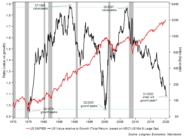 For another measure of cycles, this chart from Pim van Vliet of Robeco shows the relative performance of each major factor in each decade since the 1930s. The 2010s was the first in which value came dead last since the 1930s — which, oddly, was when value investing was first promulgated by Benjamin Graham. This gives reason for hope: 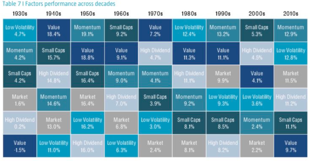 But when exactly can we know that value is ready to take over? Again, Watling suggests that it moves in line with cycles in the economy. New transformative technologies start off, and move through an innovation phase and into expansion and then maturity. Value does well when technologies have picked up and begun to proliferate through the economy. Thus the dot-com boom gave way to a period when many companies improved profits by harnessing the internet. This implies value takes over at the end of a cycle. Watling also suggests that value needs to be compellingly valued at an index level, and valuations of single growth stocks need to be extreme (thus signaling the end of a growth phase). At an index level, value is almost as cheap as it was at the top of the bubble in 2000. I don't want to touch on the question of the economic cycle here. But what of mad individual stock valuations? Back in 1972, the stocks generating the greatest excitement were the "Nifty 50." It turns out that there was never a clearly defined list of 50 stocks, but this fascinating paper from Pomona College looks at the different versions of "Nifty-ness" available at the time, and offers the following "Terrific 24" that were on everyone's list: 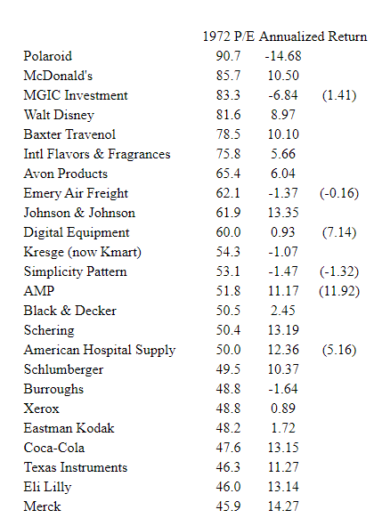 The figure for annualized return shows how the stock did from there until 2001, when the study was published — just as the next growth cycle came to a conclusion. The numbers in parentheses show what would have happened to those companies that were taken over if they had instead been reinvested in the other Nifty 50 stocks. The S&P 500 made 12.01% per annum over this period, so the list of stocks that justified their multiples isn't long. Polaroid, the most expensive of the lot, went bust. Now, here are the 20 biggest stocks in the S&P 500 on the day the market peaked in March 2000: 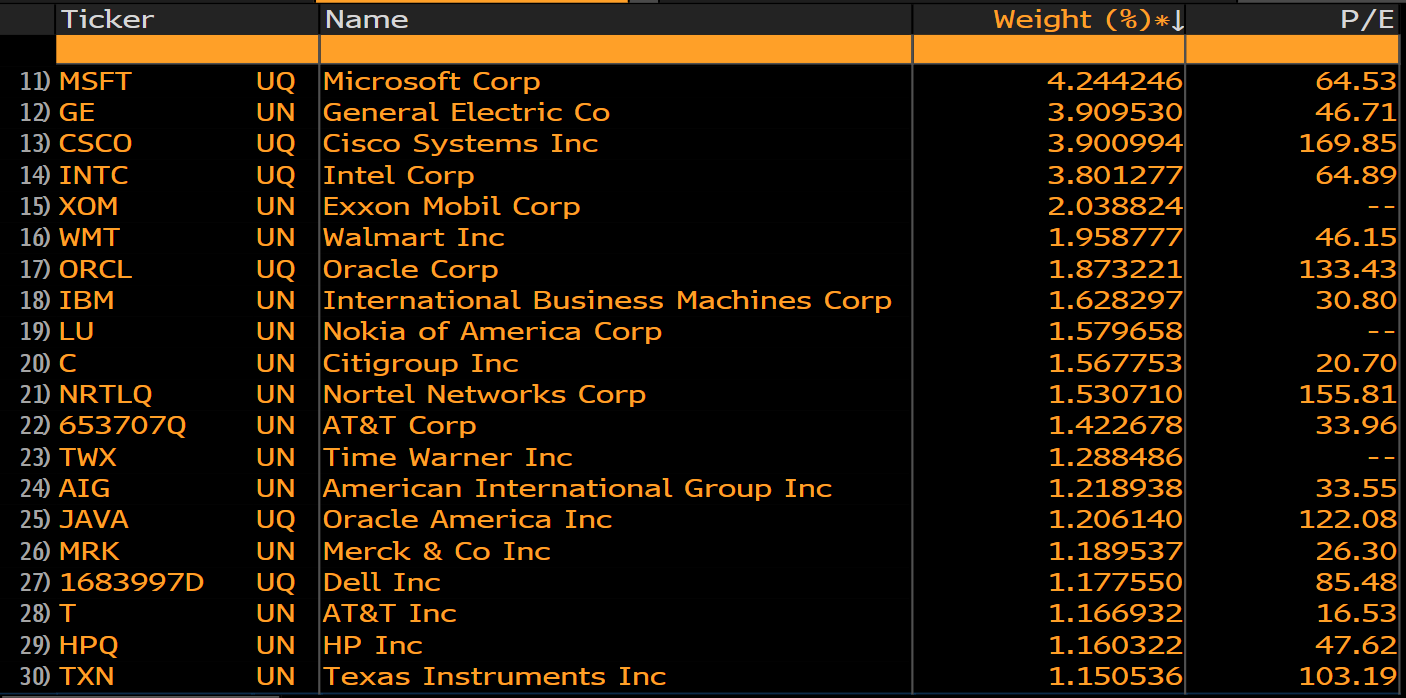 Again, hindsight tells us this wasn't a great list of buying opportunities. We know what has happened to GE; those of us who lived through the crisis are incapable of forgetting what happened to AIG; and Nortel Networks, then trading at 155 times earnings, went bankrupt. But Microsoft turned out to be a decent investment. This is how the biggest four stocks from the top of that market have fared since then, with the S&P 500 Value index for comparison: 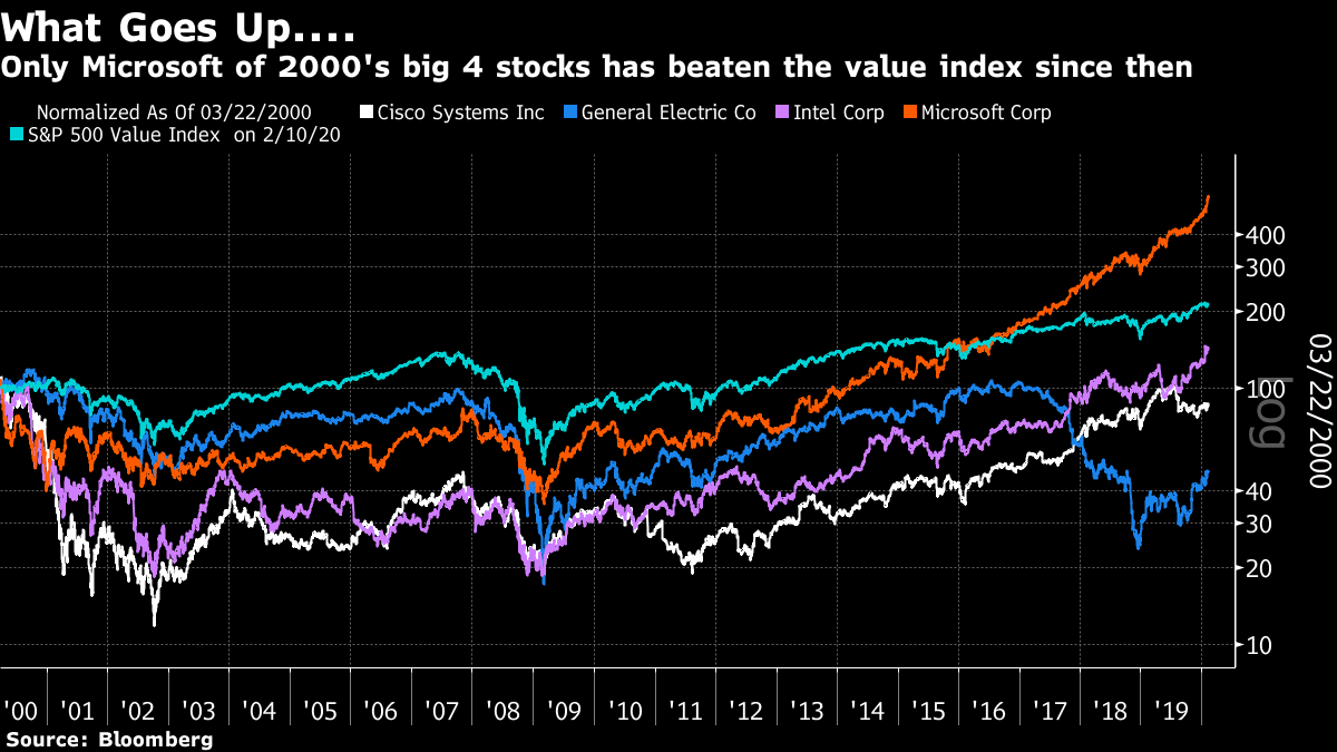 For a contemporary comparison, I looked up membership of the NYSE Fang+ index. Here they are, ranked in descending order of price-earnings ratios. (Note that Tesla shows up with no P/E is because it has no E, not having made a profit.) 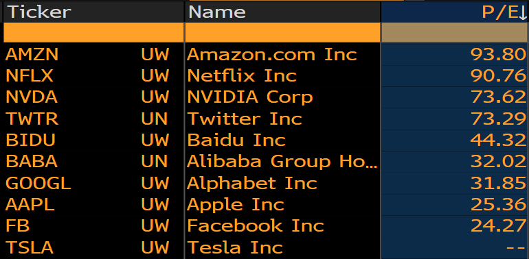 So. Amazon and Netflix are both as expensive as Polaroid was in 1972. They are also more expensive than many of the giants of 2000. That said, the likes of Alphabet and Apple look far more sensibly valued, and far more entrenched than the Niftys were. One possible counter-argument comes from Andrew Lapthorne, quantitative strategist at Societe Generale SA. He looked at the performance of the biggest five and biggest 10 stocks in the S&P 500 relative to the rest of the market (on the right), and the relative performance of the S&P 500 to its performance without those two groups (on the left). The results are spectacular: 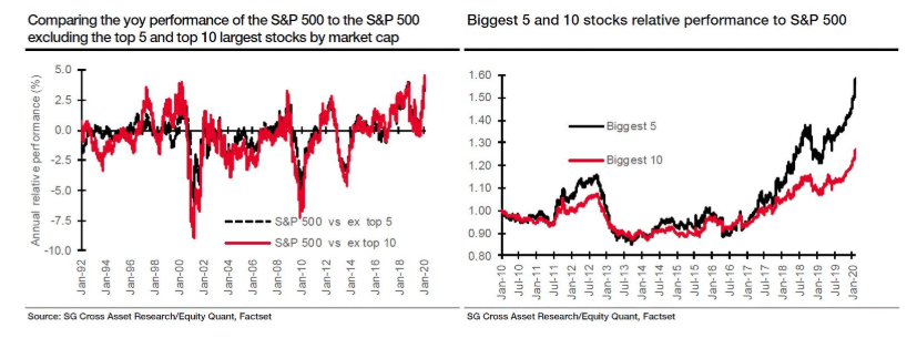 The index does indeed seem almost exactly as top-heavy by this measure as it did in 2000. The valuations of many of the biggest stocks seem a tad more sensible this time around, so on balance it seems as though value underperformance may have longer to run. But it does look as though the time for value to reassert itself is approaching. It looks like The Economist has won. Magazine covers about epidemics have a great track record of signaling the peak moment of market chaos that they cause. Time and our own Bloomberg Businessweek had coronavirus on the cover last week, but The Economist featured it a week earlier. At present, it looks like Peak Fear came on the day of The Economist's publication. This chart shows the VIX volatility index, and the performance of the most popular long bond ETF compared to the most popular stock ETF. Both reached highs just before the Wall Street close on Jan. 31: 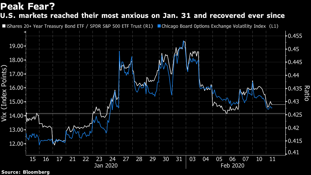 The other covers came as the market was already much calmer. The number of new reported cases reached its high between the magazines, on Feb. 4. But that may not be the most important figure. Epidemics follow a geometric progression; what is critical is to see the rate of increase decline. Johns Hopkins University keeps a handy online dashboard of the epidemic, which allows you to check its progress on a logarithmic scale. The slope is flattening; more cases are coming to light, but in China the disease is no longer growing at a geometric rate, while outside the country the rate of contagion also seems to be declining. Reassuringly, the recovery rate is still increasing. 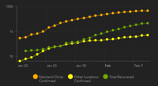 Is Peak Fear premature? It is possible that authorities somewhere in China will botch their handling and the disease will take hold again. And carriers have spread far and wide, as Johns Hopkins' maps will show. The World Health Organization is conspicuously not declaring victory yet. But with the authorities now on red alert, the odds are that this virus is coming under containment. What we don't know yet is the extent of the damage to China's economy. That won't be clear for months. It remains possible that China's problems will inflict more damage than U.S. markets currently appear to believe. Either way, it will be a while before Asian stocks can start to claw back the ground they have lost.
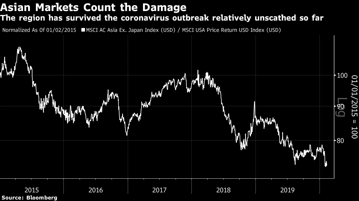
As it stands, they have lost surprisingly little. This is how MSCI's Asia ex-Japan index has performed relative to the U.S. since the beginning of 2015. It has underperformed by 25%, and the epidemic has brought it back to a new low. But the damage inflicted by the outbreak is far less than the Chinese devaluation crisis of 2015, the election of Donald Trump in 2016, or the onset of the trade war in 2018. If Peak Fear really has been reached, we should all feel very lucky:
 Like Bloomberg's Points of Return? Subscribe for unlimited access to trusted, data-based journalism in 120 countries around the world and gain expert analysis from exclusive daily newsletters, The Bloomberg Open and The Bloomberg Close. | 


Post a Comment