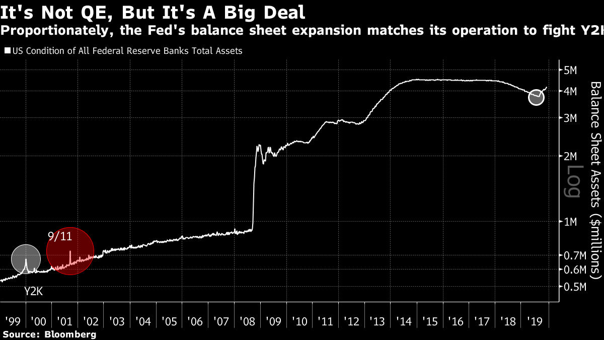
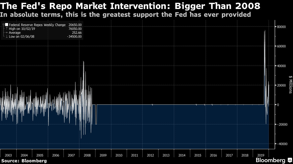
2020 Visions Modern securities markets are not old, at least in a form that we recognize today. That creates a conundrum. We all of us try to learn from experience, but when it comes to investing in stocks and bonds, there isn't much relevant experience to draw on. For those interested in trading dynamics, or the likely behavior of individual stocks, there is plenty of data that modern computers can mine for clues of the future. But for those allocating between asset classes, there is a problem. Major shifts in the macro environment don't happen often, and there aren't enough to make predictions with confidence. But we do have history to generate some useful ideas. So, with the caveats that we only have one data point for each scenario, and none of them is statistically valid, here are some years that could offer some guidance for 2020: 2000 Any market comparison to 2000 — the year that the dot-com bubble burst — is open to charges of alarmism, so I will define this carefully. By the end of 1999, the global economy was in greater health than it is now, and there was already a full-blown mania in internet stocks. Overall equity-market valuations by almost any measure were higher than they are now. But the final leg up in the Nasdaq was still a sight to behold. Already in a bubble for more than a year, the Nasdaq Composite index managed to surge an additional 76% from Oct. 7, 1999, until its peak on March 10 the following year. What lay behind this? Bloomberg Opinion contributor Jim Bianco suggested in a fascinating note that we should look to the measures the Federal Reserve took to support the overnight repo market against the risk of disruption from the "Y2K" bug — the fear that the difficulties computers had in changing to the new millennium could lead to a generalized computer crash. The Fed flooded the market to avert any problems. It did so again when the market reopened after the Sept. 11 terrorist attacks of 2001. And the moves it has made in the last few months following the September seizure of the repo market are proportionately just as big. The Fed says this is "not QE" (seen in the chart in the huge rise in the Fed balance sheet in 2008), but it is unquestionably a big deal:  In terms of specific support to the repo market, and in absolute terms, the backing from the Fed is greater even than in 2008, and it came after many years when it had barely been involved at all. To the extent that the repo market matters, this could be hugely important:  Most of us ignore the repo market, and it is safe to do this almost all the time — apart from when it has a problem. When it does, however, it could matter greatly. This is the market that pumps short-term cash into the banking system, and if there is a lot of short-term cash around, money being fungible, we can expect it to head for a place where it can make a return. In both 1999 and 2009, the stock market began its big rally on the day the Fed made the repo funds available. The Nasdaq 1999 returns were of course much greater. The week that the Fed withdrew its support, the index dropped 25%. Such a huge drop is hard to imagine without another massive mania ahead of it; but the more this stock market rallies, the easier it is to imagine a major stop when the Fed withdraws from the repo market. Liquidity has explained much of the market in the last 12 months, and this is critical to liquidity. 2017 There is another way of looking at this, however. What matters most to markets, most of the time, is the Fed. When it capitulates and eases rates having previously committed to raising them, stock markets can put in a lasting rally. The 2018 Christmas sell-off followed Fed Chair Jerome Powell's announcement that the central bank intended to keep reducing its balance sheet on "auto-pilot." It turned into a year-long rally once Powell began his great reverse of course last January.
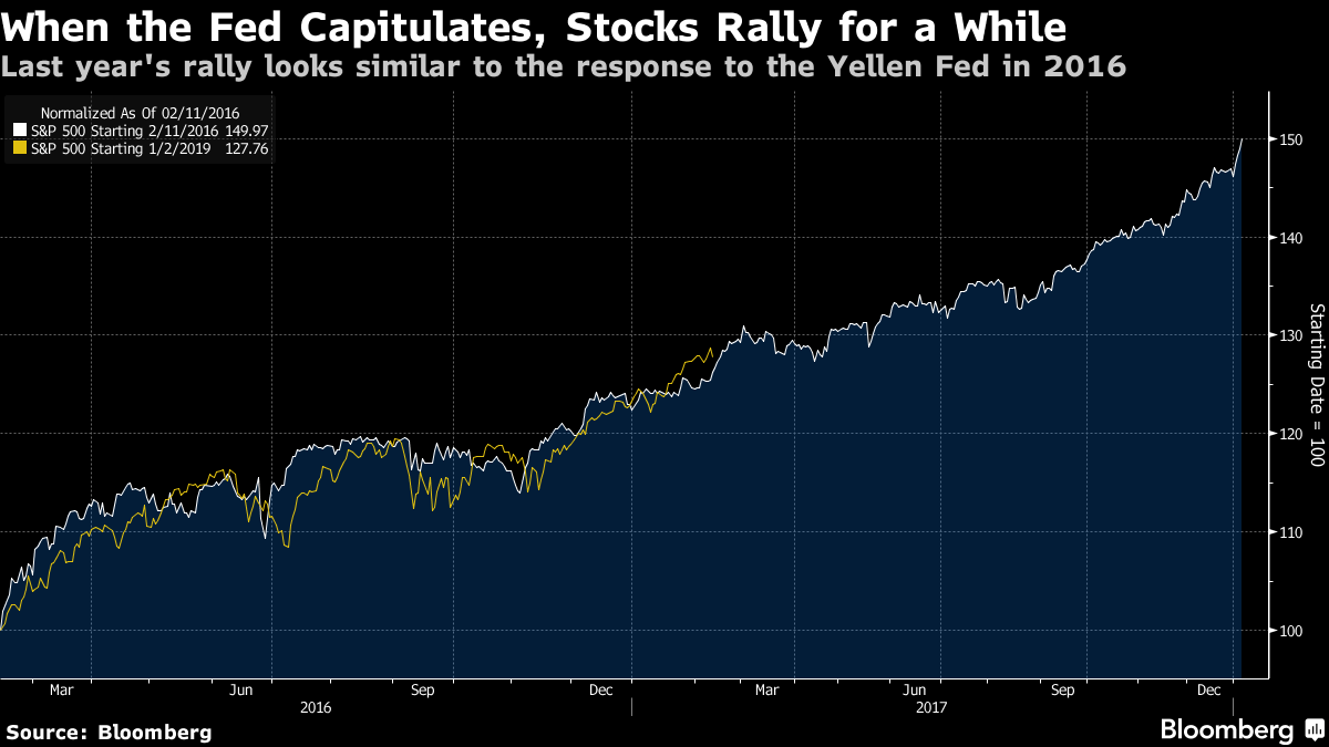
Previously, under Janet Yellen, the Fed had raised rates for the first time since the crisis at the end of 2015. The intention at that point was to embark on a slow and steady normalization throughout 2016. Then there was a global market spasm in response to a sudden Chinese currency depreciation. With investors evidently alarmed, the Yellen Fed made it known that rate rises could wait — and the stock market went on a two-year tear that only ended with the "Vol-pocalypse" of early 2018. The following chart, prompted by Tan Kai Xian and Wil Denyer of Gavekal Economics, shows that U.S. stock market performance since the Powell U-turn so far has been almost identical to its performance after the Yellen climb-down:
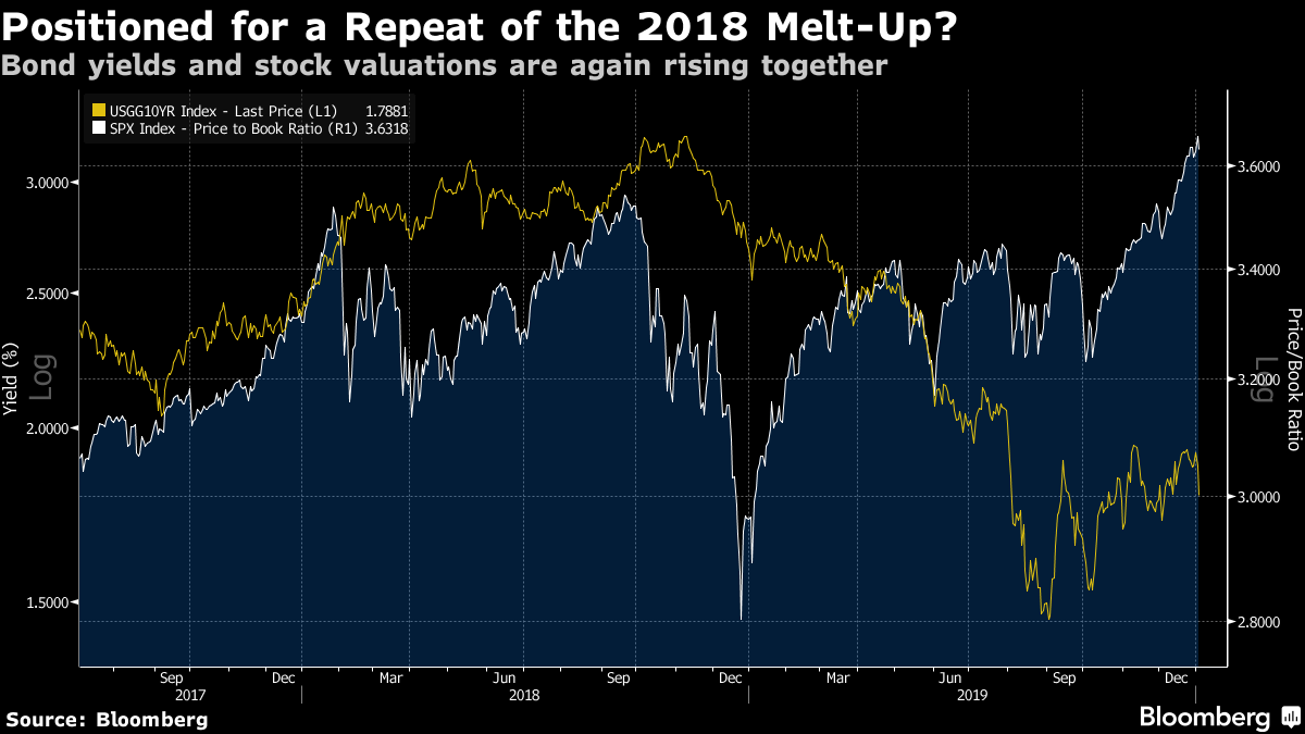
 Arguing against a repeat, valuations are already much higher, and the expansion has lasted another two years longer. Rates, too, are higher than the rock bottom levels of 2016. More positive indicators, according to Gavekal, include the housing market, which is in much better shape than it was, and the depressed state of manufacturing, which suggests it should be ready to stage a recovery. 2018 Just as when we started 2018, politicians have recently delivered news that many badly wanted to hear. This time, it was the phase-one trade agreement between the U.S. and China. Back then, it was the U.S. corporate tax cuts. Despite that political uncertainty two years ago, the previous year of 2017 had featured spectacularly low volatility. Equities were in the process of melting upwards, while bond yields were rising, in response to what appeared to be a clear coordinated global recovery. What happened next? The melt-up carried on for a month, as did an increasing rise in bond yields. Then the stock market stopped, confronted by the rising yields and their implications for valuations. That was soon followed by a spectacular market accident generally known now as a "Vol-pocalypse" as bets on low volatility went drastically wrong.  How similar are conditions today? Valuations of stocks seem just as overstretched, while 2019 almost matched 2017 in offering remarkably low volatility, particularly in the foreign exchange market. Excessive stability can breed complacency and with it, excessive instability, as happened two years ago. Then as now, bond yields are rising, in a reflection of growing optimism about the economy. The critical difference is that U.S. yields remain, for now, significantly lower than they were two years ago. Clear signs of a global recovery might well help the rest of the world catch up with the U.S.; but if they also lead to another strong rebound in bond yields, such signs could also force a retreat for the U.S. stock market. 2012, 2008, 2004, 2000, 1996, 1992, 1988, 1984 … There is one other big factor to consider; the political cycle. Traditionally, the U.S. stock market crams most of its gains into the third year of a presidential term, which we saw last year. Election years themselves tend to be difficult, riven by uncertainty. Stock market returns also tend to be worse in conditions of gridlock, when at least one House of Congress is opposed to the president. That is the case at present. Add in the sudden return of high geopolitical angst caused by the heightened tensions between the U.S. and Iran, and you have a case for concern. Some of the leading Democratic presidential contenders are perceived as very Wall Street-negative. But many traditional rules of U.S. politics appear to be in abeyance at present, and that may also apply to the stock market's presidential cycle. 2016, as we have seen, was a good year thanks to the Fed. Monetary policy, which is still largely independent of the electoral process, matters far more these days than fiscal policy, which is driven by politicians. Jeremy Grantham of GMO declared four years ago that the presidential cycle was dead, because the Fed had become so powerful. Despite this, presidential elections tend to be difficult for investors — that lesson hasn't gone away. Where does this leave us? The Fed will need to find a way out of its entanglement with the repo market without causing an accident, and we will need to see an economic recovery that isn't so strong as to push up bond yields. And we need to avoid nasty political surprises, but that is always true. On the limited data points we have from the past, that is the path to further gains for risk assets this year, and it is a narrow one. But, as ever when looking for macroeconomic turning points, we have a lack of data. Like Bloomberg's Points of Return? Subscribe for unlimited access to trusted, data-based journalism in 120 countries around the world and gain expert analysis from exclusive daily newsletters, The Bloomberg Open and The Bloomberg Close. | 

Post a Comment